HOME | DD
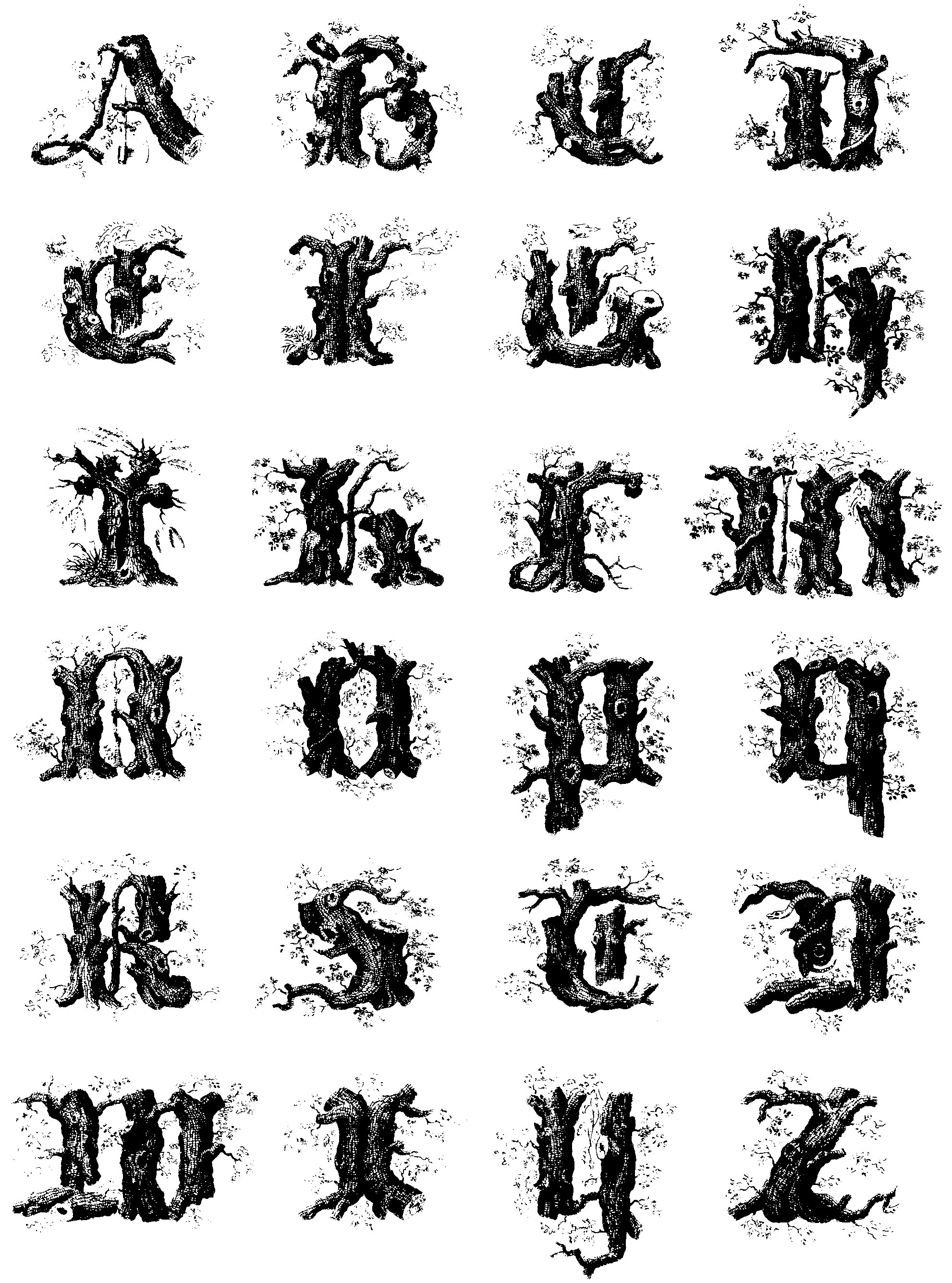
 Mindgazer — Stump or tree Alphabet
Published: 2005-12-06 02:51:05 +0000 UTC; Views: 24473; Favourites: 43; Downloads: 7513
Redirect to original
Description
a font that is now in the public domain. feel free to use it, just copy and paste the letters. send me a note if you use it.Related content


Comments: 11

In Norway we are something called "russ" and my name is now painted on my "russebukse" in this font ")
Thankies :3
👍: 0 ⏩: 0


FYI, this is now a font called Limberjack, available for download from DA. Choz cunnigham [link] has it hosted.
👍: 0 ⏩: 0

")

I have no idea how to make it into a downloadable file thingy. these are really intended to be headers, the first letter of the page. so all you have to do is cut and paste. that's why the image size is so big.
👍: 0 ⏩: 1
 (Smile)")

why thank you, but i didn't draw it, these are about 200 years old, i just collect them from the books i collect. glad you like them!
👍: 0 ⏩: 0

Do you have any intention to make an actualy font out of them? Or do you mind if I'll do? I know you said it's free for use, but I rather wanted to ask again. I'd love to make a font out of this and the two other alphabets you posted.
👍: 0 ⏩: 1
Go right ahead!!!!! that would be lovely. please let me know when you post them!
👍: 0 ⏩: 0

That's very nice. I notice that some of the letters (like H and O) are a bit darker, but the design is excellent. I'd love to see this vectorized.
👍: 0 ⏩: 0