HOME | DD
 mindtool — Hazeye2

Published: 2006-12-06 00:28:08 +0000 UTC; Views: 122; Favourites: 1; Downloads: 4
Redirect to original
Description
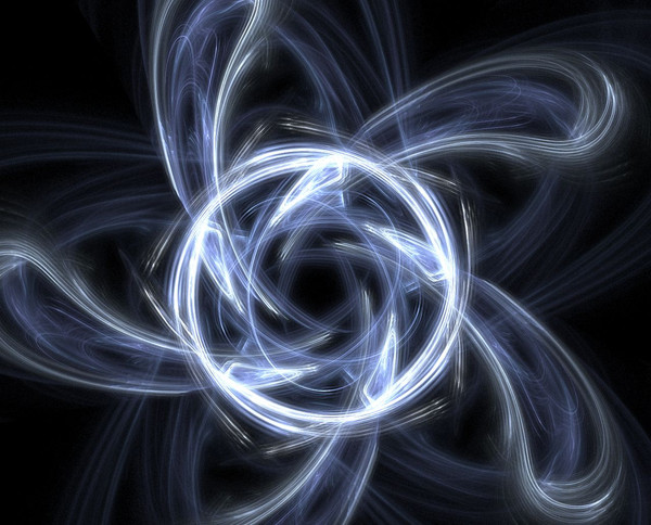
Hazeye Part II: the Son of HazeyeRelated content


Comments: 3

I like this one lots... I like how, compared to the first one, how yo added the bright blue, it really contrasts the fire and gives the whole picture a bit more depth to it I think. I likes it lots ")
and may the fudge-fishies be with you...
👍: 0 ⏩: 0

Do you think I should "transparentize" it?
That may give it a thinner look...
'tis vibrant and full o' pretty colors. I don't want to diminish the red color by making it too subtle. The contrast and colorscheme is supposed to be broad... but at the same time... I don't want it to look... how does one say... "cartoony."
Maybe darkening the red a little and playing with the opacity......... pondering...
👍: 0 ⏩: 0

I like this one the most out of all the derivatives you've done on this so far, but I feel like the pupil is still to thick-- it looks *too* Photoshopped.
👍: 0 ⏩: 0