HOME | DD
 ming85 — Folding screen II revisited
Published: 2004-11-22 13:33:09 +0000 UTC; Views: 22260; Favourites: 787; Downloads: 4923
Redirect to original
Description
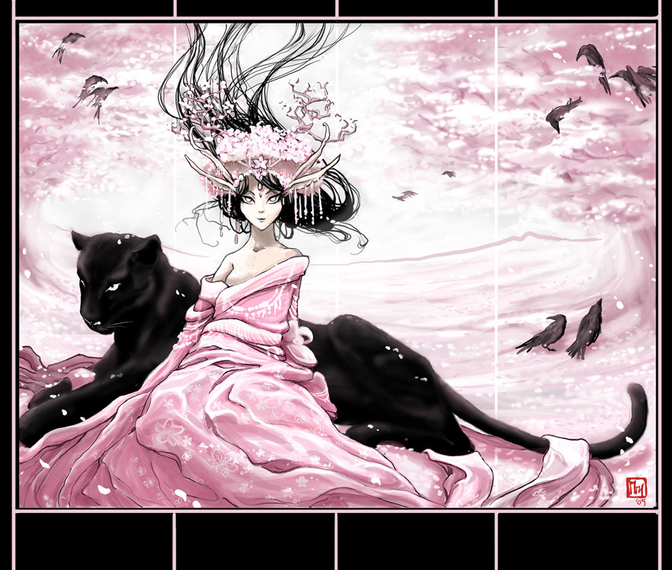
EDIT: Some mayor improvements in my opinion. The black border suits the 'evil' character better, plus adds to the overall composition. The gray sky didn't work after all, and to make it more focused and clearer compositioned i deleted much detail of the trees. I also worked some more on the skin of the kitty.Please Full view!
And follow [link] for a detail look of the head.
Folding screen I : [link]
I wanted to take the innocence out of Spring.
This one is in many ways the oposite of the first folding screen: Ofcourse in color and warmth, but also the person: the winter-woman is pure and sincere, independent, almost un-humanly vigilant and beyond reach for normal mortals.
But this one is seductive, irresistible, powerfull in a completely different way. She makes YOU do all the work, casts a spell on you. They are Active and Passive you could say. Besides that: winter is straight and motionless while spring is one big movement, and the cat and woman have opposite positions: here the woman is looking straight to you and the cat is looking away (compare to winter)
Related content


Comments: 166


Compared to the woman, the black panther (I'm assuming the black panther) is not realistic or well-drawn. The fact that it's black and has so much contrast against the woman (my eye was drawn to the panther first) its faults really takes away from what could have been a great piece of art.
👍: 0 ⏩: 1

hee thanks for the critique,
could you be a little more specifique about the faults? Is it lack of detail, the eyes?
👍: 0 ⏩: 1
The eyes could certainly be clearer, but that itsn't a huge issue. Mainly, the body of the panther is too glossy. If you look at photos of panthers or other cats, although they can seem very sleek in certain lighting, there are still sections where the texture of the fur is very clear. The paws in particular are missing detail, and the curve of the tail appears awkward - perhaps contradiction with the background. My main issue with your piece is still that the drastic difference between the black of the panther and the lighter colors of the woman seems to pit them together. The panther overpowers the woman. A darker foreground or background might serve to lessen that. Other than that it's a very elegant piece.
👍: 0 ⏩: 0


Ooooh a panther... I agree, the black frame seems to balance it out a bit more too
👍: 0 ⏩: 0

If i remember correctly folding screens are in odd numbers. Try the traditional 7 pannel.
👍: 0 ⏩: 1
haha i had no clue!
no thank you, too much work to manufacture all those pannels
Carpeting not my hobby
")
👍: 0 ⏩: 0

Very nice!
I like the panter and the crows
The combination of colors is just great ^_^
Good job on the girls hair
I don't know much more to say, aside from that I like it~
👍: 0 ⏩: 0


I think I like the winter one more than this...just because it has the color blue in it ^o^
But this one is very nice too. I like your take on the spring, and taking out her innocense

 (Wink)")
👍: 0 ⏩: 0


Wow, another one that is just simply amazing. I only wish I had this as a folding screen in real life. I am blown away by the beauty.
[ K ]

👍: 0 ⏩: 0


Beautiful picture, but I like the one with the gray sky, too...
👍: 0 ⏩: 0

still hose crows that do it for me, they are very well done and exude 'evil' lol
👍: 0 ⏩: 0


Dude...thats very kewl!! I love the pink and black elements to it!
👍: 0 ⏩: 0

wooowww omg!!!! just wonderful!!!!! I love this elf and her panter!!!! love colors too!!! great job!!!! add it on my favs!!!
👍: 0 ⏩: 0

Hmm, I love the idea of taking the innocence out of spring, but you could have implemented better if you wouldn't have made the woman-panther smile. Stern she would have looked more evil and definitely would have brought down the pinkness from cheerfull to ominous.  (Smile)")
Other than that, DUDE!, the piece is AWESOME! >_< love it!!!!!
👍: 0 ⏩: 1
Hmm i think the smile is the most important feature of the whole drawing! I like evil smiles. Sometimes they have much more impact than serious faces. She is more a temptation than a threat. But you'll find that out too late, when you're already in her claws... mwuahah.
Thanks for the comment!
👍: 0 ⏩: 1

The panther (or just oversized black cat... x.x) looks very awesome.
Even though I don't like pink, I really do love this picture.
The lady is very pretty, and I do love the clothing and how well you did it.
👍: 0 ⏩: 0

why it's in the scrapts ? it's really beautifull...

👍: 0 ⏩: 0


Omg I'm speechless, this is so amazing, one of your best artworks. I love the colors, I just love everything!!! You are an amazing artist so is your art! Congratulations!
👍: 0 ⏩: 0


Hey there you!!!
Sorry I've missed this for so long. I've been neglecting DevArt
This is totally awesome!!! I really like it! Your colors are great!!!
Mucho fave on this!!!
")

👍: 0 ⏩: 0


you're right, this is much better now than with the gray/grey. very nice.
👍: 0 ⏩: 0


very, VERY chic! only i don't know that i would consider her spring.... ... . she seems a little more fall and actually kind of winter still.... but overall i too like it better than the previous. and that's saying a lot. +fav
👍: 0 ⏩: 0

i find the cat to be a bit underdone compared to the lady, maybe i'm seeing the image wrong but the forearms of the cat look strangely straight and the face is a bit ..distorted? Lovely concept and colours though, i do agree the black border works better with the image ^_^ Nice and sharp!
👍: 0 ⏩: 0


Truthfully I liked the grey in the background because it stopped it from coming forward and being more on the same plane as the girl and her kitty. But I can also see why you changed it. It makes for a much smoother background with the cherry trees. It's all in the effect you're going for. It still looks really good. Kudos!
👍: 0 ⏩: 0

i really like the improvements. but i still dont see her as evil.. she seems almost content or bored with the beauty around her. but thats just me. still lovin the updates
👍: 0 ⏩: 0

Though I do agree this is better than the older version ((and that you would sell this in a print ")
👍: 0 ⏩: 0


It's absolutely beautiful, the black and pink works gorgeously together. Wonderful work
👍: 0 ⏩: 0

Evil Character in pink! ..... Great idea! 

👍: 0 ⏩: 0
| Next =>