HOME | DD
 minix — Serves Another Purpose

Published: 2002-09-15 04:01:20 +0000 UTC; Views: 2250; Favourites: 39; Downloads: 269
Redirect to original
Description
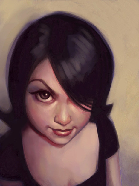
Extraordinarily good-looking tennis player James Blake. I wanted to portray how important tennis is to him by making it seem that he's admiring, idolizing, and interacting with the ball. I also wanted to convery more intensity than the reference, as if he were mentally willing the ball over the net.Changes for version2: I reworked hand and arm, so hopefully it's not as distractingly bad as in v1. I changed the shirt so that it fits in more with the overall style. The one thing that was suggested that I didn't change was the hair. I like the loose messiness of it. Thanks to *se55 ~munieco ~tarantino *the-joker ~scottdoom ~bunfi and ~xecho for their helpful suggestions on version1. Thank you guys!
Technical details: Freehand Photoshop 6.0 airbrush painting. Wacom graphire2. This is the photo I used for reference: [link] Serves A Purpose version1: [link]
Related content


Comments: 46

that is amazing, the baby dreads even resemble a crown of thorns
👍: 0 ⏩: 1

Dang, that's the first thing I thought...
👍: 0 ⏩: 1
ahhh, great minds think alike c:
👍: 0 ⏩: 1
hahaha, yup. x]
👍: 0 ⏩: 0


 (Smile)")

Great pic! I'm a tennis follower & this looks like him-& you have captured that almost mellow intensity he can get
👍: 0 ⏩: 0

oo yes, james blake is hot
this is really great, i love it, especially the hair
the expression on his face works really well, nicely done


👍: 0 ⏩: 0

I think I have the actual picture of that somewhere around here. It looks..just like it. Very good. Fav!
👍: 0 ⏩: 0
")


and what am I!?? chopped liver!!? *jealous*  (Wink)")
👍: 0 ⏩: 0

Amazing work. I think I enjoy the background as much as the subject.
👍: 0 ⏩: 0

hoy moly!! nice , great , neato drawing of this tennis player!! i really love it
👍: 0 ⏩: 0

according to the first comment: it really reminds me alot of jesus respect!
👍: 0 ⏩: 0

Wow, everyone made the Jesus comment... No use in beating a dead horse, so to speak.
You made an excellent portrayal of him in this. You got the proportions down right in this version(mainly the hand/arm)
I like how you did the hair, it looks very much like how he usually has it.
A really nice little touch is the stubble-ish goatee.
👍: 0 ⏩: 0

it does look a bit like jesus..in the face and kinda like theres a tear too
wow thats definetly nifty since you werent even trying for it to be jesuslike
i like the roughness it has to it the hair is fun and funky but I'm still floored by unico ..minix is cool and by cool I mean totally sweet -s-
👍: 0 ⏩: 0

i love the expression. it looks like the ball is levitating and he control where it goes.
👍: 0 ⏩: 0

i saw this as a fav on someone else's site and wanted a closer look...
i agree with "shirosynth"...i thought you were alluding to a christlike portrait...his hair looks like a crown of thorns and he looks like he's reaching for the sun/God...
but, hey, that's what art is for, right? everyone sees into it the way they want to...if you wanted a literal interpretation you would have simply copied the photo here instead of "painting" it, right?
anyhoo...excellent work. i love it and am adding to my favs...
keep up the great work!
👍: 0 ⏩: 0


that's better! imo the hand looks still weird in your reference photo - this was not an easy pic to paint
👍: 0 ⏩: 0

After seeing version 1, the arm and hand look better now, but still I find the arm a bit short.
Still a great job, nice facial expression, shading, the t-shirt... really cool.
You should smootha bit these blurry clear colors around thumb and index fingers. Also the index looks odd, like being shorter than normal (the size of the thumb helps making it looking weird).
The blurred background works in an excellent way.
Greetings!
👍: 0 ⏩: 0

wow! another master comp painting from this great master painter! damn real!
👍: 0 ⏩: 0

Great job. I like the blurry background.
I saw the other submission too, and I think the hand looks a lot better here and proportionally believable.
You have good fellows to help yourself improve!
👍: 0 ⏩: 0

i Wounderball !
The gleam on his skin is so slick and realistic. I love how you focused most of the detail into the face and arm and hand. The shirt, hair, ball, they all look good too, but they are more stylized -- there's less attention to detail. It really keys you into the eyes and the motion of the hand -- great effect.
Your description of the meaning behind the painting was very interesting. I wouldn't have picked up on the reverence factor. You really expanded the whole concept for me.
👍: 0 ⏩: 0

Oh wow!!! this is so photo-realistic!! as always great great work!!
.. oh and if you have the time check out my new stuff.. still uploading them now..
👍: 0 ⏩: 0

OO WAIT LET MY COMMENT BE STRICKEN FROM THE RECORD ITS HIS DAMN THUMB !
woops
omg im soo stupid ... !
wow ... ok yeh now everyhtings falling through ... shit i cant believe i just didnt c that ... anyway .. um yeh ... heheh loose sketchiness aye .. did i inspire that ( without sounding to big headed ) hmmn yeh i like it ... shit i feel so dumb ( slaps his stupid ass .. hmmn i like that * spanks again * ) ...
ok im just gonna leave with watevr respect i have left ... bai !
* running away ... ... * shouts from far away * ..... i love it ..... *
👍: 0 ⏩: 0
hmmn i still dont like his index finger ( his left one ) ... but yeh i guess i didnt wana say anything cause it was a roughy to egt back into the mode .. but yeh well next time ill voice myself ... ... but yeh
👍: 0 ⏩: 0

I'm glad you didn't changed his hair. Even if I didn't wrote you that, but I really like the curly way they're done. Not so ordinary like in the most digital paintings or airbrushs. Besides this the changing 2d/3d look of the hair is just amazing. Many points you mentioned look now better and I don't know if this is real, but all in all the contrast and the colours seem a bit richer. His arm looks also much better know, but the finger I mentioned ( the one next to his thumb ) hasn't changed a lot in his weird shape. Maybe you intend to let it look so. Anyway great piece.
👍: 0 ⏩: 0


nothing there but him and the ball, I assume it's difficult to bring that over in a picture. I know I couldn't *s*
I saw the first version, too, and you managed to improve the already good work with the revised version *s*
👍: 0 ⏩: 0

excellent airbrushing! I like the look on his face. concentrated and paying all attention to the ball! great job
👍: 0 ⏩: 0

i was wondering when you were gonna submit something new!! neway this is real good, fantastic work from you as always, so realistic!! aint that big a fan of tennis but very good drawing!!
👍: 0 ⏩: 0

An improvement on a piece that I liked alot....That can only be good....
The changes are good ones...But I still dont like the hair
But thats just me..
Great work again..
👍: 0 ⏩: 0


Oh wow, that does look a lot better I think I'll have to fav this too!
👍: 0 ⏩: 0

This one definately looks better. Oh yeah, and I agree with extirpate... I love how you just have him and the ball. Good job.
👍: 0 ⏩: 0

I love how you left the racket out and any other "noise" because its just him and the ball.. perfect portrayal for the love the game.. great work.
👍: 0 ⏩: 0

this is really excellent. the lighting is really what makes it so outstanding. and the thick black lines, great touch. +fav
👍: 0 ⏩: 0

honestly, i dont know if u realized this or not. But it really resembles a portrayal of jesus reaching to heaven, but of course, with a twist of tennis. heh, i know u probably didnt mean to do that, im just pointing that out. Great painting work.
👍: 0 ⏩: 0