HOME | DD
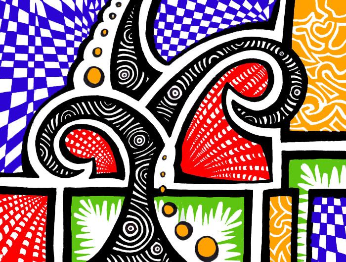
 Mint-Illusion — Delightfully Implied
Published: 2006-11-16 02:25:33 +0000 UTC; Views: 2360; Favourites: 48; Downloads: 27
Redirect to original
Description
This took me the longest out of all my art so far.But the colours are pretty, so I'm happy. :3
Related content


Comments: 51


it's very cheery! you could do stuff like this digitally so much faster... but then you wouldn't have an original of course. i dislike that about digital, but it is practical for doing drawings to put online.
👍: 0 ⏩: 1

Yeah. Unfortunately, I recently lost all the original copies of my art to someone's spilled drink.
Luckily I have them all online, I guess. n__n;;
👍: 0 ⏩: 0

This excellent work has been featured in my journal! To see the feature, visit this link: [link] . If you would prefer to not be featured, let me know and I will remove it ASAP.
Have a great week!

👍: 0 ⏩: 0


 (Smile)")


Very nice! The colours are bold and the patterns are well done, patterns and I aren't friends. It might look better if the orange was less yellow, though..maybe

👍: 0 ⏩: 1
Yeah, the green and yellow were actually wayyy different colours than they actually are, but my scanner decided to be mean.
Thanks muchly!
👍: 0 ⏩: 1
Yeah, the colours get messed up in my paintings everytime I try to take a photo of them, so I know what you mean.
You're welcome, too by the way!
👍: 0 ⏩: 0

i know this has been up since nov, but.... it reminds me of a tree that turns into roads in a city environment lol
👍: 0 ⏩: 1
Pffft, I always love comments, no matter how old the drawing~
And thanks! I've never seen in that way before, it's so neat when people let me know how they interpret my art.
👍: 0 ⏩: 0

delightfully *inspired*
reminds me of a woodblock print
<--snowmoglobe
👍: 0 ⏩: 0

love the bright primary colors...they really *pop*! did you draw with markers then saturate the colors after scanning (i'm just trying to figure how they came out so even)? very nice work!
👍: 0 ⏩: 1
Thank you!
Yeah, I had to because the yellow and the green hardly registered in the scan for some reason, and I couldn't leave just some colours saturated and some not. >__< But yeah, I used markers.
Thanks.
👍: 0 ⏩: 1
it's hard not to tweek things even just a little bit after scanning!
 (Wink)")
👍: 0 ⏩: 0

I agree the colors are good ... but the composition is the best balance of asymmetry. It affords the piece movement and enhances expression. This is a very nice piece. Thanks fro sharing!
👍: 0 ⏩: 1
Thank you very much for the comment. ")
👍: 0 ⏩: 0

I was sure that I had commented on this before, but I guess I was just lurking.
Anyway I was going to say that I love the simple use of colour on a more complicated design. It reminds me of optical illusion art :3
Anyway, fav'd.
👍: 0 ⏩: 1
Thanks! n__n I need to use colour more often, I'm just a wimp. Yeah, someone else said that, too!
Merci.
👍: 0 ⏩: 0


I'm glad you like it, thanks muchly!
👍: 0 ⏩: 0


Rad :3 I really like the pattern in the back you did with the red. Look like it's THREE DEEEEEEE.
o: <3
👍: 0 ⏩: 1
XD I have no idea what you're talking about when you say that, but I'm glad you like it! n__n
👍: 0 ⏩: 0

do you change these on the computer somehow? it's just, I know I saw it in real life, but it doesn't look like penstrokes now *murr*
👍: 0 ⏩: 1
Yeah.
The green and orange colours turned out horribly on the scanner, so I had to fix them. >_<
However it looked weird with just those two coloured and the rest not, so I just did the whole thing that way.
It's like that on my other two? big ones, as well.
👍: 0 ⏩: 0

SO crazily pretty!! Great patterns and colours, great design!
👍: 0 ⏩: 1


Nice linework and fine patterns. I really like the colors and design. Lovely saturation.
👍: 0 ⏩: 1
Thank you very much.
👍: 0 ⏩: 1

I love the colour scheme and design Great style as always.
adds to my

👍: 0 ⏩: 1
Thank you very much!
👍: 0 ⏩: 0


guess who knew this would be posted tonight? Certainly not me~!
it's really so awesome~

👍: 0 ⏩: 0


Only 'cause you're in a homoROBE. D;
👍: 0 ⏩: 1