HOME | DD
 mippa — DaiKari Contest Entry Second
Published: 2007-09-01 18:02:38 +0000 UTC; Views: 3006; Favourites: 63; Downloads: 32
Redirect to original
Description
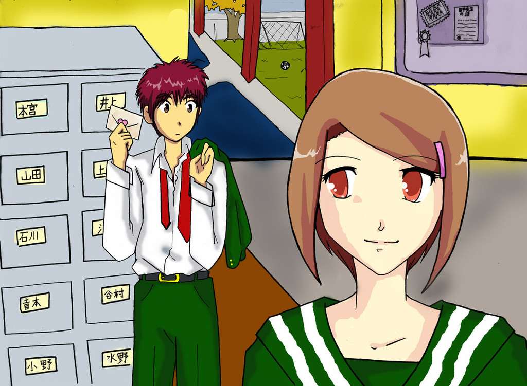
Because I love her so much (and I am so hard-up to get more drawing requests from her! ), I did another, much nicer, CG-type entry for 's contest! The theme is "Fall" and this is a back-to-school themed piccy!
I think it's pretty self-explanatory!
I was just discussing with her how I haven't done any JouxMimi pics in ages! I should really remedy that, shouldn't I?edit: was a dear and re-touched this baby for me. Thank you, Saku-sensei!
m(_ _)m Check it out here: [link]
Related content


Comments: 16

The clueless look on Davis' face shows his uncertainty about whether Kari's serious about her feelings for him. Possibly, she could be asking him out. Kari being that bold must be something that he least expects of her, which explains his surprise at receiving a love letter from her. It's like a love story of a high school romance.
Davis has his own flair for a slightly tousled look that makes him different from Tai.
The slight smudge by the staircase is noticeable, but it could be taken for a little shadow of one of the poles in the area where the light doesn't reach. This long-sleeved version of the school uniform that they're wearing is suitable for the fall season as shown outdoors.
👍: 0 ⏩: 0

How cute.  (Smile)")
Bryon
👍: 0 ⏩: 0


I love it too! I like the situation you did to both of them. Very kawaii~!
👍: 0 ⏩: 0

Soo cute! *__*! I absolutly love these two! And your CG looks good, btw!
 (Wink)")
👍: 0 ⏩: 0

I Upload New deviation of Digimon Look it!!! pleae!! Daikari xD !! bye
👍: 0 ⏩: 0


")


ahhh soooo lovely! ^___^ i love it! 
👍: 0 ⏩: 0


ACK! That's right. It's Winter...so I guess this is a winter school sketch.
👍: 0 ⏩: 0

You know, the picture is really neat, the cell shading on Hika stands out a lot and you did wonderfully choosing the colors.
It does, however, look a tiny bit rough, I suggest maybe downsizing a bit so the little mistakes aren't too noticible. Were you rushing the coloring? Eh I hope I'm not being harsh, it just shows you could have done better with some more patience ^^ I'm even tempted to retouch it myself.... =x
Also, for the airbrushing (like Dai's shirt) consider using a few more colors between the shadow and the light, you see, if you put a too dark color near one very light one it doesn't quite get the feel of cloth, unless it's latex or spandex ")
👍: 0 ⏩: 1
If you would like to retouch it, feel free! It was doing it without a tablet, so my wrist started hurting after the first few hours. x.x
You're not being mean at all! You're giving me a lot of food for thought!
👍: 0 ⏩: 1
When I'm not using a tablet, I use the polygonal lasso. I did mainly with that while retouching, I don't really use my tablet for everything becase... it makes my hand hurt even more than a mouse
I will now upload the retouched version, if you feel like using it yourself do whatever you want with it, but don't delete the original so others will also see the changes ^^
👍: 0 ⏩: 0