HOME | DD
 mircha69 — DOpp
by-nc-nd
mircha69 — DOpp
by-nc-nd

Published: 2008-09-07 12:18:35 +0000 UTC; Views: 3596; Favourites: 37; Downloads: 0
Redirect to original
Description
...Related content


Comments: 7

Overall

Vision

Originality
Technique
Impact
I like the colors and the shape even though it's really an altered ring. I'm not entirely sure what the company is (the website doesn't exist, and no description was provided), so I can't be sure that it fits what the company does. It reminds me a little of the BP (British Petroleum) logo. It's green / yellow green and circular in shape. It also mimics a sun in some ways, so I'm sure you can see why I connect those two logos.
As far as the shape goes, I'd say that it looks nice in this presentation, but at small sizes, the points may become abstracted.
The name "Dulcet Opportune"... I don't know what language that is (my guess is French), but that's not really as big of a deal as the font used. It appears to be Century Gothic (and I could be wrong about this). You may or may have not been able to choose another font for this. If this was for a client, and they requested you use that font, then I understand you using it. If you had no other fonts, then I could also understand you using it, however (and I'm sure you're aware of this), there are other fonts out there. On that note, I would have liked to see a less-used font implemented here, but it does fit with the design you've got. Just a matter of taste, really.
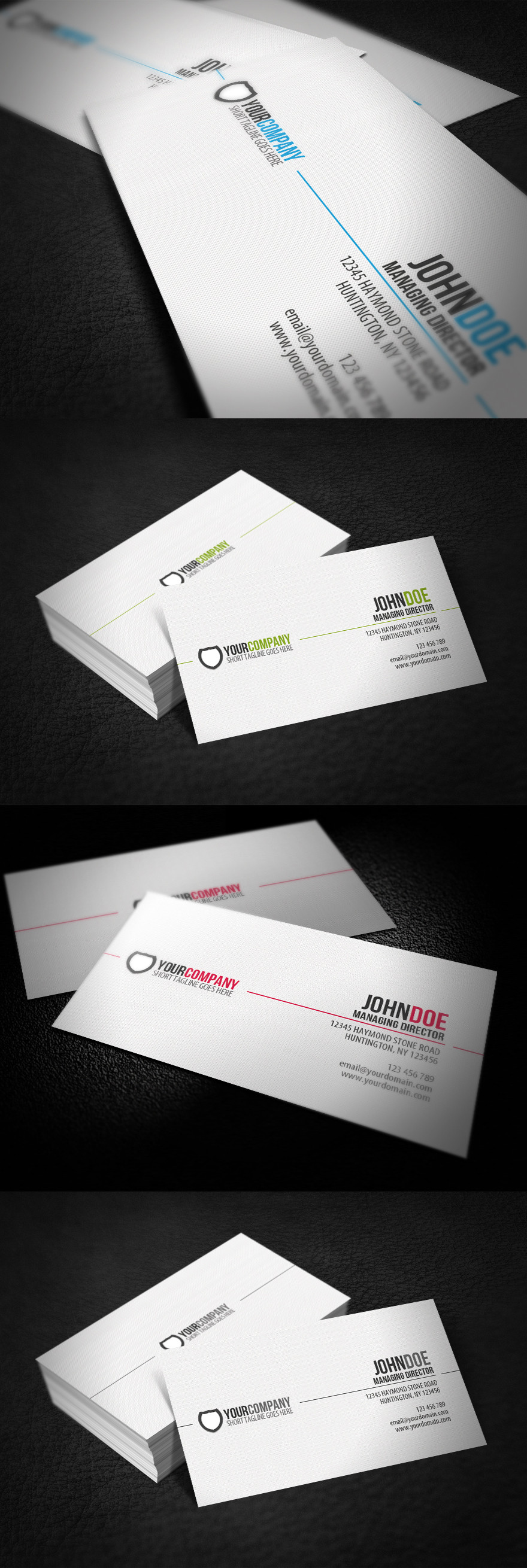
For the card layouts, on the front (logo only), I get the placement, but it doesn't make the card stand out all that much. A brighter and bolder design here may have worked a little better.
On the back (information), I totally get where you were going with this and I applaud your effort. The text is laid out in a way that's relatively easy to read, but there are 2 things that stand out to me. One being the weight of the text itself. It may become hard to read when printed if it's very thin. Also, there's no hierarchy to the text on the back making the information all look the same. In addition, the address, phone numbers and web address are all stuck together. There's no visual breaks there which make it all lump into one object.
The logo usage on the back is nice as far as placement goes, but it's very bright and stands out quite a bit compared to the information. On that side of the card, the information is the most important part, and it should show. The logo could have been set at about 15% opacity in a single color, and it wouldn't draw visual attention from the information so much.
Overall, I like the ideas behind this, and also the effort. I can see that you have a refined taste, but in my opinion, there needs to be just a little more work on this for it to really be "there".
👍: 0 ⏩: 1

thans for the critique, i really apreciate you taking the time to write this
to answer a few questions - or to clear some things up , because i did not give a description of what the company does - i'm gonna do it here and i hope it'll be usefull
the company was based in california and the client came with the name of course and opportune is similar to oportunities, the logo was made to resemble a burst - of oportunities
the font was the clients choice from a bunch of fonts and even though i know it's old and overused i think it matches the logo even though i know there are other fonts out there
the company was a venture company
 (Smile)")
👍: 0 ⏩: 0


da si io sunt mandru de ea ")
👍: 0 ⏩: 0