HOME | DD
 Mitchellnolte — Rule The Waves
#battleships #dreadnoughts #great #kaiser #krieg #war #ww1
Published: 2015-09-06 10:54:07 +0000 UTC; Views: 33241; Favourites: 789; Downloads: 0
Redirect to original
Description
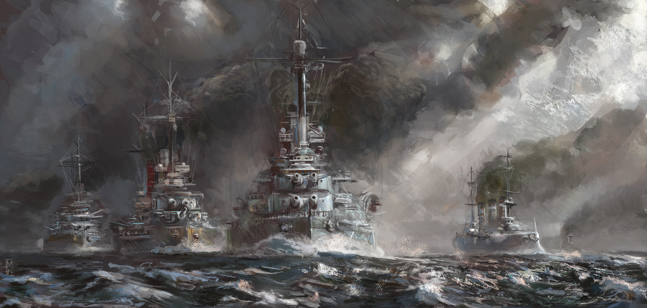
The Kaiserliche Kriegsflotte. Created for the game Rule the Waves, - available at Naval War Simulations yhst-12000246778232.stores.yah…Related content


Comments: 63

I also haven't play that game but the game is good and its featuring ships from WWI to WWII even the ships weren't constructed also featured like the USS Montana
👍: 0 ⏩: 0


This is gorgeous. It's really rare I see any WWI naval stuff.
👍: 0 ⏩: 1

yes, this a shame - i will try to get some more up soon too!
👍: 0 ⏩: 0

I can only wish there was a bigger size I could feast my eyes upon. Very nicely executed painting, with just the right balance between realism and impressionism. Reminiscent of marine paintings from the era, or from the interwar period, when a timid resurgence of realism merged with post-impressionist and abstract emotionality. A limited colour palette helps immensely in creating a grim atmosphere of incoming battle. Thank you for sharing - it was worth seeing.
👍: 0 ⏩: 1
I have increased the size now - thanks for the kind comment - yes the limited palette sometimes is what makes or breaks a work - i cannot profess to have mastered this aspect and many times i lose control of a picture with the colours alone. It has worked well enough in this one though for which i am glad.
It is in many cases a temptation to saturate and up the colours, but then, like a hollywood celeb addicted to plastic surgery, a point gets passed where nothing can be fixed and every addition just makes the work more and more of a monstrosity
👍: 0 ⏩: 1
I wholeheartedly agree with the 'monstrosity' statement. I wish it was as easy to just remove features once you realize that you've added too much, as it is to add more and more. In this piece you've struck just the right spot. If I was working on that piece, I would probably add a tiny bit more colour on the sky on the right - just to defy a desaturated rest and introduce contrast to the smoke-covered left half. However, you did good in avoiding doing just that, and the effect of a steel sky benefits the whole - it's comforting, and menacing at the same time.
Also thank you for increasing the size - the shape and detail of the Bayern-class battleship's turrets are all the more apparent. And only now I was able to notice the small ship on the far right - I like how its presence is implied by its smoke trail, and not by its own shape.
👍: 0 ⏩: 0
<= Prev |