HOME | DD

mitchellp — Dragon WIP 2

Published: 2006-10-01 15:10:16 +0000 UTC; Views: 78; Favourites: 0; Downloads: 1
Redirect to original
Description 
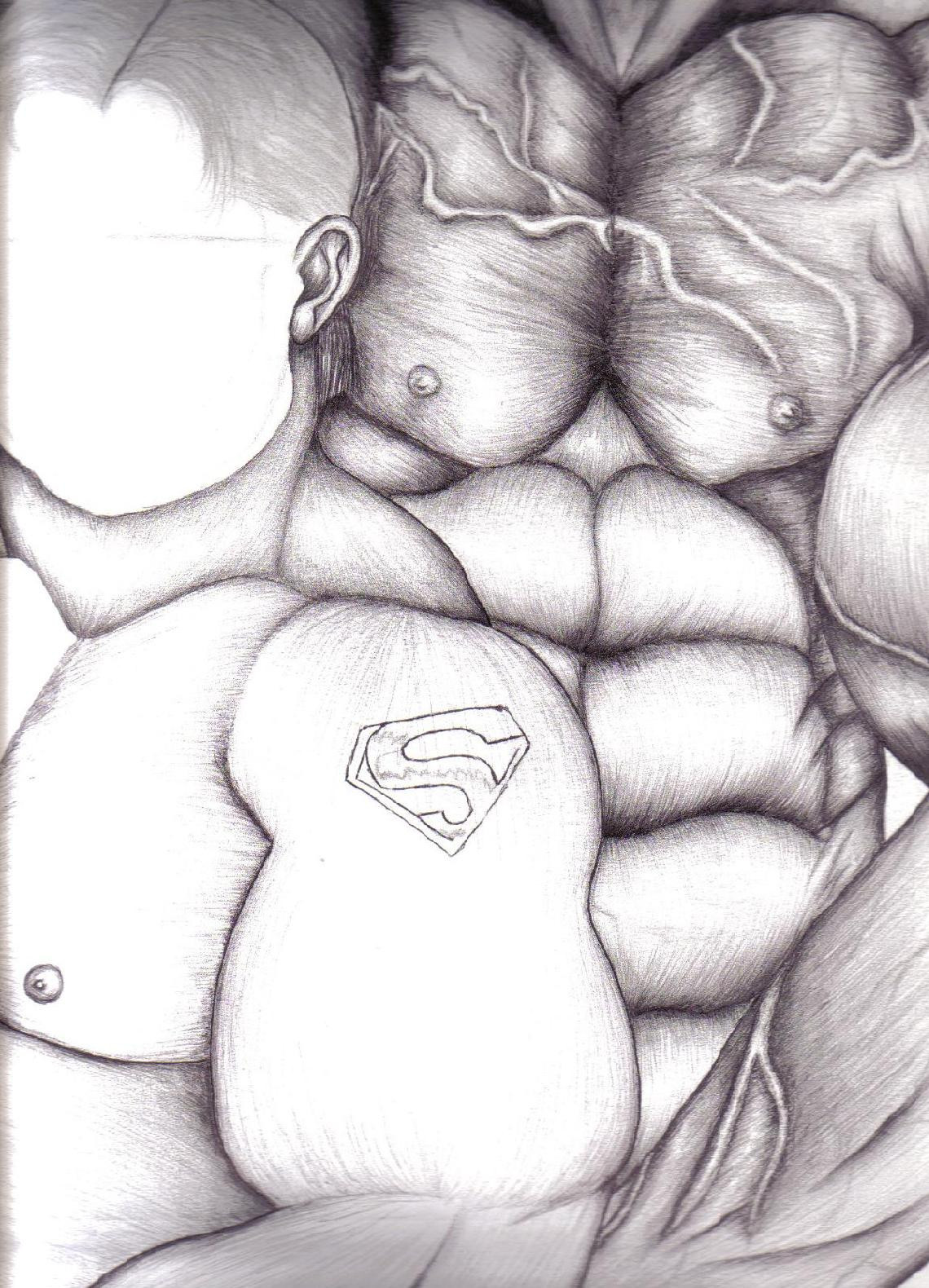
Yup I'm almost done with the dragon image still need to add a background to it. For some reason when I scan it in the shading alters making the different parts of the dragon change color not to mention all the smaller dots fade to nothingness After all that hard work it might not even show up well

If you can only see it in person.....
Related content
Comments: 24

ombraillum [2006-10-05 06:44:32 +0000 UTC]

I think what you call a distraction by mixing to pens help come up with such a good texture! Try using that as a technique!

👍: 0 ⏩: 1

mitchellp In reply to ombraillum [2006-10-05 16:52:49 +0000 UTC]

Well I tried to fix it but it was just taking too much time and I kept losing track of the pen I'm supposed to be using lol well glad you like the texture...

👍: 0 ⏩: 0

Kazuki88 [2006-10-02 02:59:23 +0000 UTC]

While I can't wait to see the end result! Its looking good.

👍: 0 ⏩: 1

mitchellp In reply to Kazuki88 [2006-10-02 03:57:07 +0000 UTC]

Thank you just wished it didn't look so weird when I scanned it lol

👍: 0 ⏩: 1

Kazuki88 In reply to mitchellp [2006-10-02 23:17:54 +0000 UTC]

Your welcome!

👍: 0 ⏩: 0

DracheaRannak [2006-10-01 22:52:56 +0000 UTC]

Looking good my friend--- Did you miss me?

👍: 0 ⏩: 1

mitchellp In reply to DracheaRannak [2006-10-02 03:47:29 +0000 UTC]

Thank you of course I miss you ^_^ and I'm sure everyone does except your partner the lucky one

👍: 0 ⏩: 1

DracheaRannak In reply to mitchellp [2006-10-02 04:51:29 +0000 UTC]

Awww! That was sweet!

👍: 0 ⏩: 1

mitchellp In reply to DracheaRannak [2006-10-02 16:00:07 +0000 UTC]

Well you deserve sweet comments

👍: 0 ⏩: 1

DracheaRannak In reply to mitchellp [2006-10-02 16:45:56 +0000 UTC]

:blushed:

👍: 0 ⏩: 1

mitchellp In reply to DracheaRannak [2006-10-02 17:06:32 +0000 UTC]

👍: 0 ⏩: 0

Eitansun [2006-10-01 18:10:03 +0000 UTC]

lovely piece......

👍: 0 ⏩: 1

mitchellp In reply to Eitansun [2006-10-01 19:49:41 +0000 UTC]

Thank you although it's not a really good when I scanned it

👍: 0 ⏩: 1

Eitansun In reply to mitchellp [2006-10-01 22:10:00 +0000 UTC]

know what you meant

👍: 0 ⏩: 1

mitchellp In reply to Eitansun [2006-10-02 03:46:16 +0000 UTC]

glad you understood me lol I didn't know it came out like that lol

👍: 0 ⏩: 1

Eitansun In reply to mitchellp [2006-10-02 03:58:23 +0000 UTC]

👍: 0 ⏩: 1

mitchellp In reply to Eitansun [2006-10-02 04:04:07 +0000 UTC]

not the first time I did it either lol

👍: 0 ⏩: 1

Eitansun In reply to mitchellp [2006-10-02 04:11:09 +0000 UTC]

I bet!

👍: 0 ⏩: 1

mitchellp In reply to Eitansun [2006-10-02 04:18:06 +0000 UTC]

Sometimes I forget what I'm talking about lol but it's funny ^_^ to reread my old comments

👍: 0 ⏩: 1

Eitansun In reply to mitchellp [2006-10-02 04:44:40 +0000 UTC]

same here!

👍: 0 ⏩: 1

mitchellp In reply to Eitansun [2006-10-02 15:57:33 +0000 UTC]

👍: 0 ⏩: 0

ombraillum [2006-10-01 16:20:09 +0000 UTC]

I'd say that if it looks better in person then it should be a super good piece! I like it a lot, I wish I had seen this before having the dragon tattooed! It's super Gaudi!

👍: 0 ⏩: 2

mitchellp In reply to ombraillum [2006-10-04 20:54:12 +0000 UTC]

Hmmm....I found out why different parts look lighter than one another it's because I have two inking pens that look the same but one let's out more ink than the other and I keep mixing them up and I decided not to add a background to it because it'll be taking the focus away from the dragon which I don't want.
just need his wing now I rarely have time to work on projects now

👍: 0 ⏩: 0

mitchellp In reply to ombraillum [2006-10-01 16:54:54 +0000 UTC]

Yes it really is a good piece upon closer inspection because you can see all the tiny dots that form the shading and if you look at it from a distance you'll see the shading a lot better as if it wasn't done using stipple.
this is my second dragon piece and I'd say it's coming out better than my first one

👍: 0 ⏩: 0