HOME | DD
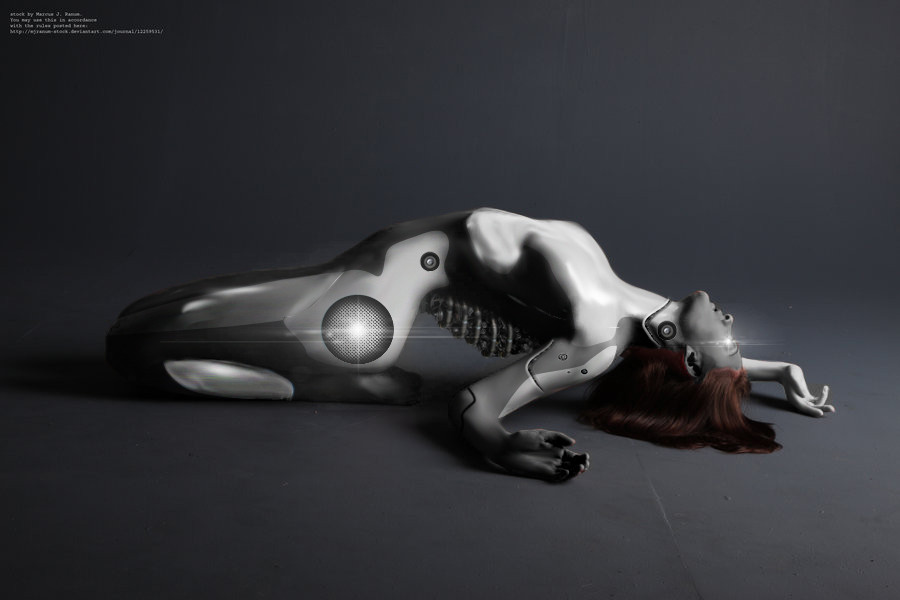
 MK01 — HW:Fleet Command, WIP8

Published: 2005-02-18 02:43:27 +0000 UTC; Views: 3291; Favourites: 25; Downloads: 64
Redirect to original
Description
That's right, there is no 7. Got lost somewhere along the way.Cables are no fun.
Related content


Comments: 4

Any way you could tell me how you did some of this? Like the glow (airbrush?) and the shine on the jumpsuit? And how smooth the cable shading is?
👍: 0 ⏩: 1

Hmmm... Let's see if I can remember...
The glow consists of two layers:
- The first is a low opacity Linear Light layer, filled with a blurred blue rectangle on black background, essentially, below the ring layer but above the body.
- The second is Linear Light, too, but 100% opacity. It contains the bright spots at the top and bottom, the glow from the ring's inside (which should be stronger), and all the details of the glow.
It started as the same blurred blue stuff as the other layer, then I applied the top and bottom light with screen mode ellipse tools, gaussian blurred heavily and painted out the detail in black and white (or screening blue) paintbrush (the linear light mode of the layer works well with the black brush, for really crisp shadows on the suit). Blur again, repeat.
That also explains part of the suit stuff. The rest is pretty well documented by the previous WIPs, I think. Get an idea of what colors you want where (really a question of observation and experience, or, if you're smarter than me, reference), paint them with a rather large brush. Blur with the smudge tool. Work out details in a very small brush (I think WIP3 got that pretty well), smudge. Repeat. And again. Aaand again.
Same procedure with the cables and mechanics, except that metal likes bright Linear Dodge spotlights. Get the darker colors on them first, smudge, add details and bright stuff. Maybe throw in Blur Tool for good measure. Don't blur the reflective lights too much, though, we want them to be crisp and shiny (I experimented with that stuff for the first time in that pic, it's just trying out things and seeing what looks good). Then, as in this case, you might want to dull down the whole bit by painting over it again with some 10 or 20 % op. brush in the dark base color.
👍: 0 ⏩: 0

It's great, but I think that the inner part of disc should have some blue lightning.
👍: 0 ⏩: 0


And yeah, cables are a pain in the butt. Look at my Borg art sometime. 
I have to say, though, you did a pretty damned good job with the cabling as it looks now. 


👍: 0 ⏩: 0