HOME | DD
 Mnadler — Handwriting v1.5

Published: 2006-09-22 20:08:07 +0000 UTC; Views: 3894; Favourites: 18; Downloads: 884
Redirect to original
Description
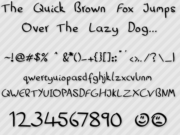
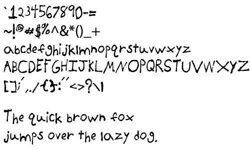
Version 1.5 of my Handwriting font.Original font: [link]
Added capital letters, tweaked punctuation marks.
I'd appreciate any sort of feedback, and if you use this for any project I'd love to hear about it.
 (Smile)")
Related content


Comments: 18

I don't know what the post it project is, but sure! I'd love if you could link me to the final result.
👍: 0 ⏩: 1

hehe, its in my favs somewhere, im too tired to look, it near midnight here
👍: 0 ⏩: 0

 (Wink)")

I must admit that your font is one of the best font I've ever seen! Keep it up!
👍: 0 ⏩: 1
Wow, thanks for the kind words!
<33
👍: 0 ⏩: 1
You are welcome ")
")
👍: 0 ⏩: 0


i like that the q and g are not on the same line
it is cute writing
👍: 0 ⏩: 0

ooh the lower case g and q are kinda funny alright, odd considering the p and y fit in there fine. might suggest adding the following puncuation at some stage for currency, quotes and weblinks and mail
" £ $ € % & ( ) ' @ # /
👍: 0 ⏩: 1
Thanks for the criticism + suggestion. I'm working on fixing the g and q at the moment, should be done and up+fixed sometime in the next few days. I'll add the new punctuation while I'm at it. Want me to send you a note or something when the new version is up?
👍: 0 ⏩: 1
go for it. I've always wanted to make my own font. Must figure that out some time
👍: 0 ⏩: 0

The capital B and lowercase q and g bother me a little, the latter two because they aren't on the same line as the other letters.
Other than that, it seems pretty nice. Are you planning anything specific with it?
👍: 0 ⏩: 1
I'll fix the B; the q and g can't be helped. It's better than it was before- before, the tails were cut off.
Nothing specific in mind; I might use it for my personal site, though.
Thanks for the critique.
👍: 0 ⏩: 1