HOME | DD
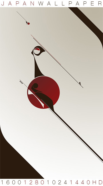
 mnmlst — aesthetic

Published: 2008-10-05 18:50:33 +0000 UTC; Views: 7740; Favourites: 187; Downloads: 233
Redirect to original
Description
creative output.net ~ believe in aestheticRelated content


Comments: 45


damn, powerful piece, great idea and flawless execution
👍: 0 ⏩: 0

 (Smile)")


...........about believing in aesthetics. Yeah.
👍: 0 ⏩: 1


")


sehr schön großer.. der style gefällt, aber in den anderen bildern hattest du glaub ich immer noch ne farbe mit drinne! hättest du hier auch mehr einbrinfen können nen hauptton
👍: 0 ⏩: 1

das ist absicht, sonst wirds doch irgendwann langweilig, außerdem wollte ich mal was "anderes" machen :>
👍: 0 ⏩: 0

Hello, i have featured you in my journal [link]
Please check it out!
👍: 0 ⏩: 0


triangles : /
...but i think they actualy work here coz they're integrated with the whole design so well, which looks good m8 : )
👍: 0 ⏩: 1


hehe dreiecke scheinen inn zu sein. leider sieht man sie zur zeit leider fast überall
")
👍: 0 ⏩: 0


and you really have a great sence for aesthetics, this looks so sweet
👍: 0 ⏩: 0


ich mags sehr gerne auch die zweiteilung. aber dreiecke sind auch gerade so up2date
👍: 0 ⏩: 0

Quite liking this.
I would have faded the ends of the lines a bit though maybe.
👍: 0 ⏩: 0


")


looks like it could fit into depthcore's noir pack if it was darker
nice job
👍: 0 ⏩: 0


