HOME | DD
 mnoo — Equipoise

Published: 2005-02-04 16:54:50 +0000 UTC; Views: 4616; Favourites: 94; Downloads: 1398
Redirect to original
Description
e·qui·poise1. Equality in distribution, as of weight, relationship, or emotional forces; equilibrium.
2. A counterpoise; a counterbalance.
3. Symmetry.
Pretty much the same lighting set up in both. A softbox on one side, gold reflector on other. Two flashes behind the head, one pointing at background, one towards the camera. Yup.
Models: Päivi and Miikka
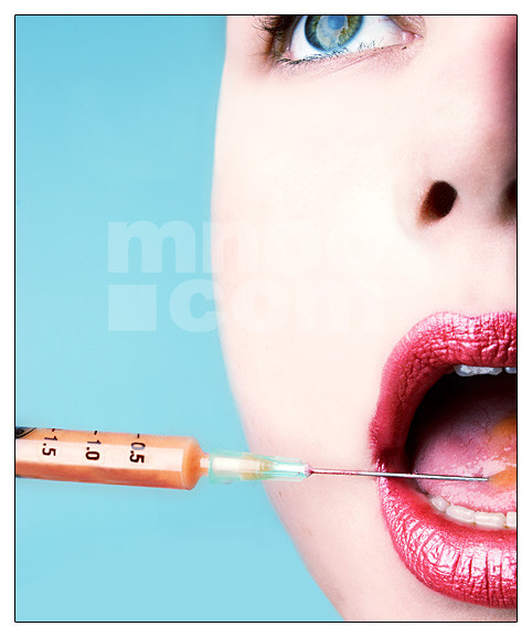
Note: Detail: [link]
Related content


Comments: 120

i love the woman's expression (her make up also wonderful--esp. on her nose). what is that thing that's in the front of the man's face?
👍: 0 ⏩: 1

They're these twig things. I wanted him to have something 'dry' while she has a living flower.
👍: 0 ⏩: 0


oh wow. these photos are fantastic. i wanna do some themed stuff like THIS!!
=daveainley

👍: 0 ⏩: 1
")
you're welcome! its fantastic.
=daveainley
👍: 0 ⏩: 0

wow, I absolutely love this! The coloring and backgrouns are gorgeous, not to mention the models!
This is just so cool. AWESOME JOB!!!!!
👍: 0 ⏩: 1

Love ya work this one is my Favourite, but i am still looking at the rest
👍: 0 ⏩: 1

Showed my friend at work your site, He likes your work  (Smile)")
👍: 0 ⏩: 1


WOOOOOWW ! this pix is really beautyful!
see ya 
👍: 0 ⏩: 1
hey i wanned to tell ya, remember the girl that asked ya if she could take ur pix for her blog... and u said no.. well that's me !  (Wink)")

okai then , see ya
👍: 0 ⏩: 1
Good that you're taking photos yourself. More rewarding that way.
👍: 0 ⏩: 1
thxx ! ")
see ya
👍: 0 ⏩: 0
OMG! I sooo love that picture ! ur work is indescriptibly amazing ! I really l000ve it ! ... 

👍: 0 ⏩: 0


great photo, not exactly my cup of tea.. but amazing. its very professional
👍: 0 ⏩: 1
Ohh fancy finding you in my gallery.
Why, thank you. I realise my girly colours are not for everyone.
")
👍: 0 ⏩: 1
yeah fancy me stumbling over here. what a shocker
yeah, i know, i wish i could love pink, but alas, it falls short on me.

👍: 0 ⏩: 1
Maybe if you try really hard?
👍: 0 ⏩: 0

Awesome picture! Very original looking!!! Love the dark rich colors!
👍: 0 ⏩: 1


very cool... the colours are gorgeous and sets off their metallic skins wonderfully
i love the opposite juxtapositions of both shots - male-female, blue-pink, branches-flower, gold-bronze
👍: 0 ⏩: 1


that little effect that they have in their skin it's just FABOLOUS!!!
👍: 0 ⏩: 1

Aika janna nahda naista nyt tammonen variversio, kun noi mustavalkoset on jo ihan sairaaaaaan upeita. Kylla namakin on siis todella mahtavia. Ja toimii tosi hyvin yhdessa.
Valaistus on 
Metallisuus on
Parina ne on
Varit on
Koko sarja on :+devlove:
👍: 0 ⏩: 1
Kiva että tykkäät.
Kyllä mäki aika paljosti.

👍: 0 ⏩: 0

pink and blue
flowers and brush
female and male
left and right
open and closed
title and concept
it's all perfect
👍: 0 ⏩: 1

Such an intersting concept. The 2 shots marry up together so well,. Not sure what else to say, it's just utterly different as you've used such interesting makeup effects and accessories, then theres the bold colours! Just simply stunning, congrats
👍: 0 ⏩: 1
Thank you.
For all your lovely comments.
👍: 0 ⏩: 1
You're more than welcome. I love looking forward to seeing your deviations. They're always really imaginative.
👍: 0 ⏩: 1


this is actually quite stunning
becouse of use this gloomy ... cosmetics?
and the contrast
and the whole look
well done
👍: 0 ⏩: 1

i really like the one on the left....but the one on the right show traces of uneven grease paint application, something very hard to avoid with that kind of face paint. i would swing more with how the paint on the redheades girl compliments her skin type and hair color...when dealing with the boy, also leaving the boys eyes their natural color. but looks good thus far.
👍: 0 ⏩: 1
I know, the paint was a nightmare! You just can't see where it goes with your bare eyes/in normal lighting... it only shows up properly with the flash. Yeah there has been talk about the boys eyes, but I did not make them any bluer, it's the compression and the eyeliner that gives that weird unnatural impression.
Yeah I'm liking the girl better as well, but at that point I had already done the other and knew a bit more what I was doing. Also it seemed a lot easier to apply the paint on female skin (even if still impossible to get even). 
Thanks so much for commenting.
👍: 0 ⏩: 0

I did not get around to commenting on this when I favourited it but I really wanted to. I think it has some really good qualities to it, obviously because I favourited it. I love how the eyes are both brilliantly blue but not exactly the same colour. Also I think the fact that their skin has the same texture but slighting different colours is really good. Also her hair colour is amazing. I adore girls with red hair. There are a few things I think could be better though. Her flower is perfect and feminine. I like how it is not on the screen a lot because if it was it would take away from her. But his twistys are really there. I am not sure how you could make them less or not as catching to the eye but that would help. Also if there body positions were more identical. The angles just seem a little off. I know that would be really hard to do though. For him it is like his whole body is that turned way. Hers it looks like it is just her head that is turned. Also since his collar bone is showing you may consider putting one of her pieces of hair behind her shoulder. I woul suggest the one on my left.
Wow this is a really long comment. Normally I do not give this much input on anything. Hahaha. Now I in no way epect you to redo this shot at all. Just some good and bad feedback to keep in mind at the next shoot.
Keep the great deviations coming.
Love, Libby
👍: 0 ⏩: 0

Wow...this is easily the most creatively colorful piece of artistic photography I've seen on DA to date. So unique--great work!
👍: 0 ⏩: 1
Thank you so much. What a nice thing to say.
👍: 0 ⏩: 0
| Next =>