HOME | DD
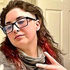 Mochaeii — Mini me

Published: 2017-10-18 01:25:20 +0000 UTC; Views: 468; Favourites: 15; Downloads: 0
Redirect to original
Related content


Comments: 13

Overall

Vision
Originality

Impact
Wow you sure know your measurements when it comes to mapping out where her feet should start and where her head should end at. I also like how you use the flow perfectly to control the coloring shading from dark to light. Planning on where the sun is coming from, and last the way you controlled your ink outlining is perfection the only advice that I can give you is to shade in the cast shadowing underneath your character with that heavy smooth gradient touch to it. So that the black color can blend in really well from dark to light and last it’s always a good idea to date your wire so that 10 years later you can look back at your parties you did way back and realize just how much you have improved.
👍: 0 ⏩: 0

You have a great style on coloring and your works looks pleasantly cute ^^
although I have to say that i'm kinda confused with the lightning direction, but overall it doesn't look too jarring
👍: 0 ⏩: 0

Good tonal effect in the hair, and the pose is natural. There needs to be more shadow on the far right (her left) of her coat. The eyes could use a pupil, but I suppose you're gong for the Pokemon effect of no pupils. Vary the tones in the eye with bits of brown or blue, so they'd pop like the hair.
I like that coat.
")
👍: 0 ⏩: 0

Overall, its pretty cute. Pose and facial expressions look fine and add character. Color scheme works out nicely. The orange highlights on the hair add a nice touch.
Shading is there, but it can be done more to flesh out the form/volume more. The lighting source and the direction of it can be better defined.
👍: 0 ⏩: 0

Pretty nice stuff! I like the proportions and the face in particular. The eye shading is really soft and pleasant. I think the main thing you could work on is to make sure your light/shadow direction is consistent. I feel like most elements have a highlight on the left and a shadow on the right, but the coat is missing its shadow on the right, the feet are brighter at the bottom (it's a cool light effect, but it doesn't match with the rest of the image) and the hair highlights/shadows don't point any particular direction. You could also consider adding highlights in the eyes to give it a pop of life. Anatomy-wise it's pretty good, only the neck seems a bit too thick compared with the other proportions. Otherwise it looks quite nice. The design is unique enough while still simple, the colors work pretty well together, and the lineart is very clean. ^^b
👍: 0 ⏩: 0

Very nice. You've really improved alot over the past few monthes
 (Smile)")
👍: 0 ⏩: 1


Ok this one is just adorable! X3
I love your cartoonish looking drawings! ;D
👍: 0 ⏩: 1
")
