HOME | DD
 moDesignz — Coloured Solutions V2
Published: 2008-10-12 19:00:44 +0000 UTC; Views: 4818; Favourites: 27; Downloads: 176
Redirect to original
Description
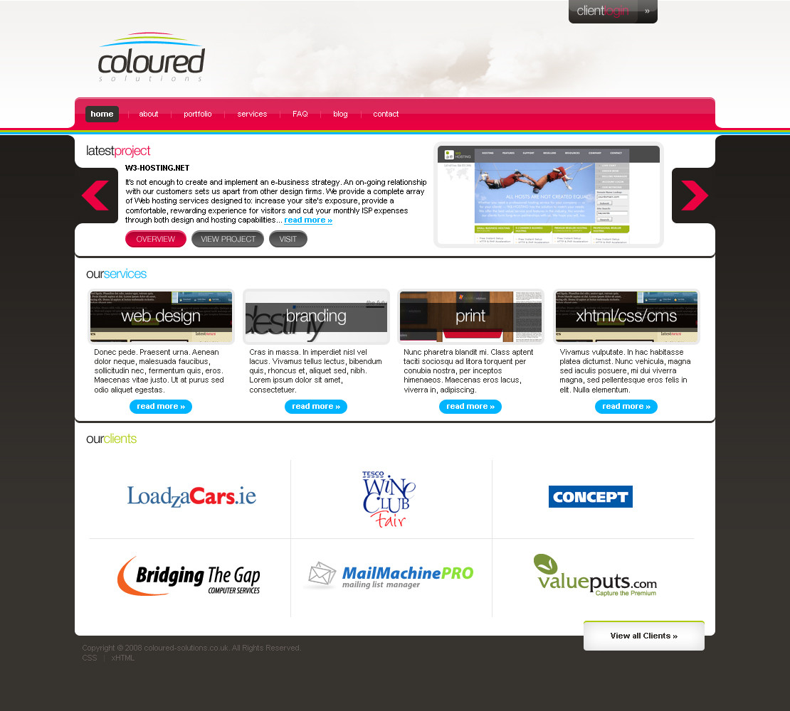
This was supposed to be used for my University coursework, but I designed another one, which I am currently coding right now and will be submitting it soon!Edit*:
Client logos were taken from a site which I can't remember because I simply have no clients.
The latest project screenshot was taken from a web design website which I can't find to reference it.
Comments, favs
 and devWatches
 are all appreciated
  (Smile)")
Related content


Comments: 26

A Beautiful site design so far....

👍: 0 ⏩: 1

Very nice work, mate.
But typography isn't very good (on text "it's not enough" are letters too close by themselfs) and i don't like "client login" button at the top.
But all parts works together well.
PS: Sorry for my bad English
 (Wink)")
👍: 0 ⏩: 1

yh I think the typography is not that good, also I didn't like the login button at the top, but I dn't have time at the moment because am working on another one for my university porject. When am done, I might submit an update
👍: 0 ⏩: 0

great design
what is the font that used in the logo pleasE?
👍: 0 ⏩: 1
thanx
it's called FF Max - [link]
👍: 0 ⏩: 0

thanx!
I was thinking of coding it for my university coursework, but I have designed a better more corporate looking one which I will be submitting as soon as I complete coding it
👍: 0 ⏩: 1

Sounds cool!
Did you get that coloured-solutions domain? If not, I can try get one for you since I've some more money in PayPal now.
👍: 0 ⏩: 1
no thanx....am actually thinking of changing to another name which I will not be announcing in public, until I am 100% sure am gonna choose it...I also made the logo aswell
👍: 0 ⏩: 1
Oh right. Well if you need a rename, don't worry I'll get it changed
👍: 0 ⏩: 1
")

wow it's awesome! I love everything at the design:-*
+fav!
👍: 0 ⏩: 1

wow its gr8... i love the whole design! How did u make those curves at the edges of the NAV bar?
👍: 0 ⏩: 1
thank you
I used the pen tool...it's like you create a triangle, but then you curve on side
👍: 0 ⏩: 1
i have to try it out, i can never use that pen tool properly lol it always distorts ")
👍: 0 ⏩: 1
lol...that's how I used to see the Pen tool before, but I did follow some tutorials to learn how to use it
👍: 0 ⏩: 0

nice...
i really like the colors of the navigator.
But your typograph isn't good.
Try work more on typograph
👍: 0 ⏩: 1
thanx...yh probably you're right about the typography
👍: 0 ⏩: 0
