HOME | DD
 MohsinNaqi — Pristine OS 1.2

Published: 2006-08-01 15:11:57 +0000 UTC; Views: 449984; Favourites: 441; Downloads: 161445
Redirect to original
Description
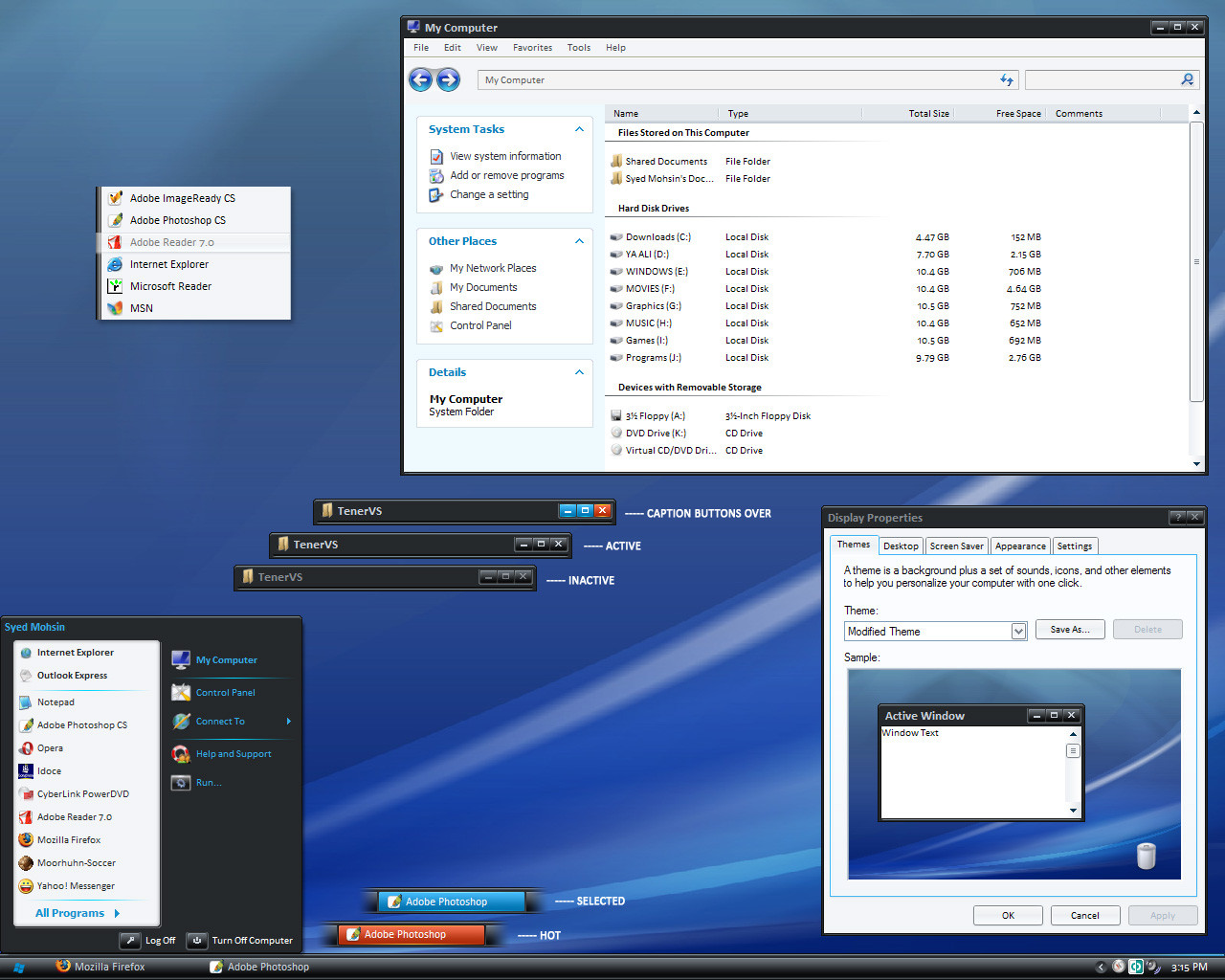
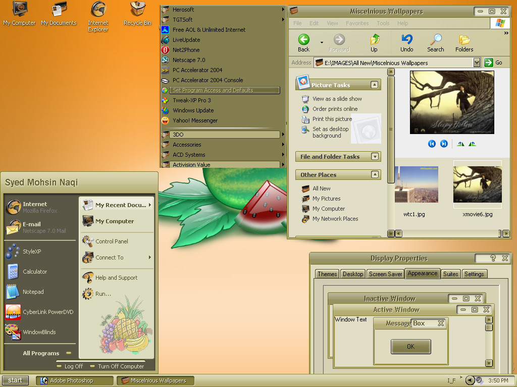
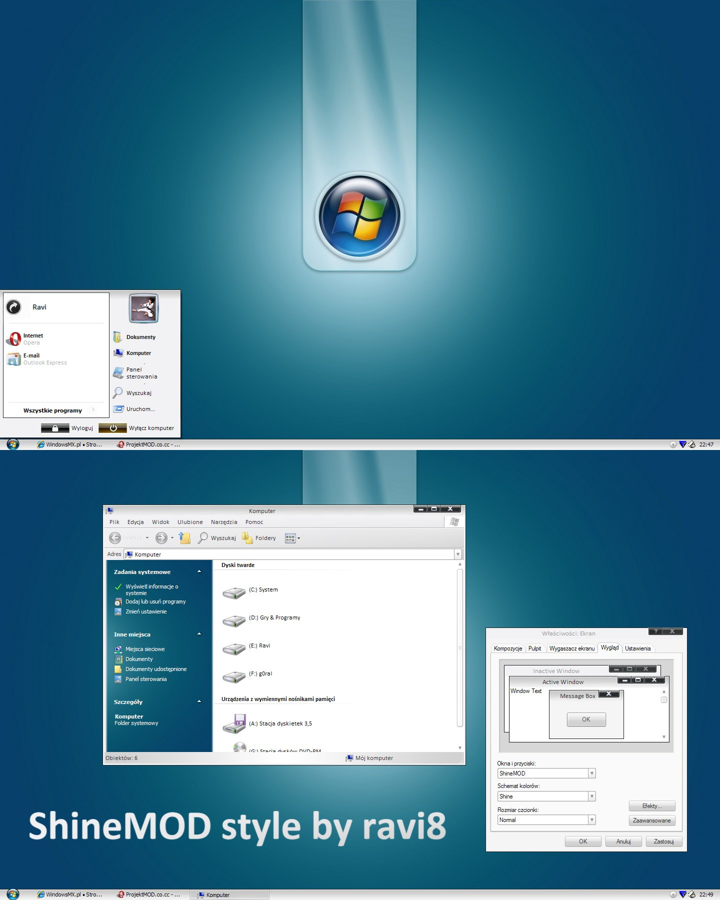
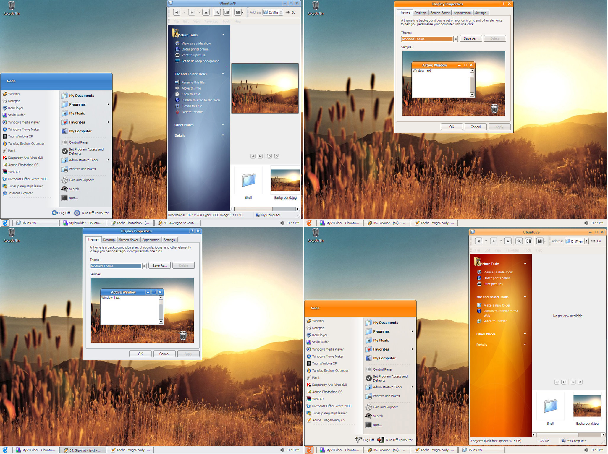
Pristine OS 1.2WAIT! before you dismiss this theme as one of those innumerable vista clones being released everyday, I ask you
to download and apply Pristine OS. I am sure you'll find it somewhat 'different'. In one word it's 'my' version of
windows vista (theme)
 (Smile)")
Part of inspiration came from Royale Vista [link] by dobee.
CHANGE LOG
Update: Added two substyles with 2 font choices; Segoe UI and Calibri
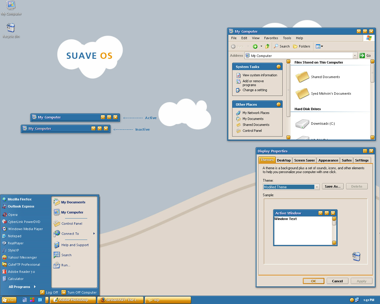
Big Update 03/08/06: Added another substyle with a new start panel
Improved the smaller start panel as requested
Improved Taskbar buttons as requested
Removed all the glitches reported as yet
Improved the corners and borders to give pristine OS a more crispy look
Update 08/29/06
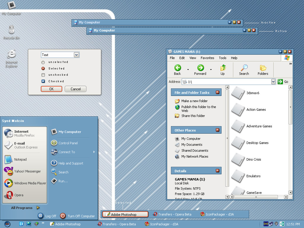
Added two sub-styles with two different compact start panels
Added tahoma font for all four sub-styles
Fixed a few bugs here and there
-------------------------
Notes:
1) You can switch between segoe ui, calibri and tahoma via font size menu
2) Download fonts from here [link] if you don't already have them installed.
3) Enable 'clear type' font setting for best results.
------------------------
The monitor icon used in shellstyle will be released soon.
New ideas and suggestions are most welcome.
Welcome to my website [link]
Enjoy!
Related content


Comments: 255

Thanks a lot.
Compact..hmm shall have to remove the white pane altogether.
👍: 0 ⏩: 0


shellstyle like in royale vista would make this even better.
👍: 0 ⏩: 1

I like this really simple one  (Wink)")
👍: 0 ⏩: 0

")

Nice
I agree, it is different from all those vista skins. I like it.

👍: 0 ⏩: 1
I found that you added a new substyle for Calibri well you don't need to. Most skinners just use the Normal, Large and Extra Large fonts dialog to do that!
👍: 0 ⏩: 1
Thanks for the tip. lol frankly I never noticed it before :-P
👍: 0 ⏩: 2
And of course I want that you keep improving the theme, if possible
👍: 0 ⏩: 0
No problem! That's for what we are here
👍: 0 ⏩: 0
Thanks for the update! I'm using it now. It made me stop using ClearLooks 0.6
👍: 0 ⏩: 1

Dude, I just switched styles yesterday (WhiteFlag4) and requested a black version. Now you come out with this theme. I hate you. Now I have to switch to this one and waste time finding wallpapers, etc. NICELY DONE.
Aerial and Royal Vista are my favorite Window Blinds themes. This comes very close to Royal Vista as you say. However, I prefer Royale Vista's subtle minimize, maximize and close buttons. May I suggest a version like Royale Vista but when you hover over them color the "X" red without the square buttons and color the other two blue. Another suggestion is to glow the taskbar items like the Vista themes instead of gray and blue. These are just suggestions not imperfections.
I very much like this theme and would unload Window Blinds if I could find a Royal Vista and aerial theme for msstyle.
👍: 0 ⏩: 1
The reason why it is a tad bit different from the rest of the vista inspired themes is that it's not a vista copycat it's 'just inspired' if that is the right word.
Thanks for your suggestions though and thanks for liking.
👍: 0 ⏩: 1
Inspire is the right word. Nobody has yet to make a clean, vista-inspired theme for Windows XP. Other skinners try to emulate Vista instead of reusing the style elements that work to form a new theme for Windows XP. I wish I had time to create skins but I'm so busy programming for open source projects.
👍: 0 ⏩: 0

I just need a good wallpaper to go with this Visual Style
")
👍: 0 ⏩: 0

Awesome work. Please make this available for WindowBlinds also.
👍: 0 ⏩: 1

In my to-do list if I don't get too lazy
👍: 0 ⏩: 0

o wow this good i love it some one needs to make a shell pack of this one good work ...
👍: 0 ⏩: 1
Thank you
👍: 0 ⏩: 0

I love the theme, but I don't mean to sound like I don't apprieciate it when I say I think the System Tray extender button looks a little..big.. ? Maybe something a little more minimalistic possibly? Thanks though, I'm using it now to replace Luna Element 5.
*thumbs up*
👍: 0 ⏩: 1
Thanks for liking and making useful suggestion
👍: 0 ⏩: 0
Yeah Tahoma, Segoe and Calibri are the best fonts please include that in the next release. The olny thing I can't get used is that the opened windows is a bit to bright it looks almost as the moseover
👍: 0 ⏩: 0

add Calibri as font, and im going to LOVE it.
👍: 0 ⏩: 1


yeah I like it! I I wasn't using ClearLooks now this would be my selection
👍: 0 ⏩: 1


Just found a liitle bug ? If taskbar is on top the Start Button is not drawing normal. Here is the screeny [link]
👍: 0 ⏩: 0

any change of a compact start menu im currently using the small one but, just figured i would ask you if that's alright?
👍: 0 ⏩: 0

Include extra font like "Tahoma", please.
👍: 0 ⏩: 1
Already two font choices. I don't want to make the file heavy.
👍: 0 ⏩: 0

Wow, this has to be one of the better Vista inspired themes out there.
👍: 0 ⏩: 1

This looks very nice. Very much eye-friendly. This is my best VS and may well take over as a deafult VS from Element.
I have following suggestions:
- on mouse-over on task bar programs, instead of using light gray (which looks more like white), make it even more darker gray. It will really look nice. White causes a little bit distraction.
- if IE (and other programs) not maximized but expanded to cover the screen (from edges), when you reopen IE and other programs, the top part leaves some space open above the title bar. Not a big deal but I am sure you can fix this so why not provide an update?
👍: 0 ⏩: 1
You can 'expand' any expandable window as much as you want, even off screen.
Thanks for your suggestions.
👍: 0 ⏩: 0


Something different than most vista skins you see out there nowadays
👍: 0 ⏩: 1
<= Prev | | Next =>