HOME | DD
 MohsinNaqi —
Resident OS
MohsinNaqi —
Resident OS
Published: 2006-01-01 12:04:33 +0000 UTC; Views: 78055; Favourites: 122; Downloads: 44261
Redirect to original
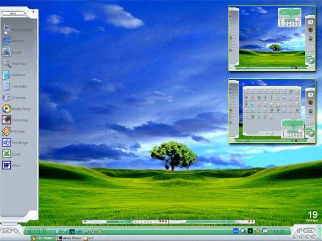
Description
a new year gift for you (Smile)")
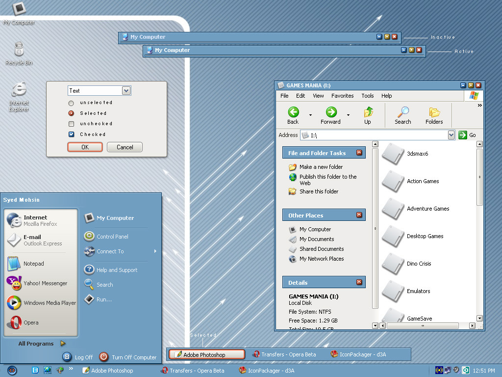
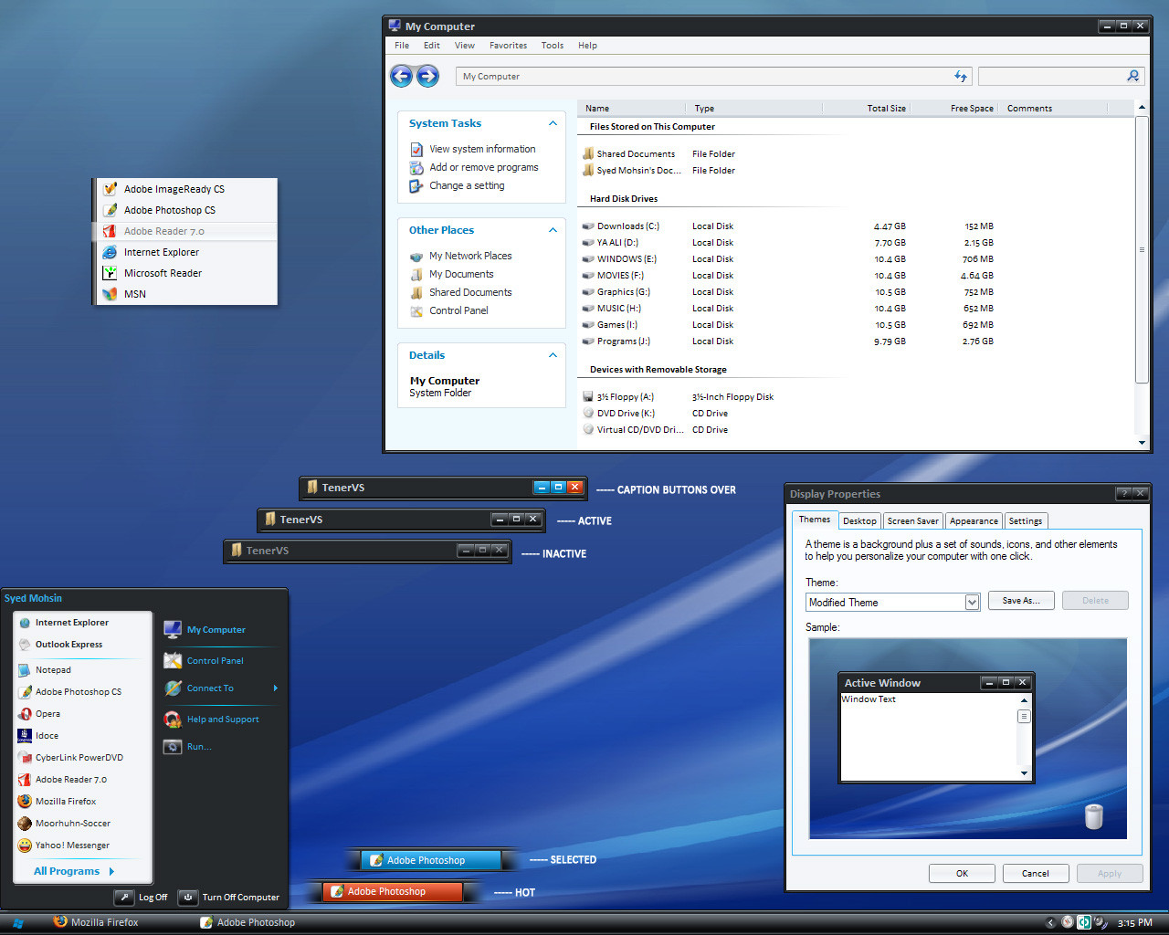
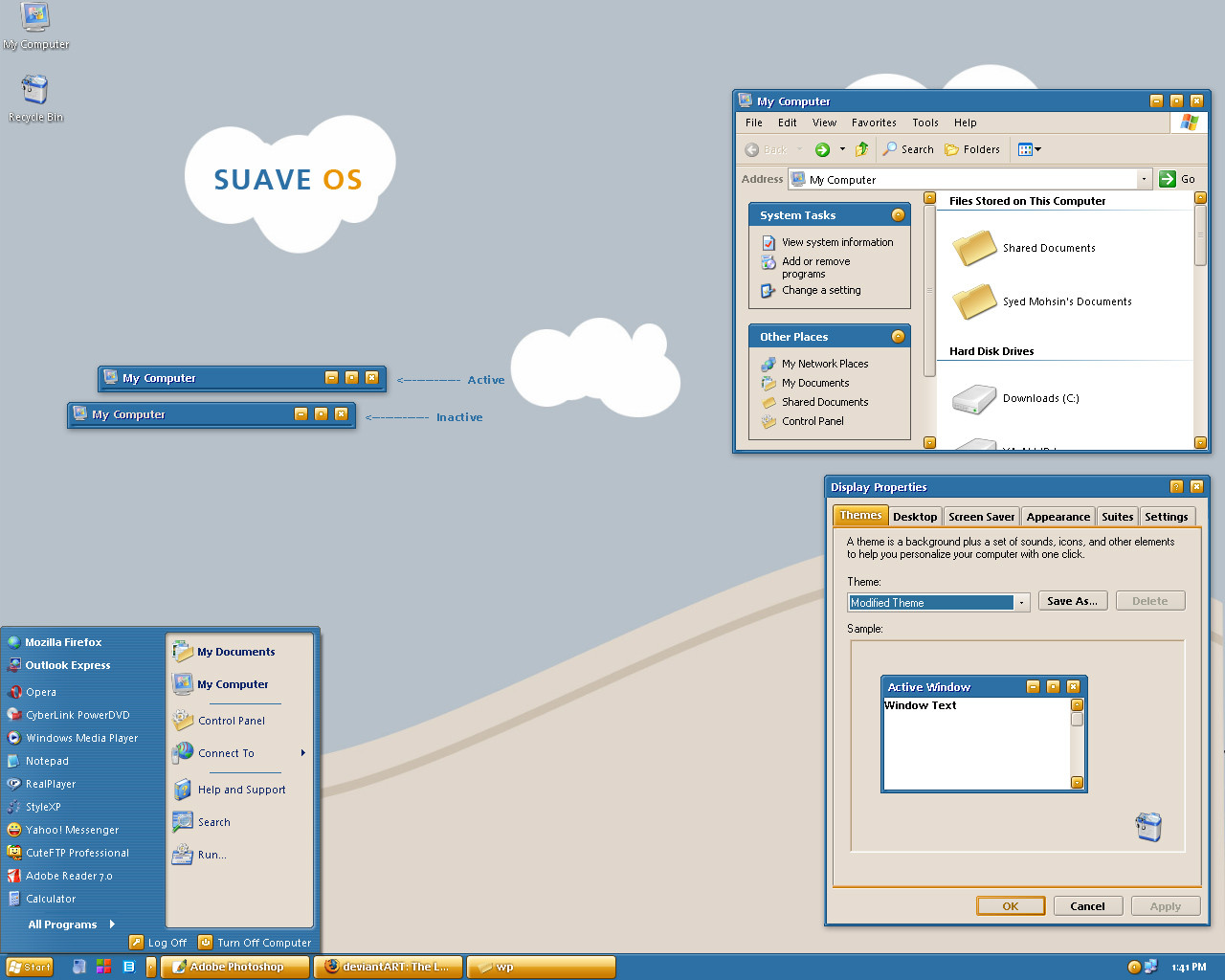
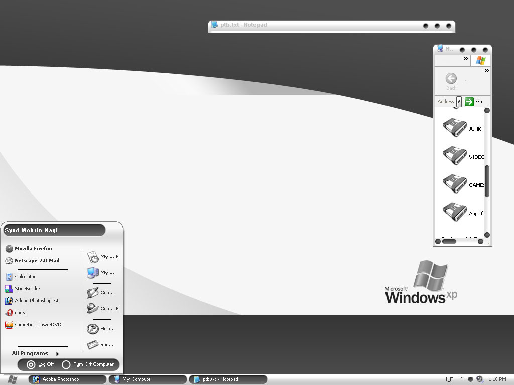
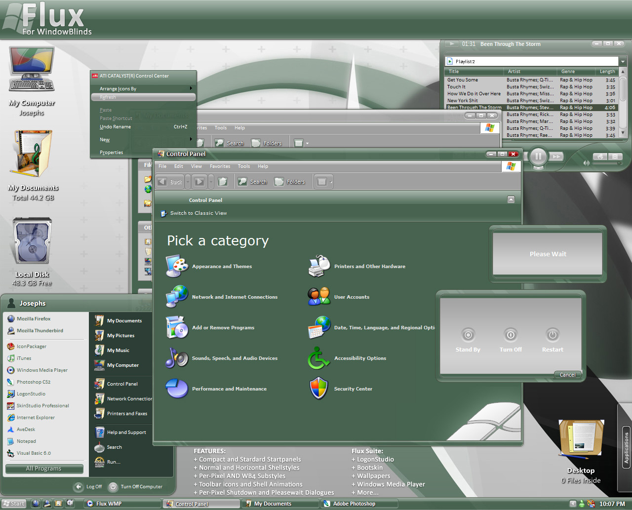
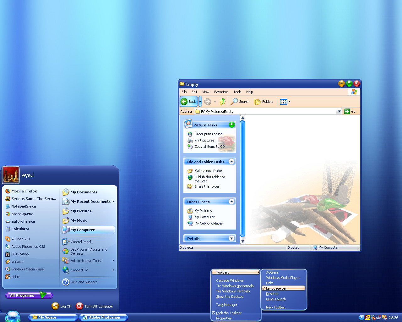
its an idea, a concept that many artists use so dont jump at me blaming me of stealing or anything, ITS MY OWN WORK ITS A VIRGIN
")
updated 01/03/2006
added compact start panel
improved normal start panel
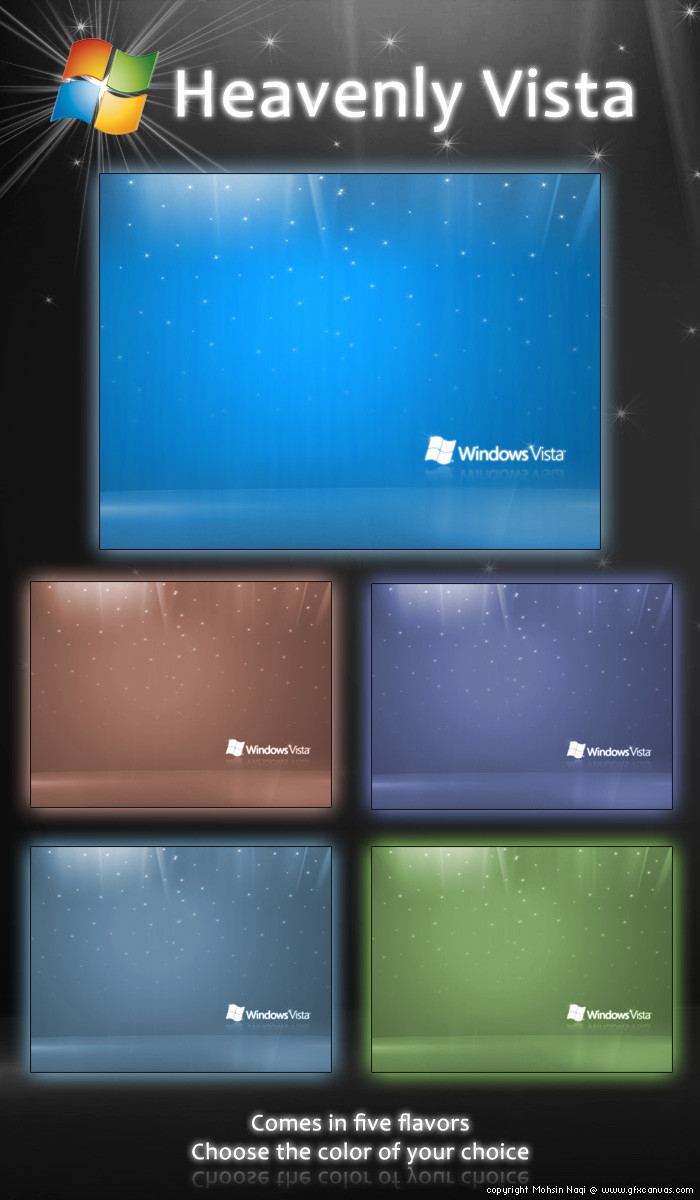
get the wallpaper from here [link] Blue Wallpaper by The-Definition
and icons from here [link] d3A Big Pack by miloszwl
happy new year and welcome to my website [link]
P.S color schemes will be added very soon
Note: in order to install this theme either download uxtheme multi patcher from here [link] its free
or download stylexp from this link [link] its shareware
Related content


Comments: 90


Start button icon is ok. Icons not too sure about them with this style but they are nice. I'd LOVE a yz toolbar for this. But this is nice and simple. Not too flashy. Maybe a pixel style font could work well with it. Awesome style thought and most of my thoughts arent against it but rather what might work well with it. I like the blue its relaxing actually
 (Wink)")
👍: 0 ⏩: 0


i like everything bar the start menu. but i find that with a lot of visual styles. good work
👍: 0 ⏩: 0


Its very good. Not original but still nice in the resolution. I think I'm going to use it (changing from Royale Luna after a while...)
Like someone said buttons a couple of pixels bigger would be better for aiming.
Titlebar font is not very readable (but its easy to change).
Scrollbars are too "fat" (beveled) compared with the rest of the style, I think they would look better with a subtle, more flat appearance (the current scrollbars can be used for mouse-over states).
👍: 0 ⏩: 0

This is simply superb. Can you add the Shadowing effect (not sure how to explain but it is the same effect you get when the mouse over happens on Quick Launch items) on task bar items as well? I kind of not like the plain look on the task bar - I know you've this for mouse over on task bar. They should look separated. Thanks for a great VS.
👍: 0 ⏩: 0

awesome. very very nice. thanks for the gift
👍: 0 ⏩: 0

I'M using this great VS a day and I just think it's the best VS I've had , wonderfull!!!!!!!!!!!!!!!!!!!!!!!111111111111111111
👍: 0 ⏩: 0

Wonderful. Will we get a great WB of this theme as well?
👍: 0 ⏩: 0
I Realy Like it its COOLL check my screenshoot [link]
👍: 0 ⏩: 0

The style is excelent, im not a fan of the colour though.
👍: 0 ⏩: 0


it's very good! looks so cool. downloaded and using.
thanks for share... 


👍: 0 ⏩: 0


Really nice, but the buttons and text on windows' titlebars are not as they are in the picture. On my computer, everyhing is justified to the top. It's not aligned to the center, as it is in the image. Just thought you should know. IM me if you want a screenshot.
👍: 0 ⏩: 0

:] weeerd..
if I may recommend, for anyone who likes this sort of thing, get a mac. : P
👍: 0 ⏩: 0


Wow, this is a beautiful VS!
The buttons I kinda dislike, but personal taste aside, this is an awesome, simple, pretty, professional skin.
Well done, this is great!
👍: 0 ⏩: 0


Beautifull Moshin!!, when r u gonna submit it to WinModify ??
👍: 0 ⏩: 0


Well...i downloaded it oO"
I have Windows Blinds...but i can't use it x.X
What does i need? oo""
👍: 0 ⏩: 1

you have photo shop, ¬¬, phwee!,
wow, it works really good
👍: 0 ⏩: 0

I love it, but now to sound like a total n00b... How do I use it?
👍: 0 ⏩: 1

you have two options, either download uxtheme multi patcher from here [link] its free
or download stylexp from this link [link] its shareware
👍: 0 ⏩: 0

Congrats on the DD, man
I really have to say I preffer xmelcan ")
I'm having some troubles with the mp3 player, but I'll 'de-doubt' them all and I'll let you know then
👍: 0 ⏩: 0
seshimeru [2006-01-02 17:19:46 +0000 UTC]
looking forward to seeing some more colour shemes. This one is a little too blue for my current theme.
Still great work though
👍: 0 ⏩: 0

looks really good.
I like the little buttons in the upper right of each window (close, min, max)
What I do not like so much is the "start" button. I think it doen't fit together with the rest
👍: 0 ⏩: 0

l dont see a difference between inactive and active windows >.<
👍: 0 ⏩: 0

| Next =>