HOME | DD
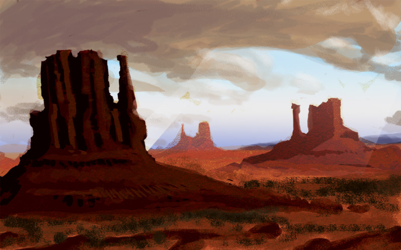
 Monkeyslunch — Desolate
by-nc-nd
Monkeyslunch — Desolate
by-nc-nd
Published: 2009-02-18 20:59:11 +0000 UTC; Views: 1577; Favourites: 44; Downloads: 47
Redirect to original
Description
Teaching myself how to digital paint. Thought it might help make my colors stronger. Its not so bad! (especially for a first attempt)Photoshop Couple hours.
Related content


Comments: 36


Very nice, man.
You have a great sense of colours (Smile)")
I do find the resolution pretty small, but that's not that big of a problem
👍: 0 ⏩: 1

Thanks! This was during my "small" phase, which thanks to comments like yours made me enter into into a "large" phase. So, the next few things will hopefully be a lot bigger.
👍: 0 ⏩: 1
That's good to hear
Any pointers you have on doing this kind of background works, I really like yours, and I still need some tips on it
👍: 0 ⏩: 1
Thanks dude! I'm working on a few things I can't show for the moment, but then I'll be back to posting.
Pointers for this type of work... hmm. I found making my own brushes really helped. Color theory is a big part of it. In this one, for instance, the blue and the orange compliment each other, to help push the mood. I study from life whenever I work on pieces like landscapes, definitely, but also I find that with landscapes especially its easier than you think to subtract unnecessary information out and abstract things without things getting wonky on you. Sketch things out and then remove what you don't think is needed, then do your rendering, and remove again. I had so much extra junk in this one before hand and ended up just taking the eraser tool to half of it. It just wasn't needed.
👍: 0 ⏩: 1
Your welcome, man.
hmm seems pretty basic actually, but I wouldn't have thought of it myself, thanks for enlighting me")
👍: 0 ⏩: 0

")


This is really good for the first time!! :fav:Z!!
👍: 0 ⏩: 1


a sexy effort! S+ for SUPAAA!
👍: 0 ⏩: 1
Thanks a bunch! I hope you're doing good lately too!
👍: 0 ⏩: 0


I don't think it is so much a problem of stronger colors, as you are very good with that already. I think there just needs to be a little contrast in this one.
👍: 0 ⏩: 1

Hey, that looks great! I really like the cartoony style  (Wink)")

👍: 0 ⏩: 1