HOME | DD
 mOOg267 — Rey Tutorial
#rey #starwars #digitalpainting #tutorial #theforceawakens
Published: 2015-12-23 01:34:44 +0000 UTC; Views: 3770; Favourites: 74; Downloads: 0
Redirect to original
Description
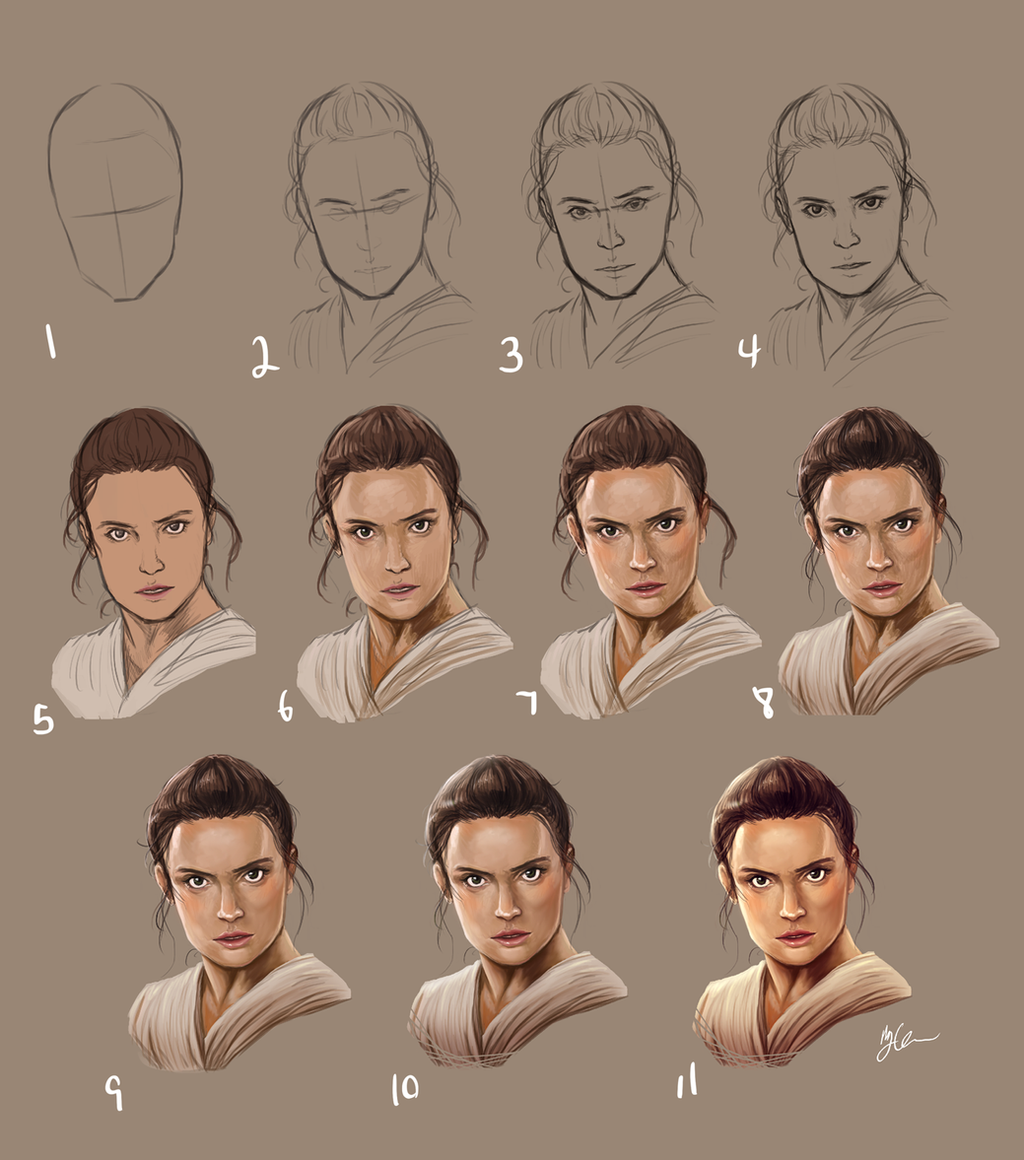
Rey step by step
1. Sketch the basic shape of the head and jaw line.
2. Sketch out markers for the ears, brows, eyes, nose and mouth as well as the hair and neck.
3. Define and polish the features, I use the lasso tool and free transform a lot in this phase to push, pull, squish, and stretch the features until they match my reference or look right (if i don’t have a photo).
4. More polishing, more lasso tool and transform, fixed the jaw line a bit more.
5. When I’m happy with the base sketch, I save it to a new layer and hide it (in case i fuck up) then make the original layer multiply. I then try to color pick from the photo I’m using to find the mid tone for each part then use those tones to “flat” my colors in a layer under the sketch layer. If you aren’t using a photo then shame on you and just guess on colors.
6. Merge the sketch down on the colors so it’s all one layer. I color pick more to get the basic variations down. I lay out a rough version of the lighting information. Nothing is too detailed or sharp. Juts blurry color info to get the basic idea.
7. Just keep color picking and filling in the lighting information. I’m very rough and sketchy in this part. I also use a brush that has “Transfer” turned on with pen pressure so I can get even more color variations. At some point I also made a new Overlay layer and added some blush with a soft brush then merged it down when I was happy with it.
8. I erased the hair strands that weren’t working and drew in new ones. Basically you’re making a blurry image sharp in this step. Just keep refining the image into smaller and smaller details. I also use the Liquefy filter A LOT in this phase. Lasso and free transform causes a bunch of gaps so Liquefy works best. Mostly the push tool but sometimes bloat and pinch. Just keep making adjustments to the features.
9. Smudge! I used the smudge tool at 40% strength to blend the sketchy colors together. I like to keep some of the sketchy look so I don’t blend it too much. Be very careful not to over blend.
10. On a new layer using the “Soft Light” mode, paint in more lighting. I use a pale yellow to highlight the light parts and a greyish blue for the shadows. I just use a brush with 0% hardness. I also turn the opacity of the soft light layer to 40-50% what ever looks best. You want it to help the contrast but not blow out the image.
11. Added a color balance adjustment layer to finish it off. This is a personal preference thing cause I like my images to be more saturated and have more vibrant colors and color picking alone usually doesn’t do it enough. My rule is usually highlights should be warmer and shadows should be cooler and midtones are whatever works best for the image. Rey has a yellowish undertone in her skin and clothes so I kept an orange-yellow midtone, but Poe is more red.
Extra info:
USE REFERENCE! there’s no shame in using reference for poses, faces, colors, or anything! Everyone uses reference. It’s not cheating. Especially for something like this which is essentially a photo study.
Use what ever tools you are most comfortable with. I use photoshop and have a wacom cintiq companion 2 but if you’re more comfortable with SAI and an intuos 4 then use that. You do not need to spend more money to make better stuff. Practice is more important.
You don’t need fancy brushes. I literally only used three brushes and only one of those was custom. I mostly try to use a “sketching” brush with transfer turned on and controlled with pen pressure.
I’ve uploaded an accompanying video that captured from the flat colors on: youtu.be/b6YzXaaF0u0 . Let em know if you have questions or want to see more!


