HOME | DD
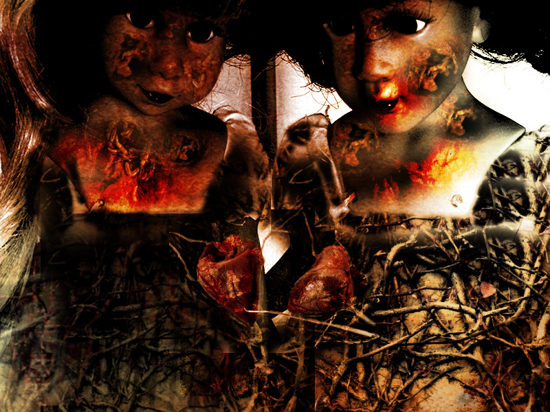
 moogstruck — fire bound

Published: 2003-07-02 07:03:06 +0000 UTC; Views: 201; Favourites: 1; Downloads: 26
Redirect to original
Description
part of a duel at [n]stock by: ~thespook and ~tinderstock
brushes by ~aleksandra
Related content


Comments: 9

Awwwwwwwwwwwwwwwwwwwwesome textures on this! It works really well!
👍: 0 ⏩: 0

like someone whipped him...
that's way cool, too small though
👍: 0 ⏩: 0

totaly wicked use of textures
i have yet to see anything as confronting as this... not like that's an altogether bad thing of course.
you would think someone as submerged in textures as I would be more in touch with the darker arts eh?
nice work
👍: 0 ⏩: 0

Bound to a horse and dragged through the forest, horse whipped to death .... another move by Windham Earl (?)
I like the way that you have made the image look like a macabre fantasy and this is emphasised by the figure and it's wounds.
Love the textures.
👍: 0 ⏩: 0


Hmmm, the colours nice!
Wich duel is it? I looked around in the duel part of the page, but I just couldn't find this picture.
That one cut form the shoulder to the middle of the back looks a bit fake, otherwise everything is fine.
👍: 0 ⏩: 0


I think that's cool. A little small though. I actually like those colors, they work well with this. The only problem I see here is that the cut/line on the arm on top looks fake. The rest blends well and looks like it belongs.
Nice work! I hope you do well in the contest/thing.
👍: 0 ⏩: 0

the cracks on the back are nice, not sure tho that i like the colour
👍: 0 ⏩: 0