HOME | DD
 moogstruck — messyid

Published: 2004-06-13 07:29:08 +0000 UTC; Views: 231; Favourites: 3; Downloads: 49
Redirect to original
Description
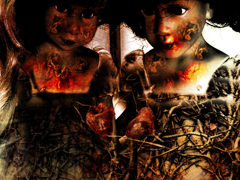
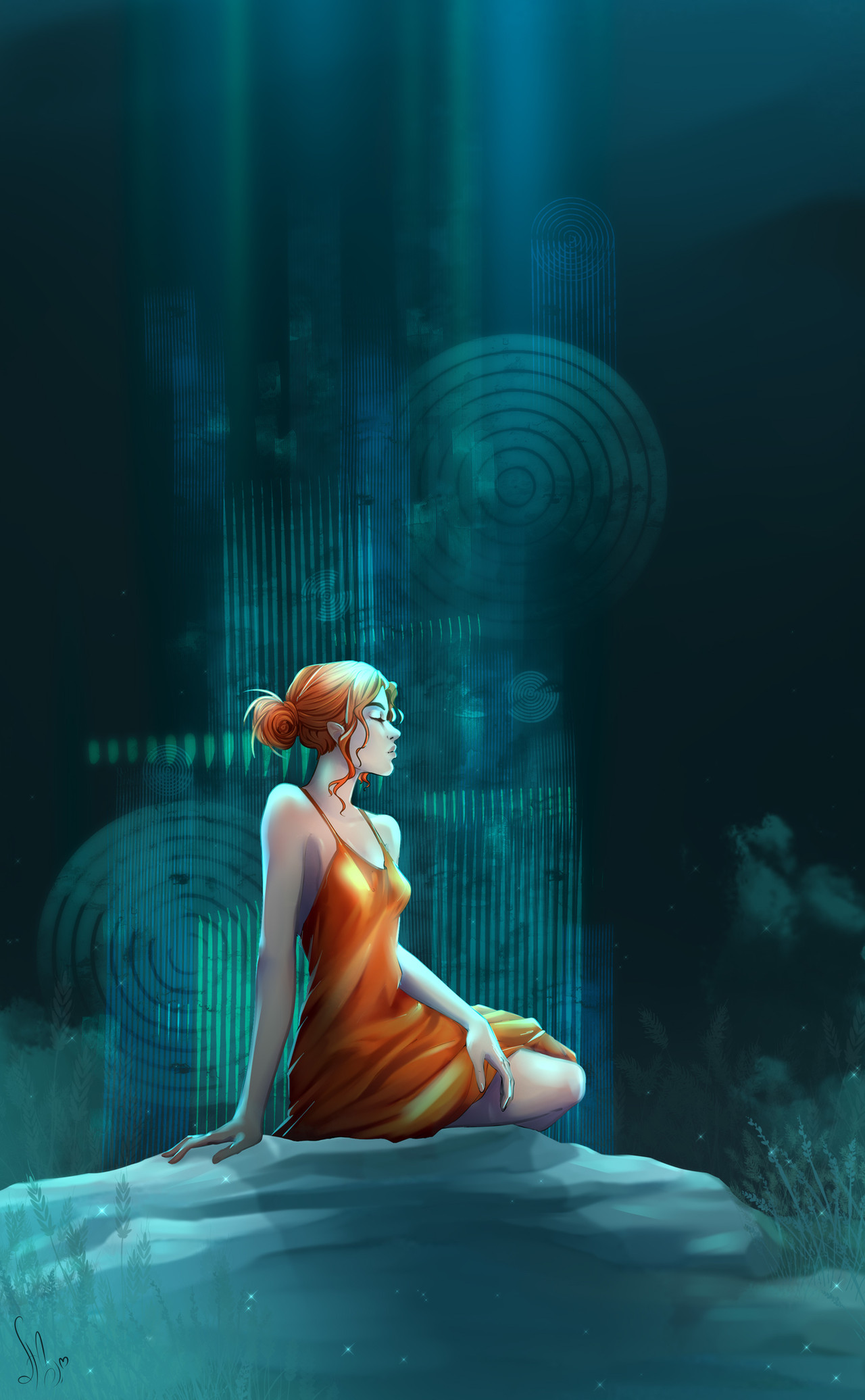
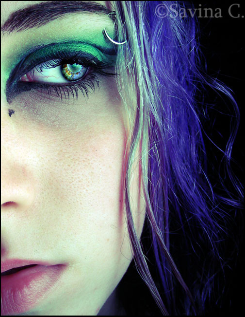
i like red.
Related content


Comments: 20

methinks it is an om-like symbol. at least it reminds me of it. cant remember if it was a dingbat font or what?
👍: 0 ⏩: 0

the symbol in the right corner.. what does it mean? Looks like something osmannian or from witch alphabet..
👍: 0 ⏩: 0


")

This would look really cool with some transparency in it... so it's not so blocky.

👍: 0 ⏩: 0

wonderful! this is inspiring and beautiful and somewhat different from what i'm used to seeing from you and red is definitely your color  (Wink)")
and for sure one of the best ids i have seen in like ever on here
👍: 0 ⏩: 1
WOW thank you so much!! hehe yeah practically 90% of my wardrobe is red. and i have like 20 different red lipsticks. lol.
👍: 0 ⏩: 1
red is totally hot on like...the right people. red lipstick on me, for instance, look s like i got in a fight with a red popsickle.
👍: 0 ⏩: 0


nice effects this is really beautiful  (Smile)")
👍: 0 ⏩: 0


looks very classy, the dress - the long neck like that, and hte eye... that's a turkish symbol at top? hmm hmm red, yes, really tasty. :lunalupin: has some ultra red pic. mmmh yah, that moogstruck typed font looks really exquisite.
whole impression sirene, not messy..
👍: 0 ⏩: 0


Well done. It looks worn down, but then seems very classy. Nice colors, too.
👍: 0 ⏩: 0

Beuatifully Done!!! love the torn edges the color and the lighting!!
👍: 0 ⏩: 0

