HOME | DD
 moose562 — The Seven Year Itch
Published: 2005-05-02 22:25:25 +0000 UTC; Views: 562; Favourites: 6; Downloads: 36
Redirect to original
Description
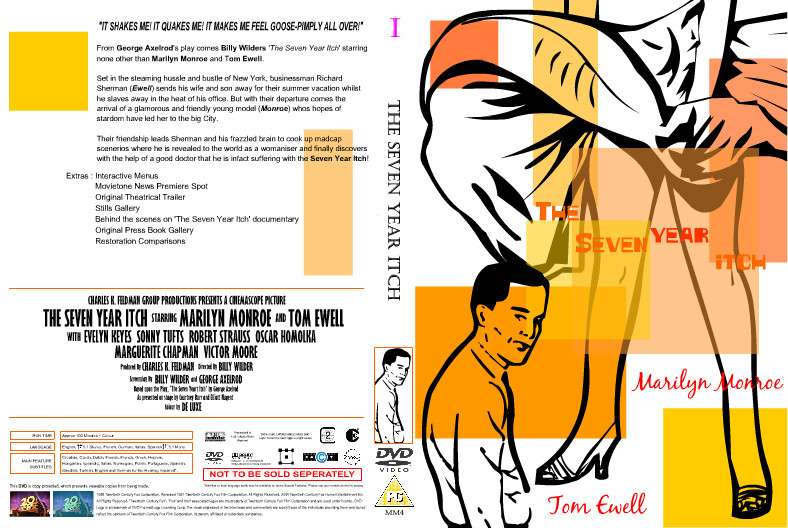
This is the fifth cover from my Marilyn Monroe Definitive DVD Box Set that I had to design for my final major project of degree year two. I was so against this film from the start, purely because of that terrible scene where the dress blows up (and everyone remakes it over and over and over againThe reason I hate that scene is cos the photos from it make Marilyn look *appalling* - I just can't stand it. I don't care about the whole Joe DiMaggio thing, I can't stand him anyway. But I chose to use it cos I had no idea what to do! This one, along with 'Gentlemen Prefer Blondes' and 'How To Marry A Millionaire' were the *hardest* ones - cos they are the most well known I guess. So was hard for me to go completely abstract - and PLUS, I was near burn-out stage when these were finished!
Related content


Comments: 5

These are great layouts. I majored in Advertising in college and I still have never made layouts that look this cool. Only suggestion is that for the title, you have orange text on an orange background, kinda hard to read. Maybe a little more contrast might help, unless you had some conceptual reason for making it that colour.
👍: 0 ⏩: 1

oh no conceptual reason so you are right, i'll have to change it for my end of year exhibition! thankyou for the comments its very kind of you
 (Smile)")
👍: 0 ⏩: 0

i agree with you, i love the the orange squares they do add a touch of retro funkyness to the piece! i also like the idea of having the line drawing in contrast with those lovely orange squares! very kool! the type on this is very well handled! you have space and legibility so all well there, NEXT!
👍: 0 ⏩: 1
yeah i loved the retro thing going on in the film too! come over and watch them with me

👍: 0 ⏩: 1