HOME | DD
 moosekleenex — dont buckle
Published: 2009-01-14 22:28:05 +0000 UTC; Views: 2225; Favourites: 182; Downloads: 0
Redirect to original
Description
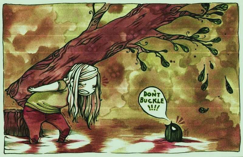
color/saturation adjusted, and ugly lines that appeared in the scan that I hope go away ;-;Related content


Comments: 29


I think this would make a nice print for a t-shirt design. Loving the muted colors and the background makes it feel kind of wintery/fall...kinda cold feeling...that could be the falling leaves too. lol

👍: 0 ⏩: 0

Aw, so beautiful! Too bad about those lines. D: Maybe the scanner is getting old?
👍: 0 ⏩: 0

 (Smile)")

I think it doesn't really belong in Scraps, because it's cute ^^
👍: 0 ⏩: 0

Oh, this is amazing! 
If you ever consider selling this one, let me know! I'd love to have it!
👍: 0 ⏩: 1


i love ypur coloring and you should cloro more.
")
👍: 0 ⏩: 0

this is so pretty
I think you should make a comic, I would buy it
👍: 0 ⏩: 0

oh no! this will not turn out well for either of them...
beautiful painting...
👍: 0 ⏩: 0


I love this piece - the girl looks just like my niece!
Heh heh - rhymes.
👍: 0 ⏩: 0


this is beautiful! and so finished looking, despite the unfortunate lines. they don't detract from anything, don't you worry!
👍: 0 ⏩: 0

the water is so gorgeous! the lines on it are SO well done. i love how she looks like she's straining really hard...and the words in your pictures always seem so meaningful, i can't help but love them (the titles are always brilliant, too)
👍: 0 ⏩: 0

Why in scraps ;3; this is pretty much what I meant and wanted in an earlier comment of mine, haha ♥
👍: 0 ⏩: 0


dude, this is so cool. I love the colours and the way you worked the watercolours (?) are so nice. .... and I think the scanner lines are cute
👍: 0 ⏩: 0


I like this a lot. You don't seem to use "grungy" colors very often, but I think your style looks nice colored this way. And as always, great concept too.
👍: 0 ⏩: 0


Remembers me of some fairytale. The hero and the teacher or the martyr and the villan. Love it all: colors, efects, lines...
👍: 0 ⏩: 0

Nah, I really love the scanner lines because they make it look like a vintage cartoon.
👍: 0 ⏩: 0


I really like this, the ink makes the water look like it's smoking. o:
👍: 0 ⏩: 1

