HOME | DD
 MountainInspirations — Late Spring
Published: 2011-05-28 01:41:39 +0000 UTC; Views: 748; Favourites: 30; Downloads: 9
Redirect to original
Description
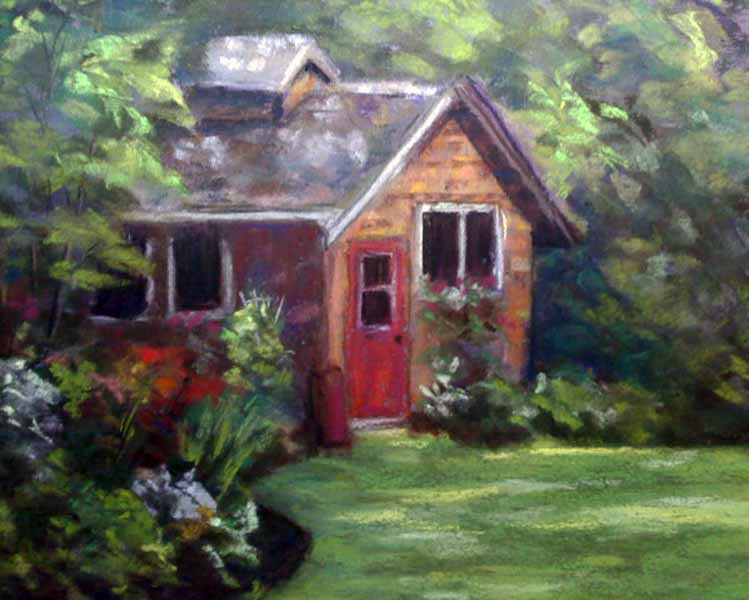
Late Spring pastel on colorfix paper, 11 x 14. completed 5/27/11Related content


Comments: 25

Spring on Easel
The visitor........ by TriciaS
-Kiku of Earth- by reizezdewickid Late Spring by MountainInspirations Tranquility by rooze23
Sunrays by G.Gercken by artsaus SPRING by Hydrangeas Spring Path by heartMelinda
Crocus by kir-tat Redbud in Spring. by herrerojulia Dreaming Of Summer by AngelasPortraits
snowdrop by kir-tat
A Courtyard by JohnPatience
👍: 0 ⏩: 0

Very nice lighting here Lisa!
Well, it's been a while since I actually SWAM in the sea (or a lake!) but it was great to get blasted with sea air and get the city out of my hair for a few days!
Indeed, what is it about nude beaches, they seem to attract the wrong crowd.....!
Have a great week and speak soon,
John.
👍: 0 ⏩: 0

Thanks, Mark. I've just tweaked it a bit. Will update the pic as soon as I can. I wasn't happy with the front of the building. Let me know what you think.
👍: 0 ⏩: 1

I like both the old and new, maybe you should have done two
👍: 0 ⏩: 1
I'm lucky I finished the one!! *giggle*
👍: 0 ⏩: 1
Oh I am sure you could do more too  (Smile)")

👍: 0 ⏩: 0


This is quite lovely. It could benefit from some highlights on the foreground flowers. It would add more depth and lead the eye into the cottage. (Just a personal opinion)
👍: 0 ⏩: 1
I actually took out some of the light areas in that flower bed. In real life it took away from the cottage. The picture here is way different. I still think the front wall of the cottage is too light. What do you think?
👍: 0 ⏩: 1
if you bring the flowers forward and run a clear prussian blue glazu over the wall it would probably work.
👍: 0 ⏩: 1
its pastel. can't do a glaze! but I'll try some deep blue on it. I'm sure that will work. and thanks!
👍: 0 ⏩: 1
You are welcome.
👍: 0 ⏩: 0

you don't think the flowers on the left are too light?? I can't decide
👍: 0 ⏩: 2

I wish I could see it in person. Scanners and photographs just don't do justice to paint and their colors.
Ask yourself, what do I really want people to see, the cottage, this flower or that one, or all three? Imo, the cottage should be more obvious than the trees and the grass (though of course they gently move the eyes back to the cottage). However I'm not sure which if any flowers should stand out a bit more. I just now noticed the sweet little white lattice holding up the bush against the house wall (or is that a rake?) (I'd rather it a lattice.) You could try to accentuate it just a teeeeeny, because it's so cute. Unless in person it stands out more than on screen, then leave as is.
Where is your sun placed? That should decide which flowers need more light or not. That has to come from you.
So, cottage? flowers? cottage and flowers? That would be your answer. It's a very sweet and pretty painting as is, too. And I'm a terrible one to ask because (being novice and learning) I tend to over-paint and over-detail. My tired old eyes need help I guess.
")
👍: 0 ⏩: 1
I tend to overpaint, too, that's why I left it for a bit. I've tweaked it some, and I'm much happier. I'll post a pic later when I have time. The sun is coming through the leaves from the upper right, so the light is diffused (which is becoming my "signature"). I've toned down the cottage some, and added highlights where the sun peeks through onto the roof and front wall.
I really do appreciate the feedback.
👍: 0 ⏩: 0

they're not too light but rather it would be nice if you had more color if you could~
👍: 0 ⏩: 1
its actually VERY colorful IRL. The photo does not show it so well. 8-( I'm thinking of having it scanned.
👍: 0 ⏩: 1
oh i see....hmmm well isn't it already scanned??
👍: 0 ⏩: 1
no, it was photographed. my scanner won't take 11 x 14. I'll have to bring it to Staples or something
👍: 0 ⏩: 1
oh! mmm~ that sucks-wait why now just a library scanner??
👍: 0 ⏩: 0
you don't think the flower bed on the left is too light?? I can't decide.
👍: 0 ⏩: 0