HOME | DD
 Mountny — Good place to read
#myoc #oc
Published: 2018-04-08 17:12:42 +0000 UTC; Views: 527; Favourites: 31; Downloads: 2
Redirect to original
Description
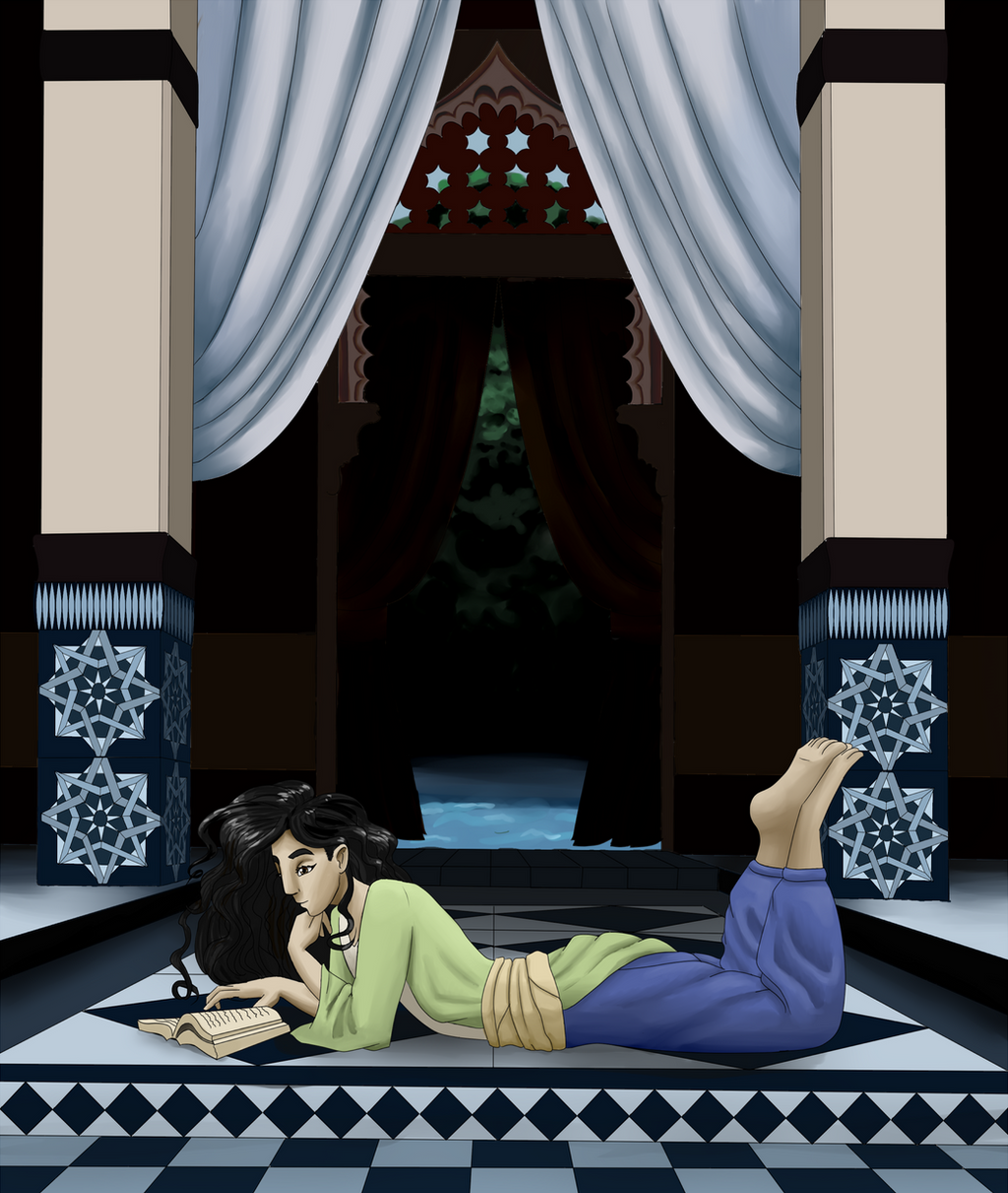
Talitha found a relaxing place in her family's estate to get some reading done. She was happy to have some peace from Dari and all of his crazy ideas. He seems to expect her to figure out how to make his ideas for machines work. Talitha had a natural talent for spacial reasoning, mathematics or problem solving in general. If it wasn't for her, Dari would probably never actually create any of his inventions, just continue to dream about crazy machines and write half done plans. As much as Talitha liked to help him, sometimes his ideas had no hope of ever working. Recently he was telling her about making a machine that could fly to the moon. Talitha tried to explain to him that the moon was probably a lot farther away than he thought.For now it was time to catch up on some reading for university. Hopefully Dari would leave her alone for a few more hours.
~~~
This took me a while but I'm really happy I finished it. I've been pretty obsessed with Dari and Talitha recently so I've ended up drawing them a lot. I focused on one point perspective and I tried to improve on anatomy. I drew her head at a bit of an odd angle so I'm not sure if it look right. I figured I should draw it at a different angle than what I'm used to so I don't get stuck drawing the same thing over and over.
Used this ref: senshistock.deviantart.com/art…
Related content


Comments: 31

I don't understand anatomy But Thank you that have written the story to the drawing. They supplement each other. It is interesting to look. And to read.
👍: 0 ⏩: 1

I'm glad you enjoyed the story.
👍: 0 ⏩: 0


First of all, I really like the theme of this picture, there is something I love about seeing a girl reading a book. (Maybe it's because I can find myself in that, haha.) You say in your description that she's reading for university, but it seems like a quite interesting book, because she looks very content and absorbed in it. Her pose is very relaxed and her expression thoughtful.
Another thing I like is the way you drew her facial features. Oftentimes when artists with heavily stylized to even semi-realistic styles draw non-white characters, they only seem to pay attention to skin color and maybe eye shape. It's very refreshing to see a girl who also has a larger nose and eyebrows that convey ethnicity.
The room looks very good too with all the ornaments and patterns. It looks a bit empty and impersonal for my taste, but then again, maybe that can be fitting for a large hall in an estate. I think you did a good job with the perspective as well, I imagine it was a lot of work to get it all right.
The main issue I have with this piece is the shading, because I can't figure out where the light is coming from. When I look at the pillars, the light source appears to be located somewhere in front of the picture, outside the frame. But the floor right in front of Talitha is darker than the surrounding areas and when I look at her clothes and hair, the light source seems to be somewhere above. My best guess is that it's supposed to be above and in front of the picture, but I think that this would affect the tiles in front of and behind Talitha as well. Lighting and shading can be tricky, so it's best to decide on a light source right when you start coloring. Some people like to create an extra layer with a rough sketch of the light - some pointing arrows can be very helpful too.
I hope this is of some use to you.
 (Smile)")
👍: 0 ⏩: 1
Thank you for your comment!
Talitha is one of those strange people who actually get excited about math and can somehow find it relaxing to read about. I will never understand her! I'm glad you like the way I drew her.
I appreciate the tips on the shading, it is nice to know not just what is wrong but how I can improve.
👍: 0 ⏩: 0

Hello from ProjectComment !
I love the serene mood of this piece: it actually tells the story in the details. The complex and regular ornaments on the pillars suggest an order in Talitha's thoughts and echo with the underlying world order that she is trying to uncover. The symmetric composition around a door to the garden invites the viewer in, and the lying figure keeps it grounded and substantial.
You have done a nice job with the reference adapting it to your needs. The character looks very natural.
I’d like to focus on coloring now, as I feel a slight mismatch between the character and the background and I’d like to share my thoughts on it. You are using mainly local colors, that do not affect each other, and lit and shadowed areas of an object differ only in darkness, but not in hue. There are some nice pinkish tones on the curtains, but other than that colors are pretty uniform.
One way to deal with it is to go for a stylized look and to use cell shading, making your local colors work well together (i.e. they should have something in common). This would mean making your colors more similar in some respect. Now, the pillars obey these rules: the light blues are similar in hue to the dark blue and differ from each other in similarity to the beige tone on the top. However, Talitha's trousers are of a not germane shade of blue that is closer to purple than to green, but more importantly there is nothing to connect the two. The green does work well with the blues on the background, but it does not bring the blue trouser any closer.
Another approach may be to work with the local colors you have, but to introduce the hues from the environment into them. In this case, you would add some beige on top of Talitha's clothes, both in the green and in the blue, and some of the greenish blue reflections from the bottom. Conversely, some green would be on her jaw and on the lower part of the left pillar and here and there on the floor, while some blue from her pants would reflect on the right pillar. This is a way towards a more realistic painting, but maybe this is not what you need for this kind of illustration.
To wrap up my comment I’d like to compliment this piece because it speaks to the viewer and says maybe even more than what was originally thought by the artist. I believe that is a success.
👍: 0 ⏩: 1
Thank you very much for such a detailed comment!
I appreciate your analysis of my drawing. I took a while to plan this picture in an attempt to improve and I'm glad my work on composition payed off.
You gave me some very useful advice in regards to the colour. In the future I would like to try more realistic painting so I appreciate your tips. I think the focus for improvement of my next picture will be the colouring so I'll keep what you said in mind.
👍: 0 ⏩: 1


I'm not going to write a full length comment, but I wanted to say that it's really challenging to portray things (in this case: a person) who stretches straight across the picture, but you managed to pull it off nicely. The pillars and that line of black diamonds balance it out somehow. Also there is a sense of depth, even though the colors are rather flat.
👍: 0 ⏩: 1
Thank you for pointing out some specific things that you like about this picture, I really appreciate that. Unfortunately the colours are flat due to me getting bored with this drawing so I should probably learn to be more patient.
👍: 0 ⏩: 1
I know the feeling. Often once a picture (or the key object in it) is "good enough", I go "screw this, nobody is going to see this anyway, so why should I spend more time on it?" As a result, some areas may be more rushed than others.
👍: 0 ⏩: 0

Wow! That looks like a great place to read! Nicely done!
👍: 0 ⏩: 1

Wow! That reminds me of me reading on my bed. Nice job!
👍: 0 ⏩: 1
Thank you I'm glad you like it!
👍: 0 ⏩: 0

Looks great but the I got distracted from the character by the background, try to blur the background a little bit so it would give that depth of field and makes the subject pop more, Good job !
👍: 0 ⏩: 1
Thank you for the suggestion! ^^
👍: 0 ⏩: 1
you're welcome, I hope you give it a try !
👍: 0 ⏩: 0

I feel like the background and foreground don't mesh too well but they are both beautiful and this piece is still beautiful all around.
👍: 0 ⏩: 1
Thank you ^^
What about it doesn't mesh? The colours or perspective?
👍: 0 ⏩: 1
It just seems like they are stylistically different, and that might be because the background mainly relies on solid geometric shapes without much non-geometric furnishing, which clashes with the more organic-looking reader. It could be something totally different though.
👍: 0 ⏩: 1
I understand now, thank you for giving me the specific reason why it didn't look right. I agree that the styles of the background and character clash, I knew something looked off but it was hard for me to tell what it was. It's good getting another point of view.
👍: 0 ⏩: 1
You are welcome! This is why were are here on this social media platform!
👍: 0 ⏩: 0

I am incredibly jealous of how good you are at backgrounds.....I hope to get mine as detailed some day.
No need to apologize for drawing the same characters, as I have been doing the same as of late. I think a lot of writers tend to draw their characters in waves, until they get obsessed with someone else.
The pose looks super relaxing! Like she is really into studying and having her mind focused on the book in the moment.
👍: 0 ⏩: 1
I'm sure they will. ")
That's true, I don't mind seeing the same characters of yours either because I feel like I get to know them better.
Thank you! I'm jealous of her ability to focus on studying so easily.
👍: 0 ⏩: 1
I like Talitha from what I read, and I'd be curious to learn more! I'm sure I'd have a bunch of questions next time we talk
👍: 0 ⏩: 0