HOME | DD
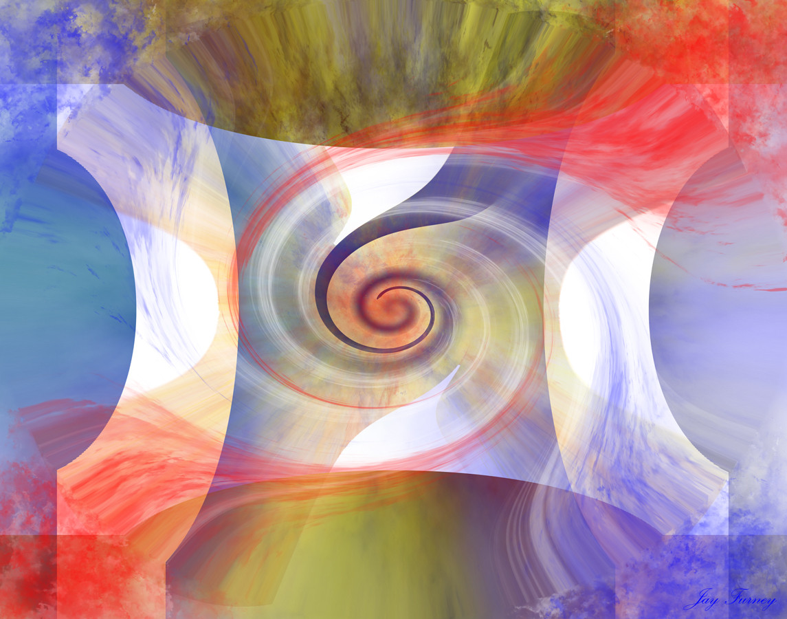
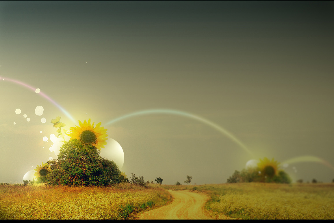
 mp0 — Toxigen

Published: 2006-03-05 02:14:14 +0000 UTC; Views: 4382; Favourites: 101; Downloads: 947
Redirect to original
Description
=adit vs =mp0vs
Go give him a
 [link]
 cubicflow.net
Related content


Comments: 92


this might look better with more of a dynamic crop. Im not saying it doesnt look good right now, it looks great. but if it were cropped horizontaly, it might give it more of a "dynamic" feel. Overall, quality is amazing, concept is great. well done
")
👍: 0 ⏩: 1

o.O lol it's landscape though ?
👍: 0 ⏩: 0

I don't feel this one is blended enough to see it as one piece of finished work. I have commented previously on the other deviant's part of this piece, which I thought was really good. While I thought it might have needed something else or was lacking a bit of content somewhere, I don't know how this all fits together to make up for that. However, I think your design is very nicely done and the colors are teriffic.
👍: 0 ⏩: 1
blending isn't part of the concept
👍: 0 ⏩: 1
But it doesn't look like it's part of the piece at all. Know what I mean? It looks like your part of the design is just kind of sitting there, not really adding to the composition really at all. Maybe I'm interpreting it wrong. I think your other stuff is fabulous, just this piece.... it looks "incomplete" or something.
👍: 0 ⏩: 1
the idea was abstract vector with terragen, thats the smoke coming from the train the concept was pollution, yes you are wrong
👍: 0 ⏩: 1
First of all, while I did not say the piece sucked, which it doesn't, you have failed at executing the concept you had in mind. Sorry, that's my opinion. Which *you* opened yourself up to by posting your thumbs in my forum
Second of all, if you do not want, or cannot take constructive criticism (which I can safely arrive at the latter conclusion just by reading prior comments), then here's a concept... change your settings to "critique discouraged".... it's really that simple.
And finally, most artists like to hear what others see in their work or do not see. This helps so that they may use that information in future work to improve if need be. Apparently you are not one of them. So here's yet another concept.... post your thumbs only in those forums that offer "comment for comment" type deals. That way you are sure to get the lame "wow", "cool", or "dude that's really awesome" type of comments. Or, better yet, check the activity of the person who started the thread to see what kind of comments they give out. That way if they like to actually help artists with the improvement of their work, versus helping them get mega meaningless comments, you'll know *not* to post your thumbs
Sorry for the misunderstanding. Hopefully if you follow my advice and refrain from posting your thumbs in my forums, it won't happen again. Or, if I see your name and remember you as the one who only likes the lame comments like "wow" and "cool stuff dude" I will try to ignore you.
Have a nice day
 (Wink)")
👍: 0 ⏩: 1
lol, terragen and vector. yeah.. comments are fine, but don't try to go on and on about the blending when you don't know what your talking about.
👍: 0 ⏩: 0

wow this is amazing, ilove how it al comes from that lil train
👍: 0 ⏩: 1

I like how the two styles have been blended, this is excellent!
👍: 0 ⏩: 1

Oh how I love this, the flowers colour fit so well with the photograps' colours. Wich it was big enough for a wallpaper, ah heck I'll use it anyway.
👍: 0 ⏩: 1


thats a nice re-working of his render. I like it. I saw this and thought u were like...ripping it, but it turns out it was a collab, lol. I just dont see this piece in =adit 's gallery, lol. Oh well, nice abstract.
👍: 0 ⏩: 0

killer design right there, a little** contrast over all maybe.
👍: 0 ⏩: 0

Terrain and blending= awsome. But the vector work slashes that awsome subtlety into half. *oww*
It's not bad, just not the mood expander for this landscape.
👍: 0 ⏩: 1

Like this one , it looks just perfect with the background .. NICE
👍: 0 ⏩: 1
thanks alot ^_^
note me when your ready to collaborate!
👍: 0 ⏩: 1
Yes I will , when my next drawing done .. ^__^
👍: 0 ⏩: 1

")
👍: 0 ⏩: 0

excuse me, but a little bit of constructive criticism would be nice
👍: 0 ⏩: 0


thats cool...i wish i could do that. your work always has a delicate something to it with the lines and stuff...i dont know if thats the right word but thats what i like about them the most...
👍: 0 ⏩: 1

Neat...I wish all of the pollution around here looked that cool
👍: 0 ⏩: 1

Nice work... im not sure this is a new style of art though, check out [link]
👍: 0 ⏩: 1
agreed, this is one of my favourites ")
It's not like a "huge development" some people have done it before.. but not as good as we will
👍: 0 ⏩: 0

started off in illustrator
👍: 0 ⏩: 0

Very nice, this one since it's a new style, might need a DD. I really like the concept of this.
👍: 0 ⏩: 1


this a great piece of digital art. I feel you could have merged Vector with the terrain alot more to make it look more effective and blended. this is still very nice.
👍: 0 ⏩: 1
i like it how the smake turns into the vec art.  (Smile)")
👍: 0 ⏩: 1
| Next =>