HOME | DD
 mqken — VeloStratus - Final Version

Published: 2007-06-20 23:30:17 +0000 UTC; Views: 1644; Favourites: 22; Downloads: 37
Redirect to original
Description
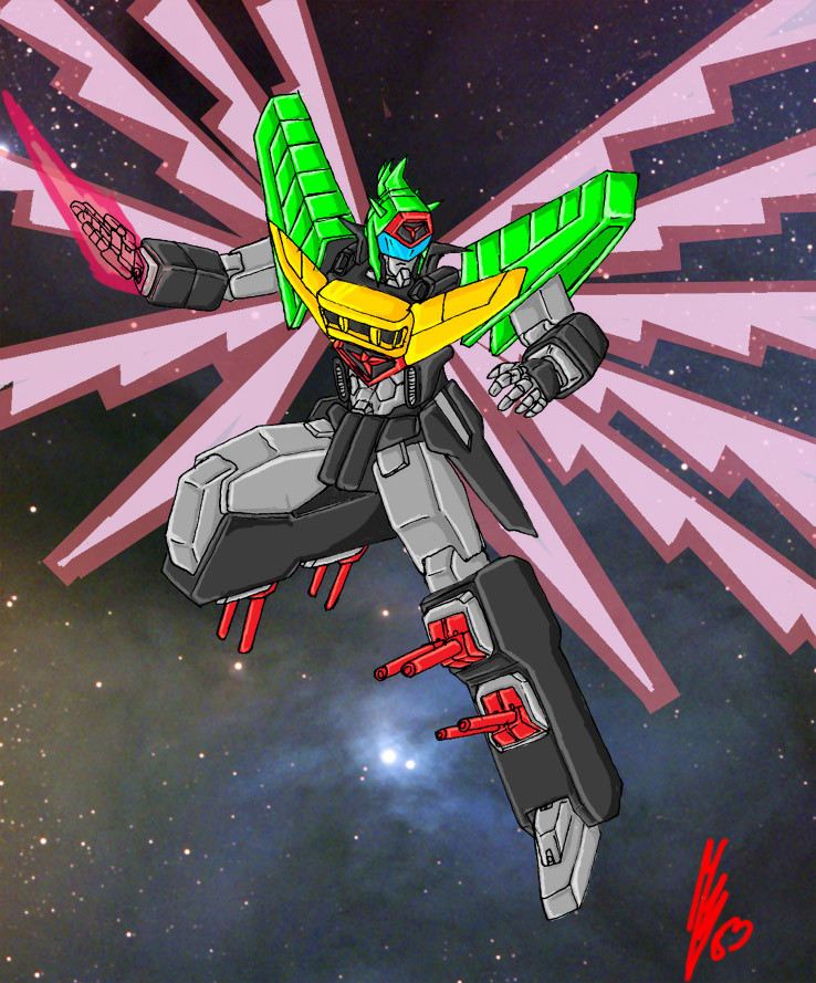
This is the best Mech Drawing I've ever done so far.My finalized version of the Stratosvelo mech is finished. From the original version I added 2 more wings and changed the head since it looks like a freaking mohawk. I rele like it and I hope anyone who looks at it will like it too
 (Smile)")
Heres the original version - [link]
Equipped with 2 retractable heat scimitar on both arms.
Laser guided machine gun on both hands (altho not in this pic) , 2 explosive dagger in it's lower thigh.
1st mech in my Stratus mech series (gawd they look like gundams, mebe i should put in fanart.....NAH)
Related content


Comments: 10

looked so cool... but I'd rather [link] than this one...
however it's only my preference...
It looked so much cool anyway...
")

👍: 0 ⏩: 0

Well, you started with Eva/gundam, and ended w/ Macross plus! 
If you don't mind some criticism, I have some suggestions:
-You don't need to double up on your linework. Perhaps you're imitating someone's style, but I don't think it's helping out much. Your mech designs will be crisper and cleaner w/ just single strong coherent strokes
-I notice alot of soft feathery edged shadows in your color work. In my opinion, you don't need them so much. Maybe OK on character design, but mechs tend to look better w/ hard edged shadows. Especially desings that are more box and gundum-like such as yours. Soft edged shadows indicate a curve, and you don't have too many here. Study this guy, here's got it down: [link]
-You could do more to emphasize form with your color shading. Pick certain dimensional planes for lighter tones, and others for dark. You did it well on the upper left orange shape, but on the lower right, the whole leg seems in shadow w/ just a few soft patches of light that don't make much sense. Here is a great example of my point: [link] Even though this artist used a cell shading program, it illustrates the correct behavior of light on geometric surfaces. You can do roughly the same w/ just two tones in grayscale.
That was alot. Hope you're OK the advice. I think you have great potential!
👍: 0 ⏩: 1


no, if i did all on computer it would take me much longer, hello? no tablet.
👍: 0 ⏩: 0

whoa... very nice ur improvement is significant but i fink the torso and the pevis stick out too much but thats just me
👍: 0 ⏩: 0

OMFG AWSOME FANTASTIC AMAZING MASTERPIECE
YOU DONE IT AGAIN MY OLD FRIEND
BRAVO MASTERLY
👍: 0 ⏩: 1