HOME | DD
 Mr-Frenzy — Insomnia - inColors version
Published: 2004-12-20 12:26:35 +0000 UTC; Views: 14050; Favourites: 278; Downloads: 5451
Redirect to original
Description
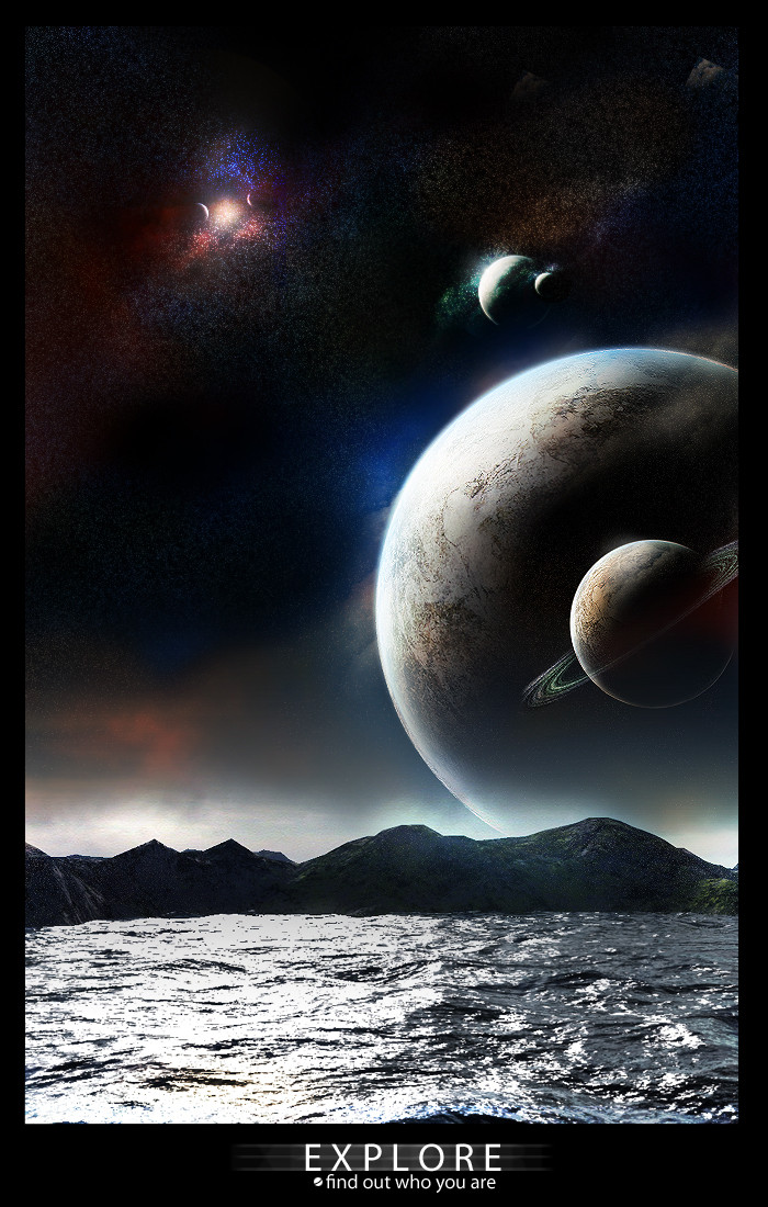
Someone asked to c Insomnia without the mono so, here's Insomnia in colors or should i say non mono (Wink)") . I had some difficulty balancing the colors and thats why i originally posted the mono version, I dont know wich one i like the most, mono or non mono, you find out guys. Well. Hope you like it.
. I had some difficulty balancing the colors and thats why i originally posted the mono version, I dont know wich one i like the most, mono or non mono, you find out guys. Well. Hope you like it. 
Foreground stock + people stock.xchng
enjoy
Related content


Comments: 120


the first version of photo was my wallpaper for 4-5 months , great job again
cong
👍: 0 ⏩: 0

Wondrous! I like this one better, I must say. The sunset colors work very well with the spacescape.
👍: 0 ⏩: 0

this is amazing. brilliant. really interesting. ")
👍: 0 ⏩: 0


I wish I could be standing there looking at a scene like that. Simply amazing work once again!
~Dave
👍: 0 ⏩: 1


OMG :excited OMG 
👍: 0 ⏩: 0

Fav+ reminds me of Finalfantasy, i'd love it if there was a place where you could see it like that
👍: 0 ⏩: 0


awesome work! I think I enjoy this one more than the other (mono), I think you did a great work with colors, specially in the sky...
i'm gonna keep watching your work... its great, and I also love planets and stuff...
👍: 0 ⏩: 0


Awesome sense of scale you've captured here, it's really great. One of the best I've seen in a semi-space scene like this. I also love the way you've made the whole image realistic ( heh )... the top of the planet is visible in the darker section of the sky, but where the sun is still setting less of the planet is visible!
No need to say more, except keep it up!
👍: 0 ⏩: 0

The colors contrast very well, and I absolutely love the sky.  (Smile)")

👍: 0 ⏩: 0


thats freaking amazing . . . whens the next flight for there leaving?? I dont want to miss it . . .

👍: 0 ⏩: 0

you are the master i tried doing planets there about a week or 2 ago i found it so much fun it was great but no where near this level of expertise how long did this take you?
👍: 0 ⏩: 0

I don't remember if I commented on this before, and my computer is acting up. I just wanted to mention that I think this is beautiful, but in black and white, it would be very dull. I love the colors.
👍: 0 ⏩: 0

Oh I DEFINITELY prefer this version. The sunset colours are stunning and have the effects of making the whole picture look more real. Wonderful!
👍: 0 ⏩: 0


Wow. I think they both kick ass, the mono one seems more of a night scene whereas this one is a dusk kind of look. the planet in the back has a majestic feel in it's size. This is gorgeous stuff.
👍: 0 ⏩: 0


I think I like the colored one better; It looks like it could be a picture from some moon with an around a large planet, although I think that in an orbit around a planet like that one the people there would be seeing shooting stars every night.
👍: 0 ⏩: 1

yea, they probabally would, and the ring around the planet would be more eliptical, or the rocks would go round earth also,
but who am i to negitively comment a work as great as this?
👍: 0 ⏩: 0

I like everything but, the border just doesn't look as good IMO...
👍: 0 ⏩: 0

*haven't red the other comments*
This is fuckin kickass man. So goddam neat colour mixes, just totally beautiful.
The planet i think could have gone a little lower and mabye some more blurred shading in the water from it. Other than that it's really really really nice.
I wish that we had places like that.
Stunning work man. SUPERMEGA
btw, Merry Christmas br'o
👍: 0 ⏩: 0

I like this one a lot better, there is just a whole other dimension to the piece with the color. Always lookin good.
👍: 0 ⏩: 0


color! yay! haha
it's still really beautiful!! i love it!!!!!
(i like the purple-ish one better...but maybe that's cuz i like purple..haha)
👍: 0 ⏩: 0

Hmm... where do I start? The orange adds something so great to the piece. The planet is amazing, especially the detail of the rings. I think the stars are wonderful. The whole concept is great.
👍: 0 ⏩: 0

I love you work man it really is amazing. plz send me more stuff that you mkae when you make it cause i love it all.. you have a rela talent.
👍: 0 ⏩: 0


thanks for replying, anyways, i rally love this work. but i like the mono better, but nevertheless both are GREAT WORKS OF ART!
👍: 0 ⏩: 0


| Next =>