HOME | DD
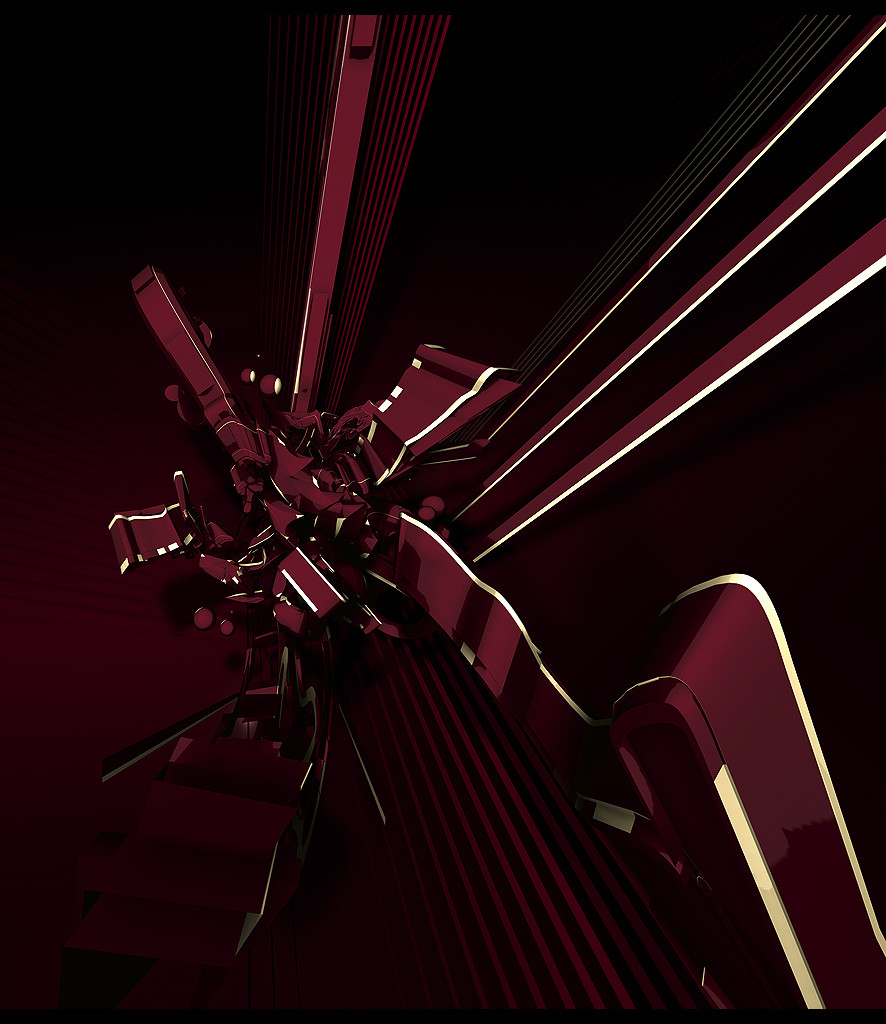
 Mr-Magic — saxofone

Published: 2006-11-20 16:36:19 +0000 UTC; Views: 1634; Favourites: 31; Downloads: 32
Redirect to original
Description
ex-plodeRelated content


Comments: 30


you think the name should be sexofone too?
👍: 0 ⏩: 1
 (Wink)")

your beautiful work always reminds me of those satelights in space (Smile)")
")
👍: 0 ⏩: 1


it's "saxophone" dear
teehee..nicely done though.
")
👍: 0 ⏩: 0

")
👍: 0 ⏩: 0


oh finally! and damn i like your titling style. it's good enough to be ripped. but hell, i'm not a ripper.
666 resolution. wo0
👍: 0 ⏩: 0

much better postwork
cody's?
still alot of unnecessary details with the render but u cant really change that now.
much better typo too...
see the top left of the piece? what bothers me is the sudden transition of that darker area, into the softer brownier colour to the left.... that imo ruins the atmosphere of the piece. not totally
i also think you could have afforded to crop some off the bottom
codys yellow detailing on the yellow bits on the render is still hot.
👍: 0 ⏩: 1
lol bitch. from what i showed you i did the postwork. but i have to say he did an awesome job too. and lmao. you always find something. sudden transition to darker area. lmfao.
thanks still. i love you.
👍: 0 ⏩: 1
its true though
and its easy to find things
i can find more if u like
👍: 0 ⏩: 1
compos in the left side is weaker and too heavilyweighted to the right
makes it look trendwhored
👍: 0 ⏩: 0


nice, I like the colors of the render, plus overall felling of the piece.
Missing something in the background, maybe the color isnt the right one!
but great work!
👍: 0 ⏩: 0


Okay, I'm faving.
But maybe iam just jealous that i dont have many watchers, and not many ppl to comment/fav my pieces
👍: 0 ⏩: 0


really nice !!! title fits perfectly like dremddl said, lovely!
👍: 0 ⏩: 0

Very good.
I like how the title is fitting the lines, they look like a note lines..its good
👍: 0 ⏩: 0
