HOME | DD
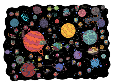
 mrdynamite — space poster

Published: 2011-05-02 21:10:12 +0000 UTC; Views: 10437; Favourites: 257; Downloads: 429
Redirect to original
Description
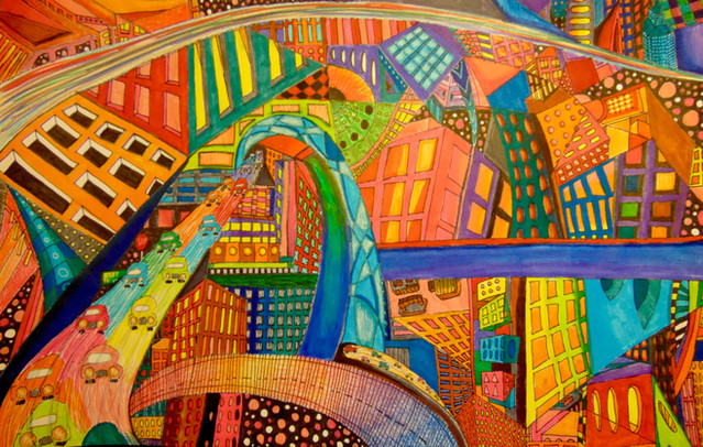
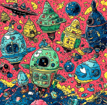
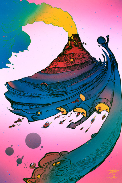
this was just a test... first attempt, it is way too busy and too colourful for a poster and i haven't put all the info on there, its just to get the idea across. going to do some other versions. But it was lots of fun to draw anyway.Here is a red version: [link]
still DOWNLOAD FOR FULL SIZE so you can see all the creatures lil faces.
Related content
Comments: 17

i love your work SO MUCH. tbh i love busy posters, i like when there is lots to look at (i need this on my wall)
👍: 0 ⏩: 0

Too busy for a poster? Maybe you should check out MY gallery!
In my opinion, the longer you ca keep 'em looking, the more successful the poster.
This is great by the way.
Incredibly Trodheim-esque.
I love the lazer hands, by the way.
👍: 0 ⏩: 0

I like the red one best... although halfway between both would probably be my favorite. I love all of your drawings so much....
👍: 0 ⏩: 0

very, very, very awesome. you may be right about the business from a design standpoint but as a chunk of art its wicked.
👍: 0 ⏩: 0

I like it and do not think it is too busy for a poster. If I walked into someones house with this I would go to it and oogle! Constructively though the darker spaces and wobbly lines to the left throws it off a little orientation wise. I tried to stop it but my mind kept saying where's the lil creatures n stuff on the left side D:
👍: 0 ⏩: 1

thats a good points, i might put some more in the left for better balance
👍: 0 ⏩: 1
