HOME | DD
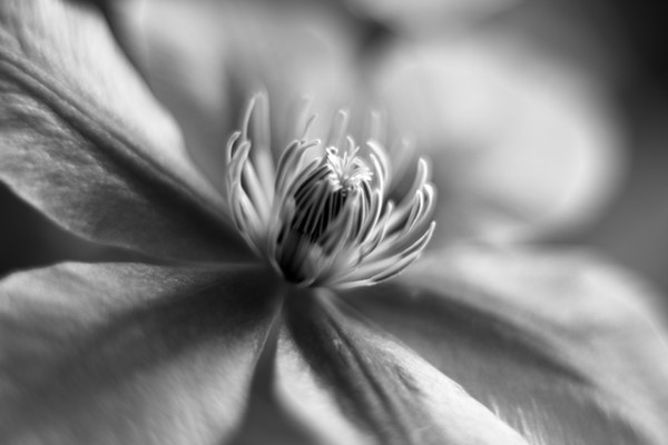
 mstargazer — Clematis I
Published: 2009-05-20 23:30:42 +0000 UTC; Views: 1340; Favourites: 123; Downloads: 0
Redirect to original
Description
A new Clematis for my mail box/postbox ..I love the purple and pink of these flowers but I liked it more in monoRelated content


Comments: 67


Featured here - [link]
Have a wonderful day!
")
👍: 0 ⏩: 1

Thanks John you are a sweetie
👍: 0 ⏩: 1

Thanks John, I am a bit slow this week

👍: 0 ⏩: 0

👍: 0 ⏩: 1

You're so very welcome.
👍: 0 ⏩: 0

Very nice. I like the selective focus and the b/w tones.
👍: 0 ⏩: 1
Thanks Mark, glad you like this one, I liked the results as well
👍: 0 ⏩: 0


 (Smile)")


Dreamlike, espcially in mono. sometimes the colors of plants and flowers can overpower the delicacy and shapes of the object and using the mono here really emphasises the beautiful shape of the petals xx
👍: 0 ⏩: 1
I am going to do a news article of nature in mono or maybe flowers in mono.. after I read this comment I was like,Char is right, brings out details that sometimes get missed..
👍: 0 ⏩: 1
Well.. the way I see every monochrome image is that in comparision to the color version the colors are missing (dohhhhh big time lol). What I mean is that in the color version the eye sees just that.. the colors.. either faint and subdued or bright and in your face. Not many people look beyond that. But in a mono image that initial wow effect isnt there and one has to look deeper and more closely at the image to find out what the artist was trying to portray. So you look at the shapes within the image and compostion of it to figure out what its all about. xx
👍: 0 ⏩: 0


Thank you Rik, glad you like it
👍: 0 ⏩: 1

 (Wink)")
there's that word again, I do love it!
👍: 0 ⏩: 1


MOND-blowingly aazing...wow, the textures are eccentuated beautifully by the monochromatic scheme...
👍: 0 ⏩: 1
Thank you for the very kind compliment, I appreciate it
👍: 0 ⏩: 0


Thank you Jonathan, appreciate the kind comment
👍: 0 ⏩: 0

I love clematis!
But every one I plant commits suicide

👍: 0 ⏩: 1
me too, I am worried but I think this might be the year 

👍: 0 ⏩: 1

Thank you Chris, nice to see your kind comment here
👍: 0 ⏩: 1

You are welcome dear.
👍: 0 ⏩: 0

I think it works perfectly in B&W. So many coloured clematis submitted. I have some myself that I bet would have worked, given the B&W treatment.
👍: 0 ⏩: 1
upload em' always like to see what you have under the sheets

👍: 0 ⏩: 1
| Next =>