HOME | DD
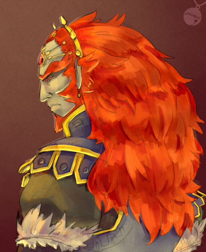
 Mudora — The Imp and Wolf

Published: 2011-11-06 22:22:18 +0000 UTC; Views: 3819; Favourites: 163; Downloads: 47
Redirect to original
Description
A newer and shiner version of this old piece of crap.Needless to say, I'm digging the newer one better.
Man I love revamping older works. Really shows how far I've gotten as an artist.
Edit:
Guys, FYI... the old one sucked. Just so you know. It's awful. It did not capture my vision of it at the time of creation, therefore, it was a failure. Sorry to those who like the old one better, but... honestly? Yeah. Older one would not get me a job, lets just say.
Related content


Comments: 30

I love Link's face. It really doesn't help that my fan-portrayal of Twilight Princess casts him as a real grouch. XD
Compared to the older version, I like this one better. The faces are much better formed, and the expressions feel they have more "oomph" behind them. I also like the addition of Link having pointy teeth. <3
👍: 0 ⏩: 0

I decided to randomly take the time and compare them both to give a brief assessment...not that it really matters what I think, but I'll do it anyway. XD
I think I like the edges on Link's face on the old one better, but it's pretty obvious with the rest of the things in the new piece that you've improved. The shapes of their faces are more realistic and less out of proportion, and that's always important. Something I noticed, however, is that in the old piece there was more detail on the clothing than the new. It's kind of odd seeing it on contrast to the upper half?
👍: 0 ⏩: 0

 (Smile)")

ahhh beautiful painting, mudora! <33
I love link's expression! It's definitely wolf-like hehe! <333
And midna's faceee is so pretty! > u <
👍: 0 ⏩: 0

Well done! I love when I see improvement and growth from past works! My absolute favorite of this new drawing is their expression. I love how you interpret Link by making him look demonic/animalistic (for obvious purposes), but still wonderful to see!
👍: 0 ⏩: 0

I ESPECIALLY love the changes in Midna. Wow. So striking.
👍: 0 ⏩: 0

Wow, I love this one! I really love the expression on Link in this one, it really does capture the "beast" in him. I love the colors as well. It's interesting to see improvements in such a short time.
")
👍: 0 ⏩: 0


I love both really! *.* I always love your works. And you may think that you didn't capture emotion in the other drawing, but it's there, at least you can feel a bit.
The bright colours are just WOW! Love it. *.*
 (Wink)")
👍: 0 ⏩: 0

Oh wow that's amazing : ) Love the shading : )
👍: 0 ⏩: 0

I think I like both equally lol.
The first one feels more in-character, but this one has the emotion really potent in it so...
I love your work always, anyway!
👍: 0 ⏩: 0

I love your Painting Style!! Its so great! You give me inspiration!
👍: 0 ⏩: 0

Midna's much better in the new one. Honestly, there are things I like better about link in the old one. It's a very good expression (in the new one), but I think my problem is that it doesn't feel suitable to the character.
but like I said midna is like 100 times better in this one
👍: 0 ⏩: 0


Heh, when you said that 'old piece of crap' in reference to its older version, I am just over here looking at both and just hanging my head in shame of how that your piece of crap is better then anything I've yet to drag out of digital art... 
But in context to the picture I think its cool how you revamped it. I like them both, you just know I am sucker for designs on a person... as Sea prooves over and over, the colors in the other one I certainly think are darker so they change the mood. But I really like this one too, Midna especially I think looks better in this one, she's much more elegant, the sharper angled features certainly make her more feminine in this picture and mysterious but with an edge of danger and she's got a great contrast between her skin tone, her eyes and her hair. And Link.... sorry I KNOW he's serious but the grrr face! I just hear puppy growls in my head!
👍: 0 ⏩: 0


I dunno I prefer the original but this one looks technically better, the shapes of their faces here are more defined(I'm not sure if that's the correct expression) it's more three dimensional since light and shadow are better placed.
I think what I prefer on the old one is the way she looks at him since it goes better with the title of the pic it's more "impish"(does that word even exist) on the new one it's more like someone took a photograph and she's posing for it, compared to Link her expression is more neutral
And I prefer the greenish shades in the old one but that's just a color thing.
👍: 0 ⏩: 0

Well, I like the Twilight effect on Link's face.And I like Midna's smile, as though she's pleased with his "Twili-fication".
👍: 0 ⏩: 0
Well, I like the Twilight effect on Link's face.And I like Midna's smile, as though she's pleased with his "Twili-fication".
👍: 0 ⏩: 0

I kinda like the other one better but this one is pretty cool too
👍: 0 ⏩: 1

as I asked another deviant, why do you like the older one better?
👍: 0 ⏩: 1
The colors are brighter, there is more detail in the other one and the textures look alot smoother to me.
👍: 0 ⏩: 0


great improvement indeed! love link's skin color and how you did his hair.
👍: 0 ⏩: 1
LoL his skiiiiiin. XD Thanks a ton. Glad you like it
👍: 0 ⏩: 1
lol what, you had trouble painting his skin? and you're welcome!
👍: 0 ⏩: 1
No, not really... I just like it too. XD The folds turned out nicer than anticipated.
👍: 0 ⏩: 1