HOME | DD
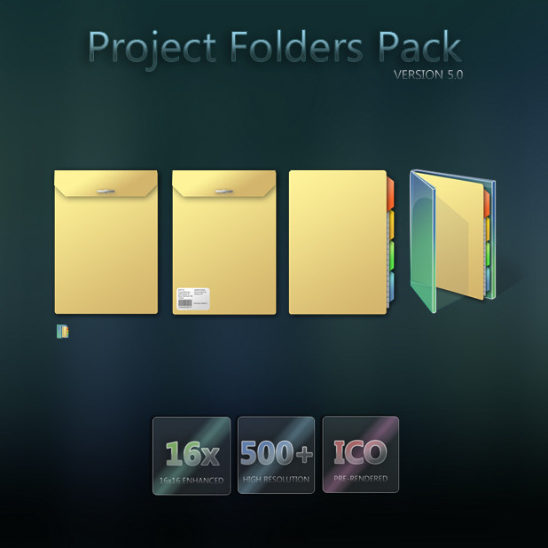
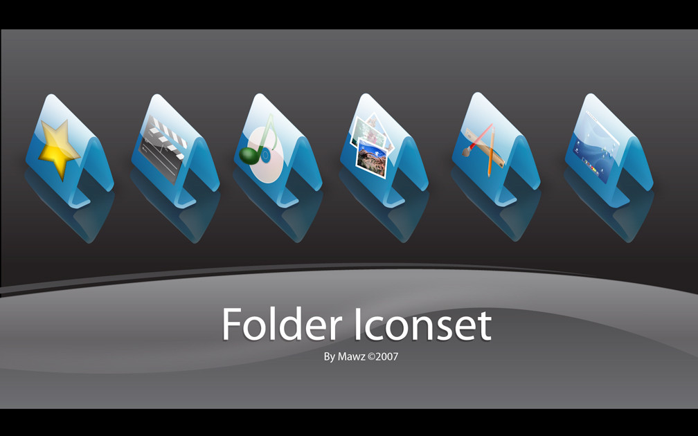
 Murakumon — Project Folders Pack
Published: 2006-11-24 21:22:09 +0000 UTC; Views: 94338; Favourites: 193; Downloads: 38233
Redirect to original
Description
4 ICOs, Vista Compatible (Smile)")
A Collection of icons to organize your various projects, with special 16x folder for my projects folder, and vista compression ICOS. I would highly recommend that if you downloaded pervious versions you download this.
P.S. Thanks to -`kol and do-xam for helping with vista icons
*UPDATED 12/07/06* -- FINAL RELEASE
Related content


Comments: 23

Oh My GOD, these are the cutiest things I've ever seen!!!!!
👍: 0 ⏩: 0


Shame there's no update to the Win7 visual style. Would be great to have a library tile version of Projects Folder.ico, etc.
👍: 0 ⏩: 0


It looks too small, can you make it a little bigger? Maybe it's the spacing someone mentioned...
👍: 0 ⏩: 0


Those are beautifully done. But...are you serious? Vista uses "ICOS"? O_o looks a tad close to the Mac "ICNS" icon suffix.
👍: 0 ⏩: 0


i didn't give much thought to the spacing, i think they look good next to the real vista icons, I am somewhat disappointed of how useless they really are, i wish i could add "Projects Folder" into the create new right-click menu. Kinda a pain to change each folder's icon. Thanks for all the comments
👍: 0 ⏩: 0

Real nice, though they appear small due to "blank" gaps between the upper and bottom most edge of the icon canvas and the images themselves... in 48x48, for example there is a 3px gap on either end... folders of this style tend to go to the edge as like I said they would look small. The design's good. I dig 'em even though they are small, however I'm gonna stick with my M$ Vista icon packs.
👍: 0 ⏩: 0

Thanks for the comments
👍: 0 ⏩: 1

")
 (Wink)")


I love the verisimilitude; they really do look like manilla folders and envelopes. The shading on the tabs is excellent, as is the college-ruled paper peeking out.
I can't wait to see more.
👍: 0 ⏩: 0


Download Link Fixed (I Think) Thanks Janniegirl
👍: 0 ⏩: 0