HOME | DD
 MushiXD — Another small step...
#manga #monochrome
Published: 2017-07-11 01:46:58 +0000 UTC; Views: 555; Favourites: 14; Downloads: 5
Redirect to original
Description
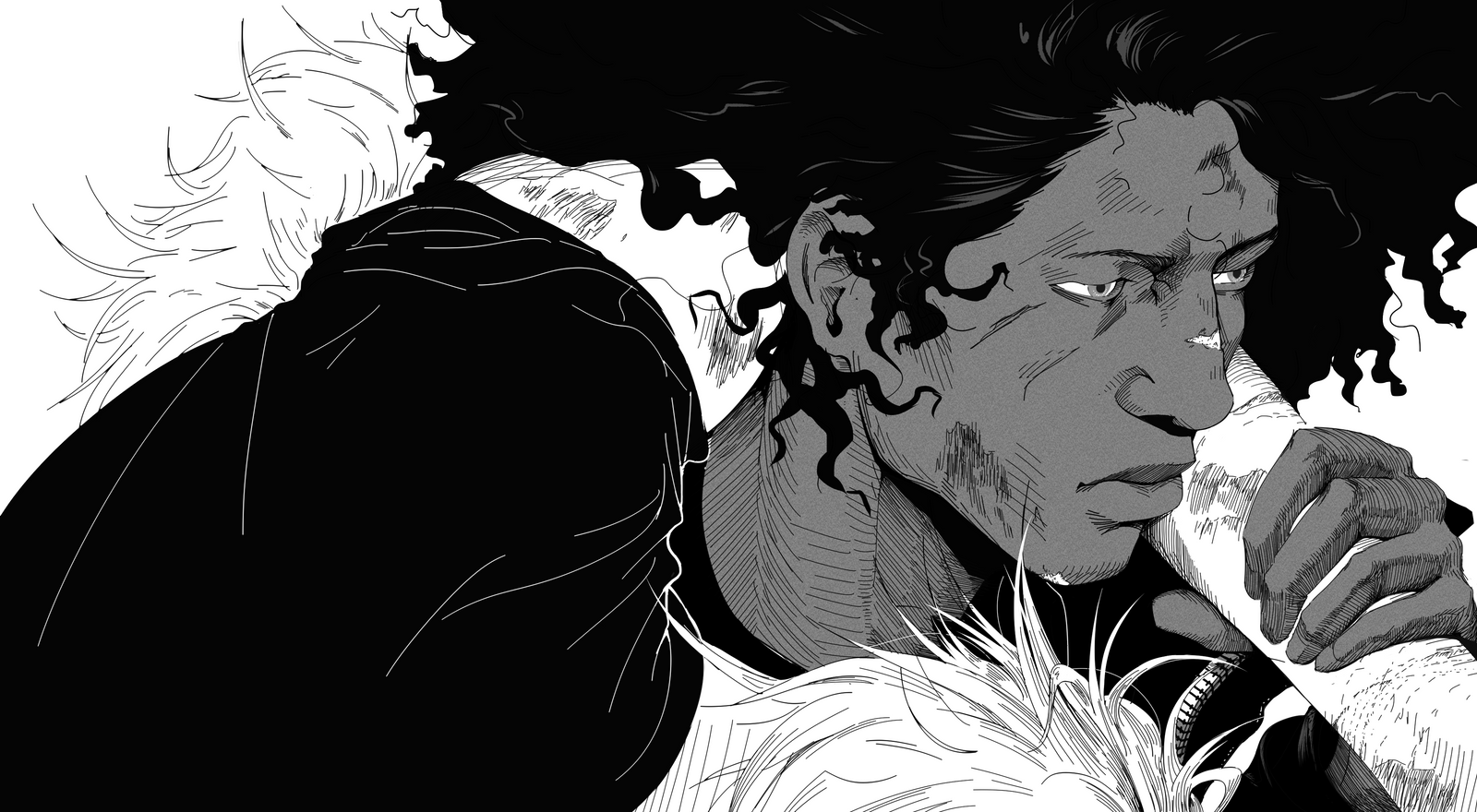
Once again still figuring things out for my manga.Firstly this is entirely inspired by this frame from Jojo's bizarre adventure: Diamond is unbreakable.
When it comes to the lineart i used the "felt pen" tool in clip studio paint. It has no size or opacity variation so every line is of uniform width from start to finish.
Where there are thicker lines this was achieved by either doubling up over a line or increasing the brush size, and of course occlusion shadows were drawn first
then colored in as opposed to allowing the brush weight to dictate this as before. This allows for much more control and deliberate line work.
Hatching got a bit hairy on the neck and hand but this will be something i'll iron out over time. Maybe Takahiko Inoe's method of defining shadow shapes first
before hatching could be useful in avoiding this in future.
I wanted to keep the tone simple, so i limited it to 3 values. Or so i wanted - It became four. Black, white, 40% gray and 70% gray.
The texture was achieved by using the "perlin noise" filter in clip studio paint which is preferred over the standard Dot or line screen tone.
Not sure how you would replicate this in other programs as of yet.
Overall i think this method looks slightly more mature, however i do want to try using a bit of line variation in future attempts.
It's definitely a step closer to what i want at least.
There are some minor inconsistencies with regards to the plot, specifically the clothing both characters are wearing and the length of the hair. This is solely because
i thought that making it consistent wouldn't serve the composition as well.
Most importantly, this has mainly been a note to myself, but if you did read this, Thank you for your time.
Related content


Comments: 7

👍: 0 ⏩: 0


this is a really great art style, i rly like the variety of styles you use in your work.
👍: 0 ⏩: 1

That's very kind of you. Thanks.
👍: 0 ⏩: 0

I can't give you a proper critique since you're far more skilled than me, but I'd say two of the fingers look swollen and the sternocleidomastoid muscle looks too large?
Beautiful work either way though. : )
👍: 0 ⏩: 1
Thanks. It's funny that you should mention the fingers as i did end up shrinking the two smaller fingers very late into the drawing. I am awful at drawing hands and even when posting this i thought that the distal phalanges of all of the fingers save for the one closest to his face are all too small. I didn't quite notice that the fingers i didn't shrink were now out of proportion which i definitely do see now.
Another reason why they appear swollen could also be due to the hatching technique i used. For some strange reason i have a hard time estimating the confines of shadow shapes when hatching, and it's actually a problem i'm having with the piece i'm working on now. That also includes not being able to get a gradual or natural transition from light to dark tone, which is why the fingers are the only place where you see core shadows. I don't really think the lighting conditions would create shadows of that kind and really they were just implemented to mask my poor hatching... with even more poor hatching...
When it comes to the sternomastiod muscle once again i definitely agree. It should taper off towards the bottom. I think reason it ended up as a consistently thick form is because when hatching i tried to follow the line i had previously defined in my line art, when i really should have redrawn it and as i say tapered it towards the bottom. The form appears to protrude out from the neck a bit too much. This is probably due to the fact that the throat area looks to be too narrow. The hatching really should have been at a bit less of an angle to denote a wider form that could actually accommodate the sternocleidomastoid as opposed to making it appear like a bulging extremity.
Lastly allow me to offer a small critique of you critique. You do not need to be of a higher skill level than i to correctly identify my mistakes as you have done. It may have been a bit more of an apprehensive measure but i assure you, do not worry. Your feedback is greatly valued.
Thank you for taking the time to offer this critique. If you have anything to add please...
Feel free.
👍: 0 ⏩: 0
As always critiques are not only welcome but encouraged.
👍: 0 ⏩: 0