HOME | DD
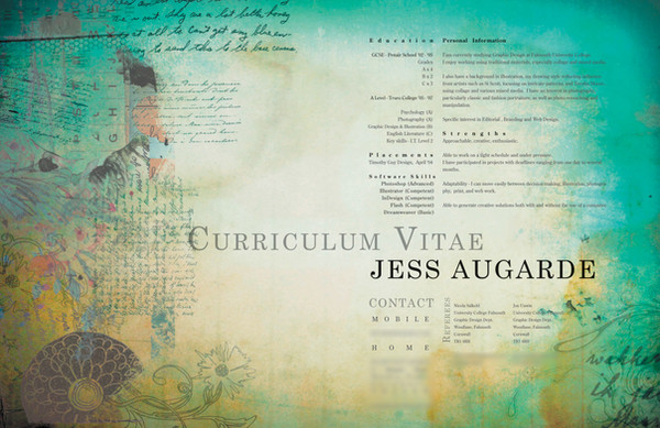
 myspeedofdark — Creative CV
Published: 2009-06-11 21:10:57 +0000 UTC; Views: 12213; Favourites: 32; Downloads: 0
Redirect to original
Description
I would really love some detailed feedback on this one.Am entering it into a Creative CV competition at uni -
'The CVs will be judged by a panel of careers staff, tutors and industry professionals.
Judging criteria includes: content, layout, structure, visual interest and originality of design.'
Any thoughts on the above criteria would be amazing - particularly the layout of the text...and whether the background illustrations need to be toned down at all...
Thanks

Related content


Comments: 19

Wonderful!!!!!!! Could you please email it to me? that would be great!  (Smile)")
👍: 0 ⏩: 0

Wow. it is Great... Can you send a copy of your fantastic Work at: keepsecret784@gmail.com.... Tnx in Advance...
👍: 0 ⏩: 0

hello you can aloud me to used please.tell me how i can edit thanks xxxx
👍: 0 ⏩: 0

oh this is too beautiful. I want this! can I please use it??! freeagentii@gmail.com
👍: 0 ⏩: 0

Hi great effects could you please send the template to me i would be grateful Thanks
Raydearden@yahoo.co.uk
👍: 0 ⏩: 0

It is amazing! It is possible to get this temple in version which I can edit ??:> I hope that yes Please, send it: picobellawela@gmail.com
Thank you!
👍: 0 ⏩: 0


veeeeeeeeeeerrrry beautifull,how u do it?i want to make a cv like that ,can u give me an advice ? thanks and keep on !
👍: 0 ⏩: 0

This is the best CV I have ever seen. I'd probably hire you without even reading it.
fdmnkjgfgd it's gorgeous. I can't offer any critique, because what i was going to suggest has already been suggested.
But anyway, it looks gorgeous. I love the colours and textures. Everything has been put together so well. <3

👍: 0 ⏩: 1

Aww, thanks Laura!

👍: 0 ⏩: 0

The layout is excellent. It has a great grid format without being static.
The thing that drew me into the piece was the blue, especially in the upper right side of the piece. I think it's perfect that you placed the info right at that corner to immerse the reader at that curve.
The only thing I have critique-wise would have to do with the cursive writing near the education and training section. I would like to see a little bit more white space between those two elements. If you look at the rest of the document, the only other time that elements come that close to each other is if it's in the same paragraph.
👍: 0 ⏩: 1
Thanks
I agree, I think I will move the cursive text to the left slightly, I didn't notice how close it was.
Although there is another place that the text touches the illustrative side (see the 'C' of Curriculum Vitae?).
I think I like it overlapping a little there though... what do you think?
👍: 0 ⏩: 1
I think that it works because the illustrative side text is less opaque than the C. Maybe if you lightened up that illustrative text a little more, or darkened the Curriculum it might work even better. I suppose you could try moving it as well to see if it works even better.
👍: 0 ⏩: 0

This looks absolutley superb!
The colours compliment each other, the textures are complex and interesting; visually asthetically it is amazing.
The only problem I would find is that I can't see the information, as the text looks a bit small from this distance.
👍: 0 ⏩: 2
Thanks!
Yeah I kinda wanted the text to be abit unreadable, so people would focus on the layout and overall look, rather than be reading my GCSE results and so on hehe. The competition entry will be full size though obviously (and at that size its perfectly readable, so thats all good)
Cheers for the feedback
")
")
👍: 0 ⏩: 1
Oh, if that's the case, then brilliant. Best of luck!
👍: 0 ⏩: 0
*I didn't mean to put visually as well as asthetically.
👍: 0 ⏩: 1