HOME | DD
 MysticSparkleWings — Meet the Artist 2.0 (+ Intro Video!)
#aboutme #artist #digitalart #emogirl #illustration #persona #procreate #ui #artmeme #gettoknowme #photoshopcc #selfportrait #meettheartist #meettheartistmeme #meettheartist2022
Published: 2022-09-27 17:00:59 +0000 UTC; Views: 8012; Favourites: 26; Downloads: 0
Redirect to original
Description
My Website | My Book | Commission Info + Prices | Ko-Fi (Now with Membership Tiers for as little as $1 a Month!) | dA Print Shop | RedBubble | Twitter | Tumblr | InstagramFinally, after what feels like 10,000 years, instead of just lightly updating My Original Meet the Artist Sheet , I have a whole brand-new one!

And not only did it take forever for me to get around to making it, the actual process of making it also took forever!

 The earliest piece of the project [the drawing of me in the center] I first started, according to Procreate, on May 2nd. And I was hoping to have the entire thing finished sometime in early June at the latest.
Clearly, that didn't happen. I don't really know how to explain why. It was just so hard to decide...well, kind of everything I guess. What should the whole thing look like? What things should be included? What should I be wearing? What should xyz smaller element look like? What patterns/background should I use? And about 5 million other questions like that, on and on, for a small eternity. And unsurprisingly, I could keep tweaking and adding and changing things for probably the next 50 years and still not be sure it's "done."
Likewise, I don't really know where to begin talking about the full project in more detail, either.
 So I'll simply start with what prompted me to finally get started after so long of (at first happily, later begrudgingly) updating the old version being "good enough;" The Intro Video I mentioned in the title !
 I originally made the Intro Video for a few different reasons. Primarily, I was just messing around in an App called Canva on my iPad while I waited for some paint on a completely unrelated project (currently on hiatus) to dry. If you don't know what Canva is, my best descriptor is "Diet Photoshop." I first heard of it as a "free, easy" way to make your own book covers while I working on Drawn like a Magnet, and ever since then, the name seems to pop up almost every time I do a Google search for something graphic-design related. I downloaded the iPad App on a whim just to see what it could do.
While I was in there, I noticed Canva had some video templates, which I wasn't expecting at all. I bumped into one that I think was designed to go on a website on a "meet the staff page," and I liked its presentation so much it set off tiny alarm bells in my head: Maybe I could use it to make an Intro Video for my Ko-fi and a Channel Trailer for my YouTube Channel.

Those two video "needs" never really mattered too much to me before, and they still really don't, but it was a good enough excuse to take this project that would, presumably, really put Canva to the test for me.
I will say the project did teach me Canva has its limitations [I'm particularly annoyed by their absolute refusal to let you use your own fonts without signing up for a subscription, even on the computer version, while they also bafflingly don't have some of the basic, common fonts available] and so I still ended up moving the video into iMovie and adding a whole bunch of extra stuff [mostly sound-related]. But that doesn't erase the fact that the app still did prove its usefulness to me in that time, too.
And I'd love to tell why having a nice new Intro Video finally flipped the switch in my brain to start on a new "Meet the Artist" image, but I'm not quite sure myself other than...the concepts are kind of similar, I guess?

Whatever the case, that's what did it, and that's one of two reasons why I bothered taking you all through the Canva story.
The other reason is because when I started on this project, I had already more or less decided I was going to use Canva to help me lay as much of the foundation for the final piece as possible—mostly in the "graphic assets" department—so I'd have that much less to worry about making from scratch myself and this taking even longer than it was going to by default.
But I quickly realized a number of Canva's limitations combined with my own indecision meant that no, actually, Canva would only be taking maybe 25% of the workload compared to the 50-60% I'd previously thought.
I was able to use Canva mostly to quickly grab assets that would've taken me maybe 3x as long to hunt down on websites like Pixabay and Unsplash manually and...not much else, really.
I couldn't do anything with text in the app lest I be locked into Canva's weird font choices, some graphics have weird limitations on how you can resize them, some don't allow you to recolor them at all and some (again) have weird limitations about it, and I couldn't even resize the basic canvas without upgrading to a subscription.
It was at this point where my mind was made up about something I'd sorta been debating ever since the idea of making a new "Meet the Artist" first entered my mind (even before the Intro Video).
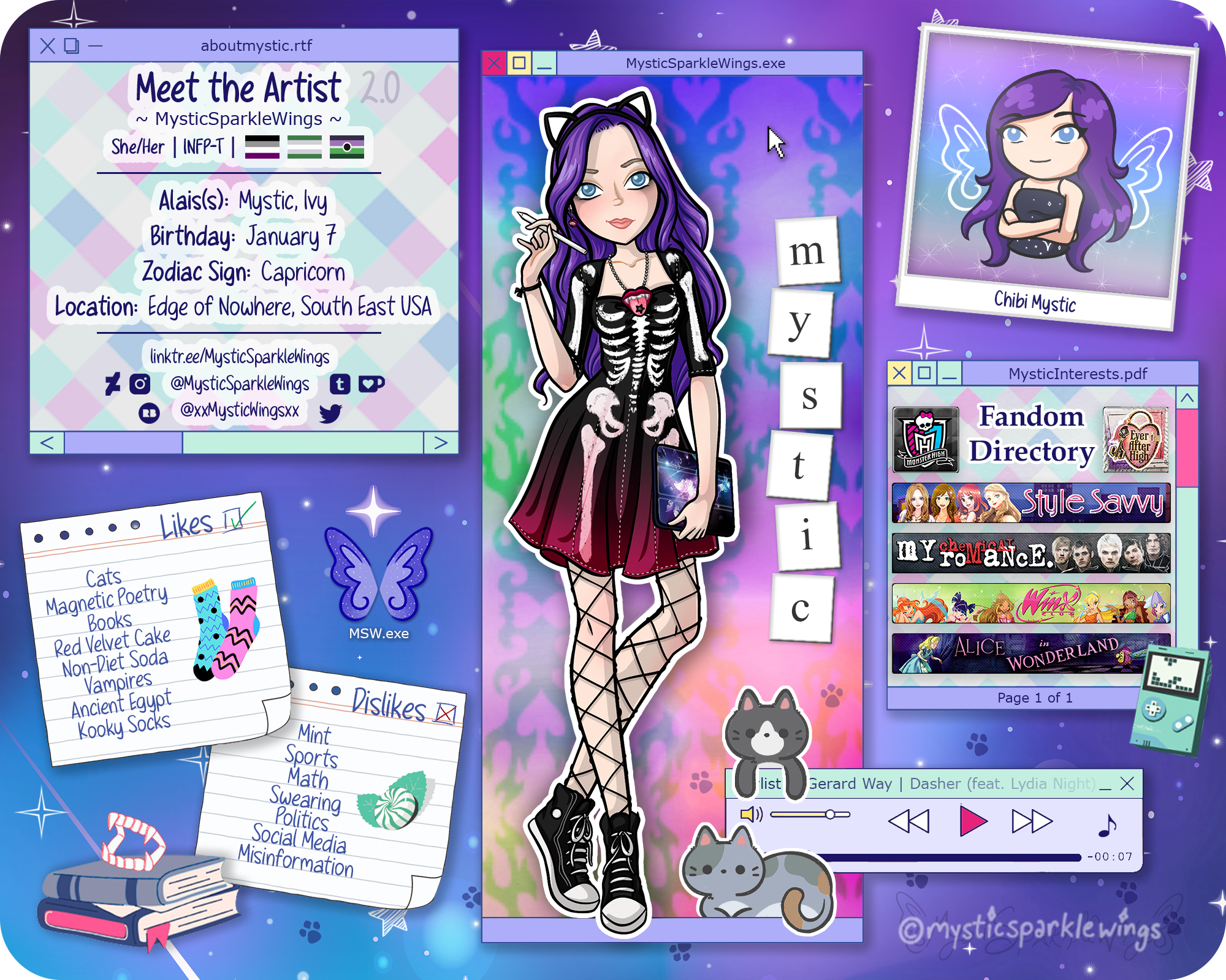
See, it's typical when you make one of these to have a section where the artist draws a dozen or so small items that are, more or less, meant to show that little bit more about them. Most of the ones I've seen take a "what's in my bag"-style approach to it, but some do more of a general inventory and or a selection of things they like, etc. This has always been my most dreaded part of making a "Meet the Artist," so much so I entirely leapfrogged over the problem last time by using DeviantArt Stamps and there's a good chance that's the whole reason I put off making a new one for as long as I did. Because I know myself too well. Like I alluded to before, I will spend way too long on those tiny objects that are only going to get a fraction of attention compared to the final piece and it'll essentially be time wasted that I could've spent improving the full piece in other ways or making other art altogether.
This time I seriously considered allowing myself to fall down that rabbit hole anyway, but once it became clear Canva wasn't going to significantly cut down the work for me in other ways, my response to compensate was to, as you might be able to tell, use Canva for grabbing assets I could use for those dozen-or-so items.
It still wasn't a perfect solution, but fortunately, all the other ideas I had for the layout ended up meaning I only needed about 1/3 of the items I originally thought I would, mostly to fill empty space.
Now, about those layout ideas...
You can probably tell to a certain extent I was going for sort of a hybrid between a computer desktop and a pin/cork/moodboard. I also considered trying to incorporate dress-up-game/paper-doll elements, but I scratched that while I was working on the full drawing of me. That drawing by itself took so much time just to decide on an outfit, I didn't think trying to decide on what other clothes/accessories to include would be worth the headache. And in hindsight, it looks like I wouldn't've really had space to include them anyway. (Ironically though, the influence is still kind of there in a way because I used a Barbie image as reference for the pose and Bratz profile pages as inspiration for the center window as a whole).
I like the different impressions both the computer and pinboard imagery give as "branding," but I didn't want to have to choose between them, sorta like how even though I take either digital or traditional art in waves, I don't think I'll ever be able to fully divorce myself from one or the other.
Worth noting though that "Chibi Mystic" up in the corner there (who some of you may recognize from my other Social Media avatar pictures and some of my YouTube Thumbnails) was almost put in a "media player" computer window frame instead of the Polaroid-esque photo frame. I made the switch for two reasons: 1. I realized only having the "likes/dislikes notes" in the opposite corner was pretty unbalanced representation of the pinboard idea, and 2. I've already used the photo frame idea with Chibi Mystic in a "full sheet" showing all the different variations I use for avatar pictures as the year progresses.
I haven't posted that full sheet yet, but I intend to at some point, and this way the theming will be more consistent when I eventually do.
 (Smile)")
Also, I was particularly proud of thinking up the "Fandom Directory" box. It probably did the most to cut down on the smaller item graphics I ended up needing. I got the idea partially from not wanting to totally give up the Stamp aesthetic from last time, and also after seeing a few "Meet the Artist" images where other people used movie or video game covers to help show what they like. As you can see, my compromise was some more banner-style images you used to see around dA (and I think Tumblr too, maybe?) that function pretty identically. [I found a template for the general banner style, but I had to compile the logos and images myself).
So that box is pretty much what it says—The fandoms that I care the most about and that have had the most influence on my personality. If you've been following me for a while, I doubt any of these are a surprise.

The Alice in Wonderland banner looks a little more obscure wholly because I really enjoyed the stamp from my previous MtA using the title card from the 1951 Disney version, because it's both my favorite version of the story and I have just always loved the style of that title card in particular. It was also the banner that required the most effort from me to get Alice, the Door, and the Text all arranged properly since I had to more or less chop it all up, then fill in some blank space and stitch it all back together.
The only other thing I think I need to clarify about this box is why Monster High and Ever After High are app-like boxes and not full banners. Simplicity, really. Both of those franchises have logos that easily fit in a smaller space while still clearly showing the name, and I think the logos themselves are pretty good at communicating a lot about each franchise at a glance.
Oh, and if you're wondering about the mint thing hanging off the bottom corner of the "Fandom Directory," that's a sort of 3-in-1 deal. (And one of the items that came from Canva originally). Some of you might remember the modified GameBoy Color I posted a while ago, which is more or less what this is supposed to be, but it also represents the fact that I do like a selection of Video Games (Style Savvy in particular) and the screen is showing something that looks a lot like Tetris, which is one of my favorite truly Retro games.
Below that is a little Music Player box, and some of you may be surprised it isn't "playing" a My Chemical Romance song. That was the obvious choice, but since I had them covered in the "Fandom Directory" window, I wanted to shift the focus slightly here. So I went with what is probably my most favorite solo song by the band's lead singer, Gerard Way, Dasher. It's a pretty different tone from MCR's discography, but it still speaks to my soul all the same.
You may also notice the pair of kitties keeping watch over the music player.
I felt like including an actual cat image in some way was a must, and there was still some empty space that was bugging my brain after just one. These cuties aren't modeled after any specific cat I have/had, because just two wouldn't be nearly enough and even for "just an art project" I don't like playing favorites. So instead I opted for two of my favorite kinds of cat fur patterns: Black/dark gray & white, and calico/"has orange spots." I didn't do jet black or stark white because i didn't want them to stand out too much. Likewise, they didn't really need the white outline like I gave myself, but it helped them pop what little I wanted them to and I sorta like how it means all three of the living things present have the white border to separate them from the inanimate objects. And the kitties left a few paw prints nearby because after everything else was done, it still felt like I was missing something and that seemed like a cute solution.

I've gotten a bit ahead of myself though—We still have the left side to talk about!

The "About Mystic/Meet the Artist" window and the Likes/Dislikes Notes are probably the more boring things about this piece as they're mostly text and a lot of what they say I just ripped straight from my last "Meet the Artist," since the information hasn't changed. Mainly, for the general info I added my Myers-Briggs personality type (the 4 letters); I don't know why I never thought to add that before, but this time in looking around at examples I noticed a few other artists did so I figured "why not?" I also added my LinkTree since that just seemed like a good idea, and I removed my age—Not because I don't want people to know, but because A. I don't like having the year listed but B. listing the number means I have to update this thing more often and that proved kind of annoying with the last one.
")
I also removed "height" and "weight" because I don't think that information is super relevant or interesting to most people that will look at this. And besides, I'm not yet of the attitude that people knowing how much I weigh is a war crime, but if I remove it now and adopt the attitude later that'll be one less problem for Future Mystic to deal with.
Ah, and I added some flags. In order for those curious: Asexual, Grayromantic, and Voidpunk. I don't experience sexual attraction, I experience Romantic attraction very infrequently and seemingly in different ways from my peers, and for just about my entire life I have felt a low-grade disconnect from my fellow humans in various ways. If you want more information on any of those three, I highly recommend checking out the subreddits for each—r/Asexuality, r/Aromantic, and r/Voidpunk.
I debated on whether I wanted to add the flags at all or not for various reasons, but my compromise (aside from making them pretty small) is the version I post to Facebook will only have the Voidpunk flag, as that's more of a subculture than it is an identity and so I feel that one is less likely to cause trouble. I'm not ashamed of who I am, I just don't like having to argue with strangers on the internet to prove that point.

Then, before we get to the Likes/Dislikes, you can see below that box I've got my wing logo trying to mimic the look of a Desktop Shortcut/Icon. I tried to fill that spot with something from the likes/dislikes, but it just wasn't working and I sorta felt like including the wing logo in some way anyhow. Plus, while it would be in a weird spot, if you look at this purely as a computer screen then it does kind make sense you'd maybe see a shortcut icon between some of the windows like that.
Now then, the Likes/Dislikes notes were one of the easier things for me to figure out about the layout, even if I originally wasn't super sure where to put them. Putting those on "paper" would give me the option to pair them with images if I wanted to, and then the images would potentially look like doodles and tie the theming back around.
As you can see, I didn't end up having a ton of space for the idea—Each "paper" got a single Like/Dislike image, but as I sort of said once before, that just meant I needed fewer total images and the few I wanted to keep could be used to help fill space elsewhere.
My Likes/Dislikes didn't really change between the last "Meet the Artist" and this one, just my opinion of what feels like a good fit to include and what doesn't. Plus, last time I was sort of held back by the stamp-image method a bit; I won't swear to it, but I think I was trying to use the actual Likes/Dislikes list more for stuff that isn't easily represented by images and/or I couldn't find stamps for, and then the stamp section was stuff that was easily represented visually. Prime example of that here is Red Velvet Cake and [Non-Diet] Soda, which were both stamps last time and not on the typed list.
I also feel my Dislikes last time were a little too general. Stuff most people dislike in one way or another, whether they'd openly admit it or not. I tried to be a little more specific with them this time, but...well, the truth is there's a lot of stuff that I don't really dislike so much as I don't care and/or I just don't understand why other people do like it, and so to put those things in the same category as my very open, passionate distaste for stuff like social media and politics really isn't fair in my eyes.
The one exception I made is Mint. I dislike mint because the cool-burning sensation caused by the Menthol that 98% of mint things contain is something I find painful whereas most other people find it pleasant. Oddly, on the rare occasions I've tried an actual mint leaf, apparently the menthol there isn't concentrated enough to cause that problem, and I actually found the flavor pretty pleasant.
So it's not that I want to systematically remove mint from social consciousness, but rather I would actually like it if I did not scorch a frozen fire on my tongue. And it's not really anyone's fault that mint does that to me, it's just science and my odds in the genetic lottery. But openly disliking mint means I'm less likely to be offered anything mint-flavored and thus less likely to be in pain, plus it made for the easiest visual representation on the "Dislike" list, ergo here we are.
The Likes list went through a couple of different images sharing the paper. The one that stuck the longest was two soda cans colored like my favorites—Dr Pepper and Canda Dry Ginger Ale. But as I figured out more of what I was doing, the color scheme started to clash with them, and I actually opted to put shoes on my avatar self this time...And originally I planned on long pants too, which would've meant "she" could be wearing kooky socks, or she could be otherwise barefoot. Doesn't matter if you can't see!
That's sort of the unfortunate thing about liking kooky socks anyway—You get very few opportunities to show that fact off!
Last time, though it was a little tricky to tell since they were primarily black, my avatar was in fact sock-footed and so I felt I only needed a text stamp mentioning them.
This time, by this point, as I mentioned, the soda cans weren't looking that great, here was my opportunity to get the socks back in. And they could be virtually any color to better match the general scheme! [We're ignoring for now that I'd end up changing the outfit to potentially show socks later...and even if we weren't I'm not sure it would've mattered because odds are I wouldn't have been able to think of a sock design that worked.]
These are really just the tip of the iceberg for my taste in kooky socks, but they get the job done! And besides, my absolute favorite kind—knee-high and designed to look like shoes—probably wouldn't have been as obvious to the average viewer as to what they're supposed to be, so it's probably for the better.
Speaking of for the better, we've circled back to that thing I mentioned about only fitting one image on the Likes "paper" working out. Otherwise, I'm not sure what else I would've fit in this lower left corner. The books with the classic one-piece vampire fangs ended up working out really really well.
I do sorta wish I could've figured out a way to get some imagery for Ancient Egypt up here, but most of the obvious things—a Pyramid or a Mummy—felt either too generic or like the color contrast just wouldn't work out. And some of the other options—An Ankh or "Egyptian-Style" Cat—felt too obscure. Or, the Ankh specifically felt like a little bit too much of a religious symbol that just doesn't belong to me, and therefore best left alone. But I still wanted to include it as a "Like" because I am truly fascinated with Ancient Egyptian culture and it's generally something you wouldn't know about me without asking, for as rarely as it comes up as relevant.
Finally, that brings us back around to the center point of this whole thing.
I already mentioned the drawing of me took kinda forever, mostly because I thought for way too long and way too hard about how to encompass as much of my personality as possible using clothes I own in real life. You wouldn't think that would be such a challenge, but I have essentially three ways of dressing: 1. Alt/Punk Girl, 2. Rainbow Brite, 3. Pastel Girl-Next-Door. They do often overlap, but usually only two at a time, or when I can squeeze 3 into 1, it's usually for a special occasion, or just generally too over-the-top for "every day," even for me.
Moreover, I really wanted to get Converse shoes in there since they are my most warn closed-in shoes and generally the only shoes I like the design of at all when it comes to "athletic" shoes. But Converse don't go with everything, unfortunately. [And they're too warm for summer, but that's a separate issue.]
To make this long, long story just a little bit shorter—Ultimately, I had to forgo both the "clothes I actually own" idea and the unofficial "rule" that it should also be clothing/an outfit I wear somewhat regularly. Trying to fit everything I wanted into an outfit with those limitations was just too tall of an order. Suffice to say I'm still not 100% happy with the outfit; It works well enough, but I do wish I'd been able to stick to it being something I actually own and wear regularly (instead of just inspired by real pieces I own)...plus I do wish I could've thought of something else to make it just a little bit more girly. This final outfit is more girly than the first one I started with because this is a dress and not pants, and I pushed it a bit further by getting some pink in there, but still.
Oh, and much more subtle, but it was also important to me to get that mouth necklace in there. If you've followed my Words that Kiss series, you may remember I'm drawn to jewelry/sculptures like that. It's a relatively new interest compared to most of the others here, but it felt important and I had absolutely no other ideas on how to reference it otherwise. But I do actually have a real necklace like this one , so that was my starting point and it stuck.
Let's see...I think the only things left I haven't addressed are background choices and the magnets spelling out my name towards the center. Fortunately, these are some of the simpler explanations out of the bunch.
The magnets specifically I think are the most obvious. I have a penchant for mini-magnets, and the placement + spelling my name out with them, as I alluded to earlier, was specifically inspired by the box artwork from the Pretty N Punk Bratz dolls.
The "center background" behind me...I really wish I had a thought-out explanation for you, but this was really a case of just trying things until something felt right. I did sort of go with some inspiration from We're A Team , but more so because I didn't know where else to start.
And that leaves us with the "whole" background. It's kind of space-y in blues and purples with sparkles. That's all imagery I've been leaning into for a while now, and then while I was still in limbo on finalizing this, I made some new social banners for myself and really leaned into it even further, so it just fits. Added bonus: It's not uncommon for default computer backgrounds to use space or night sky imagery, which yet again ties back into the overall themes I was going for.
Whew. Are you tired after reading all that? I'm a bit worn after writing it, so I don't blame you if you are.
This description is really a reflection of how much I over-thought this entire thing, start to finish, and how it took way longer than it really probably should have. Like, I kind of knew making a new Meet the Artist would take a while and that's part of why I put it off for as long as I did, but this blew right past even my lengthiest expectations.
But at least it is finally done and I'm reasonably happy with it. We'll see how long that lasts, but let us all hope that regardless of whether it's a year or another four between this one and a hypothetical "Meet the Artist 3.0" that next time it doesn't take me like 5 months to finalize the darn thing...
Artwork © me, MysticSparkleWings
Where to find me & my artwork:
My Website | My Book | Commission Info + Prices | Ko-Fi | dA Print Shop | RedBubble | Twitter | Tumblr | Instagram
Related content


Comments: 2

👍: 0 ⏩: 0

👍: 0 ⏩: 0