HOME | DD
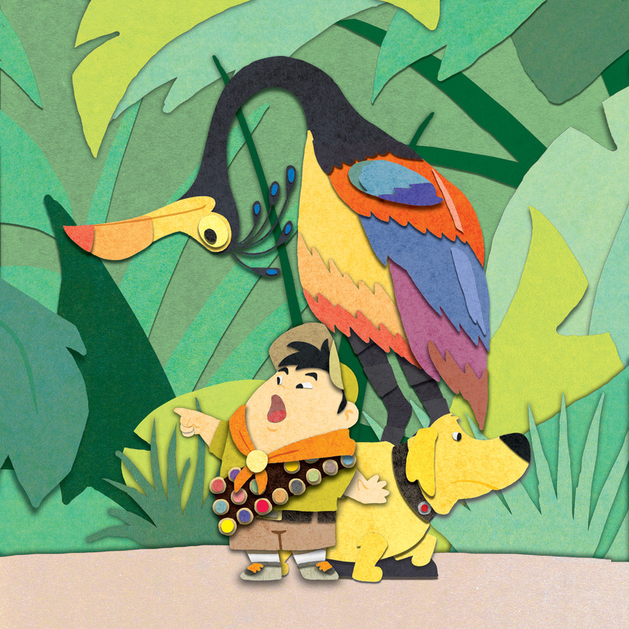
 N8KELLY — Up Paper Cut Out Attempt
Published: 2010-03-13 05:19:47 +0000 UTC; Views: 8755; Favourites: 240; Downloads: 522
Redirect to original
Description
Tried out this sweet tutorial byI like how it turned out but I know if I work with the drop shadows more it could be better.
Any critiques, suggestions, or tutorial recommendations would be greatly appreciated.
Related content


Comments: 25


Technique
An amazing piece of work! You did a beautiful job in rendering both the visual details of the characters and the appearence of the work being a real paper cutout. The colours are vibrant, true to original creation of the charatcers. In a single image you were able to represent each of these characters in one of their truest moments from the film. The only one I could ever see being different would be of Russell plastered up against the side of Carl's house.
The only point I deducted was for what I felt to be an overuse/misuse of the shadow feature in some areas of the artwork. Under Russell's feet and the right portion of his shirt where it overlaps his arm, the southern row of badges, the large green leaf in the lower left quadrant, and the blue oval shaped feathers on the upper portion of the bird. These portions appear more like floating pieces rather then the paper cutouts and pastes they represent.
You have a great attention to detail as with the bird legs being two different grays to illustrate the structure instead of just being one continuous line.
For just trying out another's tutorial I think you did an amazing piece of artwork! Kudos!
👍: 0 ⏩: 1

Thanks for taking the time to critique my work. I had a tough time with the drop shadows overall and I totally understand what you're saying. And I agree completely, hopefully next time I'll be able to fix the floaty looking parts. Thanks again!
👍: 0 ⏩: 1
my pleasure ^_^ it's the first critique i've done on dA so i'm glad it was well received.
👍: 0 ⏩: 0

This is awesome! Found it in a google search of digital paper cuts..but I cant find the tutorial do you know if it still exists? Thanks you so much. Sean
👍: 0 ⏩: 0


Thanks Sarah! You should try out some paper cut out stuff.
👍: 0 ⏩: 0


Amazing! Love the colors you used and the way you portrayed the characters perfectly shows their personalities.
👍: 0 ⏩: 0

The shadows make it have more depth.  (Smile)")
👍: 0 ⏩: 0

very awesome! Complete win and so cute :3 I have to check out that tutorial
👍: 0 ⏩: 0


")

I don't know why, but I love the way this looks, it's so much fun, and it must have taken a lot of time. I love how the paper gives shadows in all the right places. It so interesting to stare at and study. Great Work!

👍: 0 ⏩: 0


The pseudo-colour paper effect plays very nicely on this theme. It really brings out the inner child and reminds me of kindergarten. Oh how i miss breaktime.
Indeed, drop shadow would've brought it 'out'
more but this looks just fine. The bottom right area seems a bit dull in contrast to the rest of the pic. Maybe you could've burned it a bit or smth.
👍: 0 ⏩: 0

This is one of teh cutest things I've ever seen! Nice work!
👍: 0 ⏩: 0


I love the look of this one. Just for a little extra umph, I'd add some little stones on the ground for flavor. I might darken the ground a bit too or make it more grey. That's just my personal taste though. I think it turned out great.
👍: 0 ⏩: 0