HOME | DD
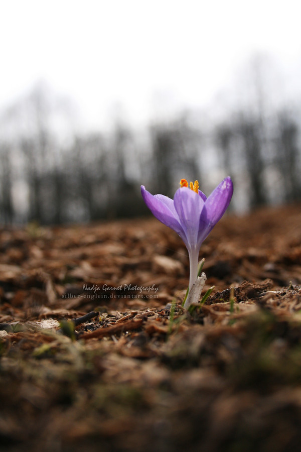
 nadjasybill — The Beginning of Spring III
Published: 2011-03-12 15:10:23 +0000 UTC; Views: 1094; Favourites: 18; Downloads: 0
Redirect to original
Description
Facebok: www.facebook.com/nadjagarnetar…Related content


Comments: 10


 (Smile)")

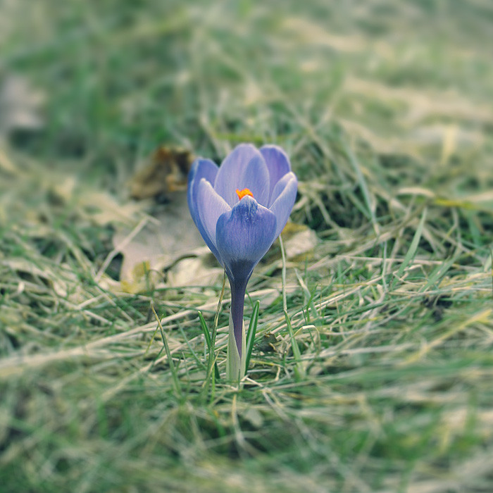
Ah, this is more like it.
I like how this is more focused than the other similar piece to it... the depth of field is absolutely fantastic in the way it's so shallow and I like how the colours contrast and complement each other too, although they contrast with each other more, I think.
The positioning is great and I like how you've off-centred it to make a more profound effect.
Not bad.
Part of me feels you could crop it into a square, but eh.

👍: 0 ⏩: 1

Thank you so much! I did try cropping it into a square, but it somehow never came out right.

👍: 0 ⏩: 1


")