HOME | DD
 NanaJ — Faust

Published: 2009-04-03 23:40:00 +0000 UTC; Views: 3479; Favourites: 40; Downloads: 296
Redirect to original
Description
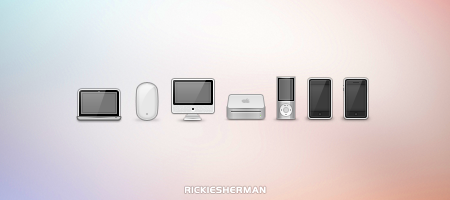
This is another work in progress.Related content


Comments: 15


Wow, love the simplicity
The white square in the Winterboard icon looks a bit too big, and the screen on the YouTube icon could do with rounded corners, but this is really great

👍: 0 ⏩: 0


 (Smile)")


these look great... cant wait for them to come out. ")
👍: 0 ⏩: 0

Mail icon is awesome! but some look like matte nano alot
👍: 0 ⏩: 0

I like the icon's style a lot, but most of them look a bit awkward to me. Specially the YouTube one, though I like the style.
👍: 0 ⏩: 0