HOME | DD
 narf41 — flatman returns
Published: 2012-09-24 21:36:23 +0000 UTC; Views: 4458; Favourites: 29; Downloads: 61
Redirect to original
Description
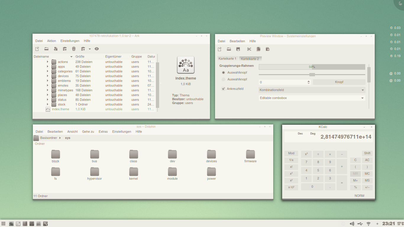
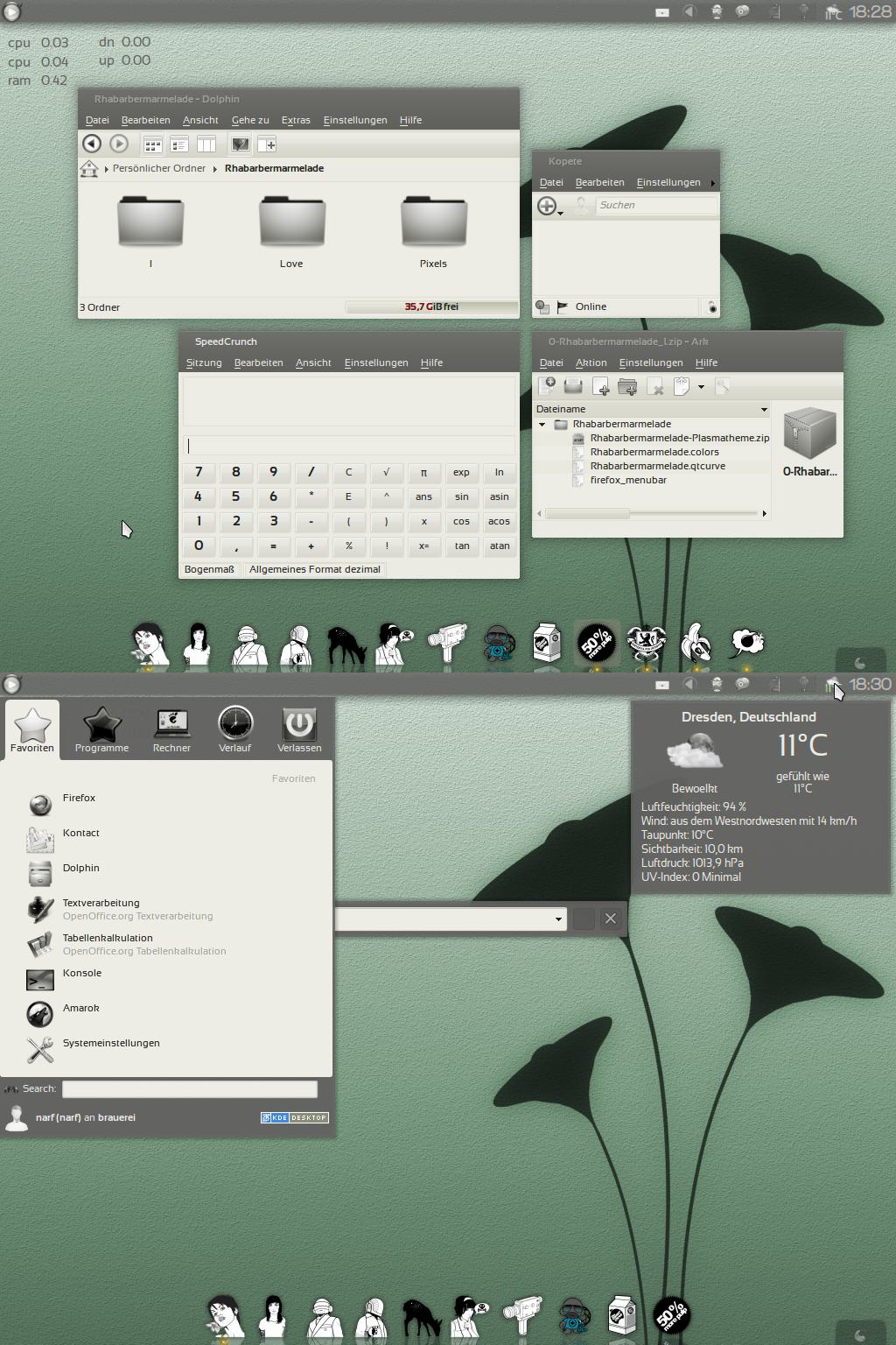
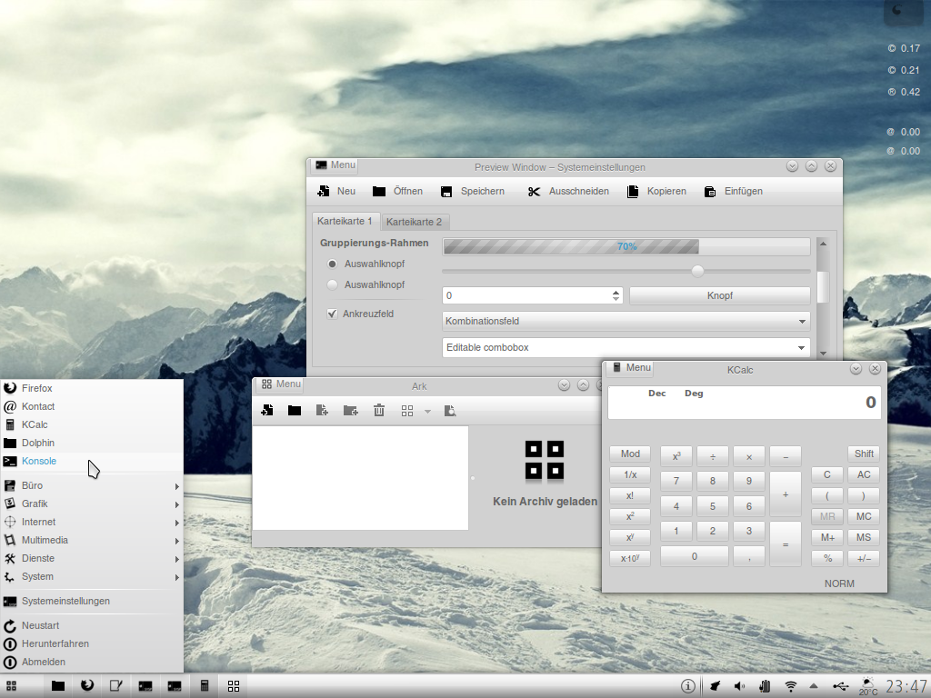
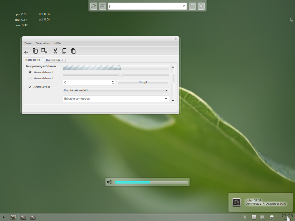
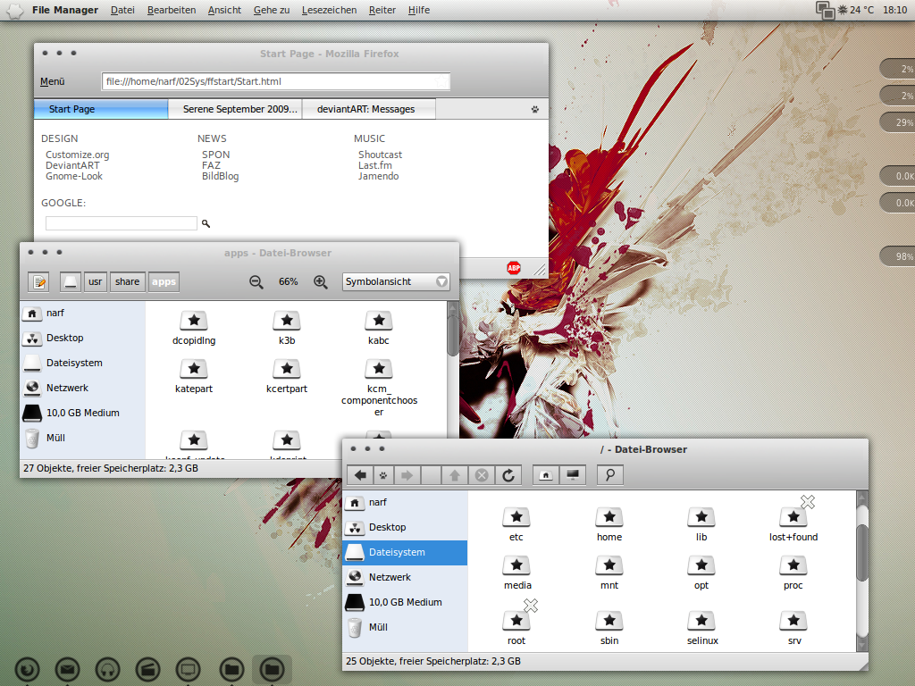
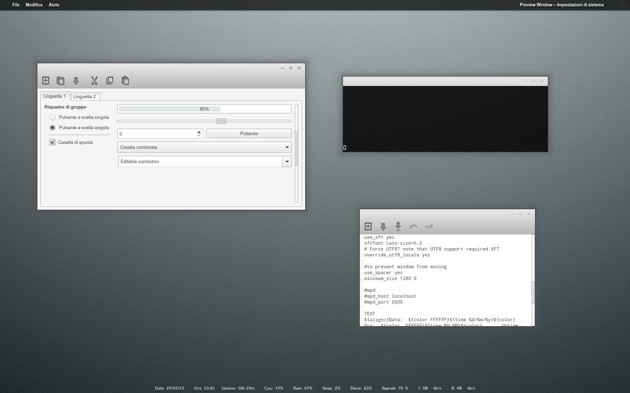
i find the direction i want slowly but steadyadded a little bit color, grey was too harsh
found some nice toolbar icons [link] and recolored them
working on a plasma theme matching the theme colors
...
let´s see, what happens next
Related content


Comments: 58


it is part of the appows wp pack, i think i found it on devart
👍: 0 ⏩: 0


Awesome work narf, just a great look you have hear!
 (Wink)")
👍: 0 ⏩: 1
thx so much, bro  (Smile)")
👍: 0 ⏩: 1

Schon irgendwie geil in welcher Geschwindigkeit du doch neu erfindest ^^ Immer wieder einen Blick wert!
👍: 0 ⏩: 1
Hehe, danke dir
Mal sehen, wie schnell sich jetzt noch Änderungen ergeben, im Winter vllt ja, ansonsten bin ich endlich wieder mit dem dicken Mountainbike unterwegs
👍: 0 ⏩: 0

Thx a lot, man
If you still want it, plz send me your email via pm
👍: 0 ⏩: 0
you changed your email account? need your new one...
👍: 0 ⏩: 1

Was this message intended for me?
👍: 0 ⏩: 1
thx a lot bro, glad you like it
👍: 0 ⏩: 1

dude, I have to try this setup. Asking for configs again ..
👍: 0 ⏩: 1
sent
if you need firefox css code, too, plz ask...
👍: 0 ⏩: 0

Ja, das gefällt mir! Auch wenn es mir persönlich auf dem Desktop zu schlicht wäre - ich fürchte, ich mag es doch etwas bunter - aber das Konzept ist nach meinem Empfinden sehr schlüssig und ästhetisch ...
Vielleicht ist der Schattenwurf des aktiven Fensters ein Hauch zu dick und zu mittig. Aber nur vielleicht ...
👍: 0 ⏩: 1
Danke dir
Ja, der Schatten ist mir auch noch zu massiv, irgendwie ist da die qtcurve Einstellung nicht soo doll an der Stelle
Farbe möchte ich auch noch bisschen reinbringen, mit den Icons für Ordner, Programme etc., da suche ich aber noch schöne. Sollten schlicht sein, aber eben farbig...
👍: 0 ⏩: 0

Macht echt was her, ich hätte den einzelnen Icons allerdings etwas Farbe verpasst und 'nen Kontrast zu erzeugen.
Ich bin übrigens dank dir jetzt seit einigen Monaten überzeigter KDE Nutzer
👍: 0 ⏩: 1
Danke dir
Hehe super ")
👍: 0 ⏩: 0

I love the flat look n' feel of it, easy for the eyes and soul..
👍: 0 ⏩: 1
thx a lot, Paz
👍: 0 ⏩: 1


thx a lot, my friend. glad you like it
👍: 0 ⏩: 0

gla you like it marc
👍: 0 ⏩: 1
Your most welcome and glad you created that great looking desk!
👍: 0 ⏩: 1

niiiiice
with the rest of icons like toolbar one, would be absolute perfection!
👍: 0 ⏩: 1
thx maaaan
well, i like it with few "modern looking" elements
but for 24x24 and smaller, i agree with you
todo: tray icons and 24x24 and smaller app and folder icons
👍: 0 ⏩: 1
then, i aspect the next episodes: D
👍: 0 ⏩: 1

nice win deco. very nice, in fact. what is it, exactly?
👍: 0 ⏩: 1
thx a lot
👍: 0 ⏩: 2
oh damn i forgot to fav it the first time...
👍: 0 ⏩: 1
thanks for the tip
👍: 0 ⏩: 1
well, it is a little bit trial and error
👍: 0 ⏩: 0
| Next =>