HOME | DD
 NCH85 — NCH logo animation the third
Published: 2014-08-07 12:41:44 +0000 UTC; Views: 3281; Favourites: 91; Downloads: 45
Redirect to original
Description
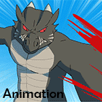
After some remarks that my revamp logo's animation is "too long" decide to simplify my logo again. Dropping the "rectangle" layout and going for a more smaller square layout, the cat design is retained and a new shorter logo animation concept is applied to the design. The design is a throwback to the very first logo design. The corner tab represents a simplified version of the speech bubble and my name goes inside it.it will be used in my future works to come.
Related content


Comments: 10


Really smooth and crisp. Definitely a worthy logo.
👍: 0 ⏩: 0


I like how the cat comes in black before popping to color. Well done!
👍: 0 ⏩: 0