HOME | DD
 negative-one — A View From Heaven
Published: 2004-08-28 16:27:17 +0000 UTC; Views: 555; Favourites: 7; Downloads: 153
Redirect to original
Description
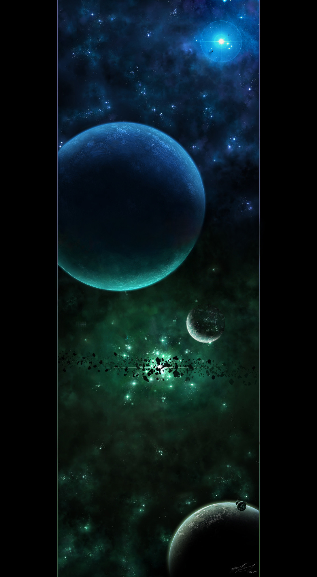
Well... i know this isn't spectacular - the brushing is lame, and the planets arent very detailed, but as per usual, i'm gona post it anyway. I feel i could do more to it. increase detail and such, but i just wanna post it") i created this over about 4 days, approximately 45mins - 1hour per day - i just couldnt find inspiration to finish it in one day. so yeh, comments, crits n' faves all welcome! thx
i created this over about 4 days, approximately 45mins - 1hour per day - i just couldnt find inspiration to finish it in one day. so yeh, comments, crits n' faves all welcome! thx  (Smile)")
Related content


Comments: 42


Nice work on the colours. Great work on the city lights too.
Great work overall.
👍: 0 ⏩: 0

Great work, i think the levekl of detail suits the image, keep it up!
👍: 0 ⏩: 0

this is great! i love the colors and detailing, very beautiful 
👍: 0 ⏩: 1

thank you very very much for the comment and the fave ) i really really appreciate it
👍: 0 ⏩: 1
no problem ")
👍: 0 ⏩: 0

well i dont like the effect u put on the text "A view from the heaven" u should improve that! ....and find better brushing methods ... the ideea is good!
👍: 0 ⏩: 1
hehe... yeh i dont like it either, buyt i formatted my comp recently and i havent put all my fonts back on yet, so i had to use mototype corsiva or sumthin like that ... myeh.. and the blur and the blue look dodgy too but yeh... i got lazy cause this was the very last thing i did, and i just wanted to post it by then. and the brushing well... lol.. you said it really. i wasnn't really worried about extremely detailed brushing mind you, i just wanted to get a good feel out of the picture, which i think i achieved. but never the less, i'm gonna go back and do some serious touch ups to it - give it the ol' fixerupper
👍: 0 ⏩: 1
u used a motion blur.... and it gaved a nasty effect .... take a look here ... i think u know this link but watch it again maibe u will find something new and maybe more inspiration [link]
[link] awesome.... u are designing only the space.... or u are doing other kind of artworks...?
i hope the links were useful for you
👍: 0 ⏩: 0

Hey ma man! Good to see your still in the action, and this peice definetly tells me you are. The dual color scheme here works nicely, and I love your star flare up top. Excellent work my friend.
👍: 0 ⏩: 1
hey champ - of course im stil in action!!
👍: 0 ⏩: 1
awesome, its good to hear that ur on a break. I hope to see some more work from yah
👍: 0 ⏩: 0

yew did good m'boy.
honestlt man, this is rather awesome! great colours.
quit yer bitchin foo'
👍: 0 ⏩: 1
now when was i bitchin'?
👍: 0 ⏩: 0

good city lights and textures on the planets (although the larger one could do with a bit more definition imo). Colours and ambience in the piece is good. I'm not as sure about the asteroids as i'd like to be though, i think they're perhaps too big... or too much in silhouette. Also, that second planet on the middle right could do with a bit of blue light at the back reflected off the northern star, some would still reach if it can light up the largest planet that much IMO.
in general, nicely done, got a good magical appeal to it which i enjoy
👍: 0 ⏩: 1
thx for the comment man
so yeh, again - thanx for the comment and taking the time to have a look at A View From Heaven
👍: 0 ⏩: 0

OMG! Well i wont post a huge comment like the last few but except to say that even tho you think it's a crappy piece i still think it possesses talent. Well done mate!
👍: 0 ⏩: 1

Hey man, first of all i have to say, your getting good at this, before you know it you will be up the top of the space artists rank hehe  (Wink)")

Although you say the composition isnt that original, these days most compositions arent 'original', even if you've never seen another piece with such a composition, theres usually someone who's going to say 'NOT ORIGINAL!', so i wouldnt worry to much if your composition isnt original, its a surprise these days if there is something thats never been done. After saying this i can conclude your composition does work fairly well, & although the two moons near the planet all the way down the bottom probably defy the laws of roche limit, i personally find them to look nicely fitting how you placed them.
You where complaining about planet texture? Hmmm, i dont seem to see any immediate troubles with the textures, they are mostly very well done, i am particularily impressed with the planets of the lower half of the image. You seem to have textured them to a degree that, like Greg Martin would say, a sense that they have a story behind them, that is, you have textured them to a state that i can observe them & make a whole story in my mind of the backgrounds of the planet, & its what most people dont think about when making a planet, once again like Greg Martin states, a planet isnt just about slapping a texture onto an orb, a planet is a gem of the heavens, a planet has story. & i think planetary working can be ALOT more fun & enjoyable, plus have a better outcome if you think about a story behind the planet you are working on.
Something im impressed about with the lowest planet is how you have setup its texturing & atmospherics, the texture on the planet is the first thing i notice, it has alot of depth & its moon-like colour scheme adds to the texture work, & although the planets atmosphere isnt the same as the colouration of the planet texture, i find it very observant/genius of you to have coloured it like the surrounding nebulae - as it reflects the mood & colouration of the nebulae, my personal tastes like the vibrance & contrast of your atmosphere, i dont have really have anything to criticise, like i said - atmosphere, texturation, colouration, contrast, has been well picked & used for this planet.
i guess im going to have to ramble my thoughts about all these planets huh, im sure you dont want an 'extended' version though 
, The two planets just above the lowest planet, they are something quite nifty, your extended darkside & use of atmosphere gives them a sort of 3-dimensional feel - one of the things i find to be a personal favourite in images. The medium sized planet near the green large star is another planet with nice texuration, & its atmospheric crescent again gives the sense of that nifty 3d effect, however i think the planet lights throw that feel a little off-course. The faint mini planets jotted around the image work nicely, i especially like that small planet up the top near the blue star because it has the dimensional crescent & a very nice drag shadow against the light.
The largest planet about mid-way of the image is probably the most not intensely textured planet in the image though, however a faint texture can work nicely, it is a little strange in contrast to the highly textured planets down the bottom. Its atmosphere IS nifty once again, giving it a dimension plus a great affect reflecting the blue & green of then nebulae, it is also faint in a sense & adds to the texturation. I think however, because it is such a contrast to the other planets, perhaps you could overlay/add some contrast to the texture, this way it will make it stand out more, thus giving a sense of it being intensely textured.
The only critique i have about some of the planets is the city lights - that is, for the planets you have them on. I have nothing against them, but just a personal taste, & im merely just stating my thoughts, not saying you must agree with me. So, what is it im disliking? well, something many people do, they mistake planet lights to being blurry, Although it seems like a light distribution or twilight from intense light glow which makes sense, it does not mean you need to blurr the actual city lights. If you look at a real picture of city lights, you will notice they are sharp glowing dots, not blurred odd shaped stars, so what i am saying is - city lights may indeed look alot better sharp, & with a light glow that gives them an intense look, then again, like i said beforehand, you may personally like the blurred look, afterall, its all about what art can do for YOU, not the viewer.
I guess my final destination is your nebulae & starfield huh, & although the nebulae isnt highly textured, it does give the affect i think you where going for - a drifting, light gaseous feel. Usually i prefer highly detailed nebulae, but this nebulae isnt more of a focus point, & this light textured effect grants it the effect of lightness. I am keen on the use of colouration in this nebulae, my favourite part being near the blue star, it gives off a vibrant blue that blends into the duller blue nicely. The next part - The stars & the starfield. Something different to normal starfields i would say, you seem to have mastered the use of variation & detail in it, the sparse use of it is not over sparse when in conjunction with the nebulous gas which is good. The thing im impressed with is that you have made custom stars all over the starfield, which would have taken some time - plus it adds to the feel that you spent alot of time on the picture.
Bordering, while although nothing you would call fancy or special, is used nicely, its spatious effect adds to the focus on the image. The text, nice choice of font & size, plus motion effect, however i personally would have liked its outer glow to fit with the green nebulae, no big problem though. Also your signature is cool hehe.
Yeah man, keep up the excellent work! 

👍: 0 ⏩: 2
jeez i love comments like these
in regards to the detail on that planet down the bottom - i did put more effort into it than any others, but i think what really makes it stand out is the drop shadow on the clouds. that added sooo much to it, it just wasn't funny. i cant remember where i saw that.. but i definately copied it from someone.. hehe
City Lights - i think two words can sum them up for me - first try. I think they werent to shabby for a first...
the neb and starfield n' stuff - you said "you seem to have mastered the use of variation & detail in it", well i can tell you that this is because i spent the most time on it. every single star you see in this picture was drawn by hand (or mouse). from the little dots to the big blue star. i really wanted to get the feel right with this picture, and i figured that was the only way to do it... and i think it turned out pretty good myself- though it does take much longer than the convensional methods.
... and thanks for liking my signature
thanks for taking the time to comment on this picture in such detail - i wish all the comments i received would be this detailed.. then i'd be like greg martin in no time ... hehe. so yeh - Thanks!!
👍: 0 ⏩: 1
' in regards to the detail on that planet down the bottom - i did put more effort into it than any others, but i think what really makes it stand out is the drop shadow on the clouds. that added sooo much to it, it just wasn't funny. i cant remember where i saw that.. but i definately copied it from someone.. hehe
You most likely got the idea from DKF's 'fragment of space' picture if i recall correctly
' City Lights - i think two words can sum them up for me - first try. I think they werent to shabby for a first... '
Heh.... That's an excuse, you know it
Je, keep up the good work man!
👍: 0 ⏩: 0

That's now laim!
👍: 0 ⏩: 1
hehe... thanks for loving it and thanks for the fave
👍: 0 ⏩: 0

hello there
first off i love that crossing hue from blue to green never tried
it myself but i love it none the less let me start up top please
the blue starfeild is so interesting an beutiful it keeps me interested althoughlt planet
texture for both sides is kinda a poor but hey its better than mine!also you use of the
black to give the cloudy effect is really gr8 i also like the large flare (blue 1) looks
rather realistic to me i like now on to teh green! as i said planet at the clour coss is rather boring
but as they say best is always last i love all the green planets rock there bad ass my friend
starfield is kinda like the blue 1 which i said i liked and the mixture of dust and asteroids totally rocks
and brings out a 3d effect love the green flare
hope u like the comment + fav m8
")
👍: 0 ⏩: 1
mate, i love the comment... hehe
👍: 0 ⏩: 0

i'm really liking the lighting and mood of the overall piece. great job man.
only 'problem' i have is that the nebula looks somewhat repetitive in the texture work. but i'm just being picky thats all
👍: 0 ⏩: 1
thanks for the comment!
👍: 0 ⏩: 0

Terrific ambience and change of colour - the two really complement each other! I'm also VERY impressed by the texturing on the bottom few planets - they're really something to gaze at. Those are what really make this piece a fave! I really ain't sure about the wide star in the green part - but it's partially covered by the stones (whoch are groovy) so it doesn't really matter!
Great work here!
Og.
👍: 0 ⏩: 1
thanks for the comment and the fave man!! i wasn't to sure about that green star either.. but that was the very first thing i made, and i couldnt be stuffed changing it @ the end
👍: 0 ⏩: 0

Amazing job man. are those astroids photoshoped or 3-d? They look great.
👍: 0 ⏩: 1
this picture is 100% photoshop.. so yeh.. the asteroids are photoshopped
👍: 0 ⏩: 1

thanks for liking it a lot!
👍: 0 ⏩: 0

The planets are not bad!! They are very detailed, yes!
Your city lights are very beautful and realistic!
Yea, the brushing isn't of the bests, but is awesome anyway!
Maybe the concept isnt very original, but personally I LUV the flare on the top right and the asteroids on the center!!
👍: 0 ⏩: 1
thx for the comment, i'm glad you liked the large blue star and the asteroids
👍: 0 ⏩: 0

*snedex is unable to comment at this moment as he is in awe* please leave a message after the beep "BEEP"
magnificent work!

👍: 0 ⏩: 1
well.. im quite stunned that you're in awe
👍: 0 ⏩: 1
np dide
👍: 0 ⏩: 0