HOME | DD

neilmjones β€” 
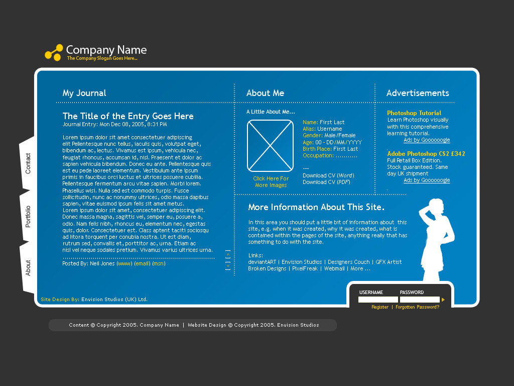
Personal Website Design by-nc-sa

Published: 2005-12-08 19:31:23 +0000 UTC; Views: 32803; Favourites: 193; Downloads: 7180
Redirect to original
Description This design is for someone who wants a personal website to show off their work

Β© MMVIII. All rights reserved
Morgan Photography
Related content
Comments: 169

mudz In reply to ??? [2006-05-13 11:41:47 +0000 UTC]

very nice, but so damn clichΓ©.

πŸ‘: 0 ⏩: 0

gniew-ko [2006-05-13 10:44:21 +0000 UTC]

Thats a realy nice dsgn_clear n estetic
Good job!_I wish i could do something like that.

πŸ‘: 0 ⏩: 1

neilmjones In reply to gniew-ko [2006-05-13 21:28:54 +0000 UTC]

im sure you can

πŸ‘: 0 ⏩: 1

gniew-ko In reply to neilmjones [2006-05-13 21:29:58 +0000 UTC]

I dont think so

πŸ‘: 0 ⏩: 0

iam-jay In reply to ??? [2006-05-13 07:59:39 +0000 UTC]

hmmm imho it isn't good, it's normal -more- it's quite poor.

πŸ‘: 0 ⏩: 1

gothican In reply to iam-jay [2006-05-13 09:33:11 +0000 UTC]

Ever heard of constructive critism?

πŸ‘: 0 ⏩: 2

iam-jay In reply to gothican [2006-05-13 11:22:49 +0000 UTC]

my english is poor even if i want to write construct critique i cant do it right now so dont be hasty

πŸ‘: 0 ⏩: 1

gothican In reply to iam-jay [2006-05-13 13:21:22 +0000 UTC]

fair enough, Jonasz

πŸ‘: 0 ⏩: 0

neilmjones In reply to gothican [2006-05-13 09:37:19 +0000 UTC]

Thanks mate , Jonasz how could it be improved???

πŸ‘: 0 ⏩: 1

gothican In reply to neilmjones [2006-05-13 13:16:26 +0000 UTC]

No problems

πŸ‘: 0 ⏩: 1

neilmjones In reply to gothican [2006-05-13 21:32:15 +0000 UTC]

I appreciate the Criticism, BUT I would have prefered something with tips on how it could be improved!

πŸ‘: 0 ⏩: 1

gothican In reply to neilmjones [2006-05-14 04:44:15 +0000 UTC]

Well hey! I wasn't the one doing the critising, I was telling someone off for not giving you constructive critism, I myself like your layout very much, especially from a web designing point of view which is what I do in real life

πŸ‘: 0 ⏩: 1

neilmjones In reply to gothican [2006-05-14 17:53:30 +0000 UTC]

lol, i know thanks for that

πŸ‘: 0 ⏩: 0

zoomzoom [2006-05-13 07:34:01 +0000 UTC]

i am a simple man too... but think this design could use some complicated details...

πŸ‘: 0 ⏩: 0

aoitenshi14 In reply to ??? [2006-05-13 07:07:33 +0000 UTC]

cool! very simple yet very lovely. i'm guessing you based this on blogger? just a wild guess. anyway, i was wondering what the lorem ipsum thing was... i always see that thing in samples...

πŸ‘: 0 ⏩: 1

neilmjones In reply to aoitenshi14 [2006-05-13 09:29:05 +0000 UTC]

Its more for flash thanks for your comment

πŸ‘: 0 ⏩: 1

aoitenshi14 In reply to neilmjones [2006-05-13 10:49:45 +0000 UTC]

welcome

πŸ‘: 0 ⏩: 0

podiyen In reply to ??? [2006-05-09 09:03:27 +0000 UTC]

suberb work

πŸ‘: 0 ⏩: 1

neilmjones In reply to podiyen [2006-05-09 22:54:48 +0000 UTC]

Cheers

πŸ‘: 0 ⏩: 0

Smuggler-Of-Mos-Espa In reply to ??? [2006-04-23 20:37:54 +0000 UTC]

Gorgeous work on this, man. You truely know your designing effects well. Very clean and sleek. Beautifully done.

πŸ‘: 0 ⏩: 1

neilmjones In reply to Smuggler-Of-Mos-Espa [2006-04-23 23:03:18 +0000 UTC]

Thank you

πŸ‘: 0 ⏩: 0

Smuggler-Of-Mos-Espa In reply to ??? [2006-04-23 20:37:11 +0000 UTC]

Gorgeous work on this, man. You truely know your designing effects well. Very clean and sleek. Beautifully done.

πŸ‘: 0 ⏩: 0

mistercreevy [2006-04-14 16:50:25 +0000 UTC]

i lovee the template sooo kooool

πŸ‘: 0 ⏩: 0

Flykes2u In reply to ??? [2006-03-24 15:43:30 +0000 UTC]

wow - just amazing... the colors are great

πŸ‘: 0 ⏩: 0

NonOfficialArtist [2006-02-26 18:56:21 +0000 UTC]

Extremely nice and clean, wonderful colour harmony. I like it a lot.

πŸ‘: 0 ⏩: 0

splat In reply to ??? [2006-01-11 00:52:33 +0000 UTC]

I'm a big fan of this design. It's fairly simple by nature yet there's a lot of detail and it's very stylish to boot.

The color strikes me first with the deep blue on grey. I like the fact that it's not going overboard on color nor is it too bold, yet it's distancing itself from your typical website design. The rounded corners are a nice touch along with the indentation for the username/password in the lower right corner. I also like the simplistic navigation with side tabs, though this makes text navigation for non-image browsers a lot more difficult.

My only issue with this design is the limitation to the content area due to a fixed size. In this case, however, it's most likely more of a micro-site with portfolio items and a bio, so it isn't as much of an issue.

Great work, especially the cleanliness of the design.

πŸ‘: 0 ⏩: 1

neilmjones In reply to splat [2006-01-11 07:45:32 +0000 UTC]

Thanks for your comments mate

πŸ‘: 0 ⏩: 0

gri3fon In reply to ??? [2005-12-16 04:18:08 +0000 UTC]

perfect blue!!

πŸ‘: 0 ⏩: 0

bz [2005-12-14 09:56:39 +0000 UTC]

actually i like this a lot. i love the colors and the design. i been looking for a good template for a personal site. maybe you'll make some template for personally sites

πŸ‘: 0 ⏩: 0

depthskins In reply to ??? [2005-12-14 09:26:31 +0000 UTC]

I like this alot. Real cool. Nice use of blue and white. I like that.

πŸ‘: 0 ⏩: 1

neilmjones In reply to depthskins [2005-12-14 13:41:27 +0000 UTC]

Why Thank You

πŸ‘: 0 ⏩: 0

bansh33-net In reply to ??? [2005-12-14 00:17:47 +0000 UTC]

oresome!

πŸ‘: 0 ⏩: 1

neilmjones In reply to bansh33-net [2005-12-14 00:26:25 +0000 UTC]

Thank you, kind sir!

πŸ‘: 0 ⏩: 1

bansh33-net In reply to neilmjones [2005-12-14 00:53:15 +0000 UTC]

lol [link] come into the wdc chat room

πŸ‘: 0 ⏩: 1

neilmjones In reply to bansh33-net [2005-12-14 13:41:07 +0000 UTC]

Im having trouble with it at the moment, but im trying to fix it

πŸ‘: 0 ⏩: 1

bansh33-net In reply to neilmjones [2005-12-15 00:09:54 +0000 UTC]

oresome, well good luck with the trouble, lol

πŸ‘: 0 ⏩: 0

ipholio [2005-12-13 22:29:14 +0000 UTC]

Very smooth layout, the fonts and gradients are very smooth. Colours are perfect for the site. Great work.

πŸ‘: 0 ⏩: 1

neilmjones In reply to ipholio [2005-12-14 00:19:16 +0000 UTC]

Thank You

πŸ‘: 0 ⏩: 0

Quentin79 [2005-12-13 14:45:52 +0000 UTC]

Great layout!

πŸ‘: 0 ⏩: 1

neilmjones In reply to Quentin79 [2005-12-13 14:48:31 +0000 UTC]

Thanks mate

πŸ‘: 0 ⏩: 0

DrunkDesigns In reply to ??? [2005-12-13 13:25:22 +0000 UTC]

hey looks very very nice but fonts on tittles looks pixelate check the mode (none,sharp etc...) excelent choice of colors

πŸ‘: 0 ⏩: 2

DrunkDesigns In reply to DrunkDesigns [2005-12-13 16:44:45 +0000 UTC]

glad that can help you

πŸ‘: 0 ⏩: 0

neilmjones In reply to DrunkDesigns [2005-12-13 14:50:26 +0000 UTC]

Thanks for that mate ill sort that out later

πŸ‘: 0 ⏩: 0

xdreamer [2005-12-13 11:32:59 +0000 UTC]

Good work mate.

πŸ‘: 0 ⏩: 1

neilmjones In reply to xdreamer [2005-12-13 12:29:28 +0000 UTC]

Cheers

πŸ‘: 0 ⏩: 0

silivrenwolf In reply to ??? [2005-12-13 03:44:40 +0000 UTC]

Nice design! i really like the colors

πŸ‘: 0 ⏩: 1

neilmjones In reply to silivrenwolf [2005-12-13 14:50:57 +0000 UTC]

Cheers Bud!

πŸ‘: 0 ⏩: 0

execute2k3 In reply to ??? [2005-12-12 09:43:35 +0000 UTC]

great!

πŸ‘: 0 ⏩: 1

neilmjones In reply to execute2k3 [2005-12-13 14:51:13 +0000 UTC]

πŸ‘: 0 ⏩: 0

shftfrm In reply to ??? [2005-12-10 14:10:34 +0000 UTC]

simple and nice layout. like it.

πŸ‘: 0 ⏩: 1


<= Prev | | Next =>