HOME | DD
 neilmjones —
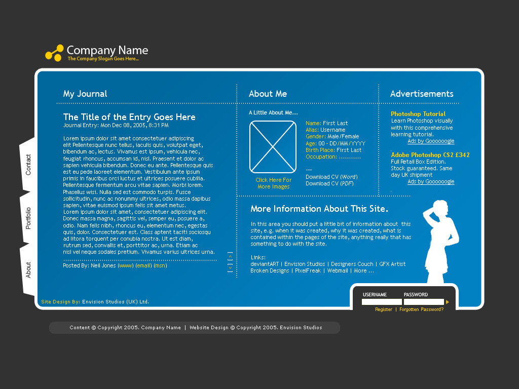
Personal Website Design
by-nc-sa
neilmjones —
Personal Website Design
by-nc-sa
Published: 2005-12-08 19:31:23 +0000 UTC; Views: 32803; Favourites: 193; Downloads: 7180
Redirect to original
Description
This design is for someone who wants a personal website to show off their work© MMVIII. All rights reserved
Morgan Photography
Related content


Comments: 169


 (Smile)")


your design catches all the things that define the current trend,but without getting overfilled...i like its style and the omogene look.good concept mate
")
👍: 0 ⏩: 1


Hay this is amazing, could you please send me this website so i could use it for my company. Thank you very much.
Yours sincerely Harry Hawkwins
👍: 0 ⏩: 1

HI, Sorry but no, I do not offer my work out for free.
👍: 0 ⏩: 0


Did you make this template yourself, or find it on the internet?
👍: 0 ⏩: 1
made it myself, it is against dA rules to post other peoples work as your own. There are many like this design on the internet as many people have asked permission to use it.
👍: 0 ⏩: 0


Your design are very well I have a little personal site... can i ask you something? can I use your work in my site Im really want that my site looks like your desing... ill be waiting your response.
👍: 0 ⏩: 0

hey i like it alot i was wondering if you would be interested in making this into a layout for myspace? i made it on photoshop
uzzletechbyrazorbladeriq5.jpg" [link] " />
👍: 0 ⏩: 0


No problem, The one that have done the great work was you not me. And you got some great photos too!
👍: 0 ⏩: 0


I have a few sugestions.
First, sorry but my english isn't very good.
Design is cool. Shape and outline are great.
There is one problem with colors. Blue and yellow in that combination where letters are not bold. Not all monitors will reproduce that at good level.
The same problem is with arrows. Also, I really don't think that you need that brackets around them. They are positioned poorly. They should be centerd with that dashed horizontal line or one at the top of text and other at the bottom.
There is one pixell error on outline. "Username | Password".
Where dashed lines intersect the cross is not clear.
"Click here for more images", "More information about this site" - why are words with capital first letter?
Sign, logo and slogan are out of the blue region. That means that they don't belong in the same data group with it and that is not good. Identity is out of the picture.
Navigation "About | Portoflio | Contact" is totaly different style than everything else.
Maybe you should keep it simple like "Username | Password"?
That grey region around copyright... I don't think that you need it.
Ok, I'll stop now. I know I'm a pain the ass. Sorry.
I am graphic designer and I believe that beauty is in the detail as well as in the whole picture.
 (Wink)")
👍: 0 ⏩: 0


I just love the simplicity of it....Other designs are overcomplicated alot of the time.^^
👍: 0 ⏩: 0

The blue doesn't mesh well with the colour scheme, but a decent design nonetheless.
👍: 0 ⏩: 0
i dont lmao its just something i got off a program on iWork ")
👍: 0 ⏩: 1

Oh. xD I saw some stuff that I recognized, but I barely passed Latin at all from never memorizing the vocabulary. xD Lectus is teach, vivam is life, est is is, et is and, sapien I forget, ante means before, mordi means dead, nunc I still can't remember, magna is big, semper is always, ad I forget, nostra is ours, diam is god, ac I forgot, too, etiam is a form of to be, I believe, neque is not, I think, and varius means different or changing. And at least a dozen other words in there I didn't recongize because I almost failed that class. O_o Of course, those are all conjugated or declined and I did even worse onconjugation of verbs than anything else. I wasn't that bad a declining nouns, though. :/ But! I'm done rambling, and sorry to waste so much of your time. xD
👍: 0 ⏩: 0

you could have had the PSD if i hadnt lost all the stuff off my hard drive, stupid PC's I think i backed it up ill have a look for it for you
👍: 0 ⏩: 0

*jealous* now if i could find a way to html it into mine...
👍: 0 ⏩: 1
| Next =>