HOME | DD
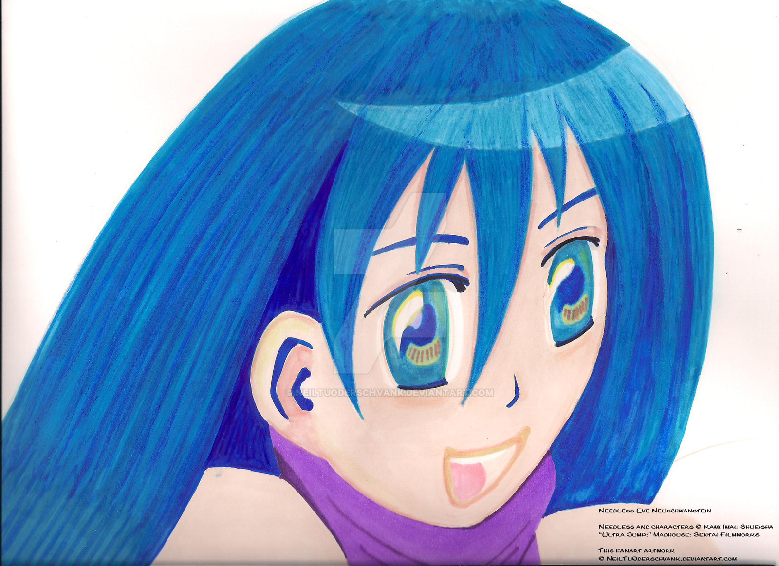
 NeilTuOderschvank — Needless Eve Neuschwanstein
Published: 2012-05-26 22:31:44 +0000 UTC; Views: 6628; Favourites: 34; Downloads: 0
Redirect to original
Description
Check out the group .Needless Eve Neuschwanstein
I have been taking your observations and suggestions whole-heartedly and incorporating them into this drawing. I am still working on it . Thank you all for your help on this!!!
Needless and characters © Kami Imai; Shueisha “Ultra Jump;” Madhouse; Sentai Filmworks
Copic markers
Blick colored pencils
Related content


Comments: 33

Overall
Vision
Originality

Impact
I love the brilliant colors and how you shaded, I feel it was a bit americanized, just with the simple hairstyle and lips. The eyes are fantastic but I think could use a bit more shine. The way the ears were attached to the face looked a little unnatural to me, but didn't take away the overall feel. Your proportions were good, the eyes were approximately one eye apart, and the visible ear lined up as well. Maybe next time you can make some hair fall on or over the shoulders, or make some tray hairs here and there, this increases the attractiveness of the character.
👍: 0 ⏩: 0

Overall
Vision
Originality
Technique
Impact
not bad for a start, but one question first, did you draw this in pencil first? its always good to draw pencil first and work from there.
start by drawing the head lightly and bald with guidlines for the eyes which lay in the center of the head and the center. add other guidlines for proportion and placement. then start drawing your eyes nose and mouth. then do the hair last and you seem to have that the hair has volume concept down. (love that color by the way and also the difference in colors making it apear to have different strands)
i also noticed you did some lineart as blue, others where the skin was and purple on the scarf. you can do this, but keep the hair line color as the hair, skin line, as the skin, and clothing as the clothing, at the ear, nose and eyelids you did blue, which can confuse the veiwer. another otion would be to choose one overall color for your lineart like the haircolor, scarf color, etc. many people choose black, and chosing some other color like the hair for example may attract more attention towards that same colored point. see if you wanted more attention towards the scarf for example, do your lineart for everything in a slightly darker purple. this will draw attention because thicker lines attract the eye more attention than thinner.by creating the same color as one point in your drawing, this creates a somewhat "thicker line". choose your choice of lineart and go over your pencil with pen/marker/etc. . once you are finished with your lineart, erase the pencil(or not. my art teacher says erasing guidlines erases effort so its your option)
then procede to color. you coloring is fine minus the mouth which should apear darke r that the rest of your skin since inside of a body, not much light can reflect inside.
otherwise great job. keep working, and one day im sure you will be a great artist! never give up no matter what anyone says, if this is your passion, stick to it and dont let anything get in the way. here, have a heart <3
👍: 0 ⏩: 0

Overall
Vision
Originality

Impact
I like how the image looks like it is made up of almost flat colours with texture like some old magazine.Though I would like to whine a bit about a couple of things.
Firstly let's state the most obviouse bit.(at least to me) the head shape. For some reason the head looks distorted.I could be wrong but my rule of critique is if it looks wrong it is wrong though it is up to you to fix it.Personally it's not a really big problem,as a matter of fact it just enhances the ye'olde magazine artstyle.
Next up is the shading and 'lineart'.The insides of the mouth,clearly being the darkest bit of the face unless in a dentist and even then I doubt it looking like the pale glisening face with all that dark red flesh.Also the line around the mouth is a bit thick and looks like she had a serving of hot frothy cocoa just before which lead me to my next problem the blue lines.
My first tought is that this blue line represents the darkest of value so steep and contrasting you used a completely different colour altogether .But then the mouth covered in brown froth turn that neat concept upsde down.And then theres the nose.I though the very apeal of drawing anime or manga or hentai is that you can leave out the nose without anyone realising.
Aside from that everything looks fine and heck even worth a good 10 bucks.
👍: 0 ⏩: 1

"Aside from that everything looks fine and heck even worth a good 10 bucks."
haha wow
👍: 0 ⏩: 1

Overall
Vision
Originality
Technique
Impact
First, I'd like to say that the coloring in the hair is great! There's a nice texture to it, and even the shine has some of that texture. Your use of blue in the thicker lines on the face is also creative.
Going on though, I feel that the inside of the mouth is a bit strange. From what I can see, her top teeth are there, but she has no bottom teeth. And, the inside of her mouth is the same color as her face, which isn't true because of the more prominent blood vessels inside the mouth which give it a darker tinge.
The head shape is also a bit strange, with the back seeming narrower than it should be, though that may be because of the hair. The face also seems flat in general, though it may have to do with the hair again.
You did draw this relatively well in a difficult perspective, but the it doesn't seem to have a very creative subject matter. It does seem you are focusing more on technique more than that here though.
Overall, great job, and keep on drawing!
👍: 0 ⏩: 0

Overall
Vision
Technique
Impact
The eyes look flat alomost. Make them more bubbley so we can see more of the emotion. Pluse I would make the chin like a triangle, to show that there is a chin even though it's hideing in the shirt. I love the blue outlining, it make the chacerter more original. The mouth seems famed with the outlining.I also like that I see a color balnece with the shirt and the hair. Keep drawing and deffeintly play with the eyes alittle more. Then you will be happy with the resault in the end.
KEEP DRAWING!
Brodwayanimeluver.XD
I don't know want eals to say.
👍: 0 ⏩: 1

Thank you for your critique. I really appreciate it. I will definitely work on her eyes and chin. These are the same areas that Christopher Hart stressed in his critique.
👍: 0 ⏩: 1
I agree with him on the eyes! And ur welcome
👍: 0 ⏩: 0

Vision
Technique
First, what strikes me is that great color of the hair, and when you look at it for a moment, you realize that even though it has a shine on it, it's not a flat color, but textured, as if it has strands. There is a touch of dark blue to represent the interior, which gives it a feeling of depth.
The artist selected a tough angle to draw (3/4 down), but handled well - and you'll notice that the far eye has been purposely drawn narrower, to account for perspective.
There are only a few minor changes I would make to it -- but it's just my point of view -- the artist is the final arbiter. I believe that the far side of the forehead, which is indented, is fine. But the chin may be too far recessed. If you'll notice the crest of the bottom lip doesn't aline with the tip of the nose. I think if it did, it the head shape would look perfect.
Last, I like the eyes - the shape and great detail, but a small addition might give them a bit more impact, with very little extra effort. Here's the idea: Under normal lighting conditions (and this looks like that to me), the light source is overhead in the form of a ceiling light, the sun or moonlight. This light shines down onto the head, and as it does, it casts a subtle shadow onto the top of the eyeball itself. This makes the eye glisten, but also gives it impact, because it darkens it. So I suggest the simple addition of darker colors to the top of the eyes, blending into the lower half, which would remain the same. Given that the eyes are already well drawn and detailed, this could really make them glisten.
These are small changes. It's an ambitious drawing, nicely done. I hope my critique was okay.
👍: 0 ⏩: 1
Thank you very much for your great critique! It is really helpful! I will work on her eyes as you suggest and try to make them glisten.
👍: 0 ⏩: 1
Wonderful -- I'm so glad it was worthwhile for you.
👍: 0 ⏩: 3

Or, you know, at least not delete them.
👍: 0 ⏩: 1

And that is how to properly respond to a critique, Mr. Hart. Take notes; it'll be worth the effort.
👍: 0 ⏩: 0

It'd be nice if you responded to critiques as well as
👍: 0 ⏩: 0

Overall
Vision
Originality
Technique
Impact
Hmmmm... I really liked that you used blue as a color for the theme. It's the right shade of blue that is bright and lightens up the character's personality. I really like the color choice that you have made for the character. The blue looks really pretty on her and matches the purple sweater that she wears, I like that.
For the ears though, I think Chris Hart has a tutorial on ears that you could use. It should be in his galler somewhere. More details can be put into the ear itself for a more realistic appearance.
Really like the hilgihts and shadings you've done and I can see you used blue rather than black for the tiny shadows. That adds a nice touch.
Exlcuding the bangs, the hair kind of looks like one massive lump though. The details make the hair look nice and wavy with the hlights and coloring, but I feel you could have put more details in the individual locks and strands. But this is just my opinion though.
She looks so bright, cheerful, and happy. Her eyes really lights up her face. I think you hilighted her personality very well.
I'm trying to distinguish the shape of her head. It kind of looks off to me for some reason. But maybe this is just me and the shape of the head is fine. I'm not sure, I'm new at critiquing.
mmmmm.....The alignment of the eyes seems off to me, but this might be just me. But it dosen't really matter whether the alignment of the eyes are correct or not, the bright personality of this character takes up the entire piece so its insignifigant.
Very nice job, good job. I really like the colors in the hair. It looks very nice. She looks very cute. e.deviantart.net/emoticons/s/s… " width="15" height="15" alt="
 (Smile)")
👍: 0 ⏩: 0

The lighting seems to be a bit crazy here? The hair lit from the top right corner, the eyes from the left.
On a side note, I wonder if Christopher Hart will write something helpful to anyone one day? He's apparently not succeeding on DeviantART at doing so.
👍: 0 ⏩: 0

I'm also avoiding talking about light sources and color choices used to dictate where the nose and details of the ear are.
Partially because I forgot about that, but also because I don't really want to nitpick at every little thing in your image and make you feel like you're a terrible artist.
You're not a bad artist. You're an amateur and show many of the halmark signs of a beginner, but that doesn't mean your a bad or terrible artist. It just means that you have a lot to work on to improve your work. You do have potential.
👍: 0 ⏩: 1
I really appreciate your thoughtful comments! I have signed up for FFF (Faces, Figures and Features) for this coming trimester. I had planned to already at the end of last Advanced Manga class and told my teacher this (so she shouldn't be surprised
👍: 0 ⏩: 0
I'm sorry that I'm posting on an image that you posted back in may and not on a more recent submission. I'm really only here because Hart is a hack and kissed a lot of ass in his critique.
I'm going to be frank with you, but this piece is extremely stiff. I know that comment probably doesn't make much sense to you because it didn't make sense when my friends would tell me the same about my own work back in the day. Essentially what I'm saying when I say your work looks stiff is that everything on the character from their hair down to their smile looks forced. There is no movement or 'life' to the character's hair. Her hair just looks kind of like chunks of blue wood that were glued to her skull. Hair is effecting by the likes of gravity, the wind, and movement. It's a good idea to watch how your own hair reacts to when you move around or when it's windy out.
Off of the hair and onto the face. For starters, eyes have form. They are not just these flat things in your head that are just composed of the iris, pupils and "white bits." Eyes are essentially like small balls resting in your skull that skin wraps itself around. This is something to keep in mind when drawing eyes from different angles or perspectives. As for the rest of the character's head/face I can't really give much of a critique on without making it sound confusing. I cannot stress enough how important it is to draw things out lightly before going and adding ink and colors because it helps avoid making a lot of easily avoidable errors. I highly suggest drawing your characters out lightly before throwing on clothes, hair, and other details to avoid a lot of the stiffness. In all honesty, it's always a good idea to look up references of actual people or even use yourself with a mirror when you come into trouble with areas on the face because it lets you get a better understanding what you need to do to make the face look "just right" when it comes to the placement of eyes, ears, the nose, mouth, etc.
In all honesty, I really do suggest for you to take a small step back from drawing anime from time to time and draw what you see from life. Not draw what you see in a photograph reference, but what you see in the world/environment around you. It will help you out phenomenally on your figures, backgrounds, objects, and more. This thread on the Art Discussion on Gaia actually explains life drawing way better than I can, and there are tons of references and resources in the thread that you can use to whatever extent you see fit.
I also suggest letting go of any 'HOW TO DRAW [WHATEVER]" books that you may or may not own. Especially if it's something written by Christopher Hart. I REALLY cannot stress how bad those books will be for you later down the road. There are so many more books such as Loomis that are worth the investment when it comes to improving your work. I also suggest "Drawing From the Right Side of the Brain" by Betty Edwards which contain a lot of drawing exercises that help you out a lot.
You're free to take my suggestions to heart or just toss them out. That's entirely up to you. I do suggest to at least give that thread a look if you do decide to go, "Nah, I'm good."
👍: 0 ⏩: 0

i Have a needless group so if interested please join [link]
👍: 0 ⏩: 0

May I just say.... :I
Only reason I'm here is because of Christopher Hart's pathetic excuse for a critique, very kiss up if you ask me.
You should look at a few tutorials and try to draw backgrounds.
It's good, but there is no true light source, the nose is blue... 
It look as if she has almost no neck, her shoulders are bunched up, and the thing that bothers me the most is the inside of the mouth. Call me weird but the inside of my mouth isn't my skin tone.
The way her hair is positioned looks as if there is a wind (in the back it higher and stiff
Just a tip, you may chose to use one color to make the lines or just use a darker shade of the color around it. Say you had a girl with blonde hair, you would outline the hair with say a dark yellow or a darker yellowish brown color. This would make it "pop" a little more.
Oh and that thing Mr. Hart said about eyes, no no no. How he explained it, I had to stop reading to laugh. To laugh at his description.
He made it seem as if this picture had no flaws, when it does. You can pick every piece of art apart and find flaws. His is just easier to pick apart, yours as well, and don't get mine started on how flawed my work is.
I just suggest you read some tutorials, practice more, watch some people who draw with Copic markers (this may help you use them easier (honestly it looked to me as if you pressed a little to hard with them), study up on anatomy and light sources, and maybe find your own style.
Keep up the good work. I hope that helped.
Good-day,
~suki-desu123
I'm sorry for any errors/typos/grammar mistakes/etc. I'm not in the mood to edit it to much. Don't bother asking why I didn't put this in a critique because I didn't have enough things to point out for me to write one
👍: 0 ⏩: 0

Went here because of the (badly) hilarious critique of Christopher Hart
But in all seriousness, you have some heavy problems with faces. They are badly stylized and they are generally scretched towards the bottom. I think you better check this tutorial, in order to overcome that problem: [link]
👍: 0 ⏩: 0

good for starting out but, practice makes perfect
it looks kind on one dimensional and lopsided, and the coloring could use some work.
I'd reccomend you outline things in black/ sepia before you color them, that way it'll look more clean.
I like how you put the higlight in the hair, nice touch if I do say so myself, but the streaky-ness of the hair is kind of unnessasary. To get the hair effect down, use a thin outlining pen (005 mm) to add fine lines in certain places in the hair. This will make it look like the hair is in strands instead of line-ish looking things. Just dont put too many lines though, or else the hair'll look like spaghetti XDD
Overall, good work. I'd say, keep trying and you have great potential


👍: 0 ⏩: 1
Thank you for critique. I will keep working on the hair.
👍: 0 ⏩: 0

Hello! I do very much like your coloring on this, but it seems as if the drawing itself needs more time. Like the face is very "flat". It doesn't look like its going outwards at all. And she just seems very stiff. Especially her hair. Draw stray hairs! Just draw kinda squiggles and several lines and be more free with your art!
Keep practicing! It's fun and you'll improve faster!
👍: 0 ⏩: 1
Thank you for your comments! I will incorporate them into the revised version that I am working on [link ].
👍: 0 ⏩: 0

Thank you very much!
👍: 0 ⏩: 1

I gave Needless 5 stars (out of 5) on Netflix streaming. I really got into it.
👍: 0 ⏩: 0