HOME | DD
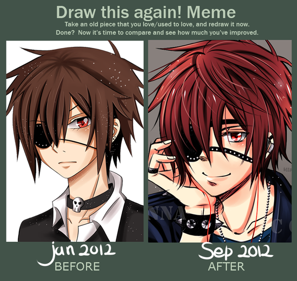
 Neire-X — Draw again
Published: 2013-05-27 09:58:23 +0000 UTC; Views: 18416; Favourites: 1199; Downloads: 50
Redirect to original
Description
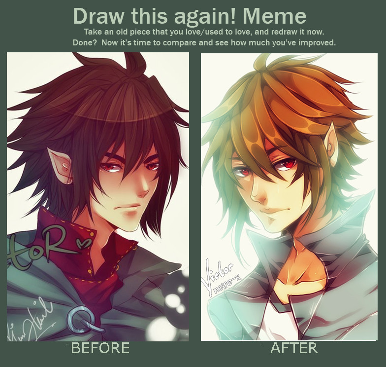
I see the chance. I took it :U- Before: October 7, 2011 [link]
After : May 27, 2013
SAI & Wacom Tablet
*Victor belongs to *phryseth
*Blank meme: [link]
Related content


Comments: 137


the after picture looks more defined and detailed
👍: 0 ⏩: 0

Love the after picture. There's more contrast and definition than the before picture (least in my opinion lol).
👍: 0 ⏩: 0


I like both versions, but the coloring is definitely a lot better on your second try!
👍: 0 ⏩: 0


Nice improvment though I kinda like the old hair more
👍: 0 ⏩: 0

...wow i had no idea anyone could get much better than your before..but your after proved me wrong...amazing...
👍: 0 ⏩: 0

I personally like the most the "before" one, but the newest one shows a few details that complement your improvement, awesome job.
👍: 0 ⏩: 0


I love too see improvement. But you have two fucking awesome drawings, awesome art.
👍: 0 ⏩: 0


D'aw. ")
👍: 0 ⏩: 0


You improved really!! ^^ Btw, I did this Meme too: [link]
👍: 0 ⏩: 0

I like the before one's hair, but the after's colors, shading, and lighting look great.
👍: 0 ⏩: 0

I like the before one better, the darker and softer colorss and shading, and the fact theres alot more detail in the hair, honestly I can barely tell it;s supposed to be the same person
👍: 0 ⏩: 0

Good improvement, dear ! I love the way you color your drawings :3
👍: 0 ⏩: 0


lol I love the one on the left is still damn better than anything I could do.
")
👍: 0 ⏩: 0

Wow! Your art is great, and you really improved
👍: 0 ⏩: 0


dat handsome face in the after panel *7* you're definitely getting better nene *u*b
👍: 0 ⏩: 0


OHH your lineart is magic. o3o + better use of lights ~
👍: 0 ⏩: 0

Nicely done! I can see such a large amount of improvement in your work even though it's only been two years~ Still impressive all the same~

👍: 0 ⏩: 0

The before version is more detailed but I PREFER THE NEW ONE 

👍: 0 ⏩: 0

You've reached level X (where X is equal to or greater than 5 + Y where Y is your previous level to the 4th power over the circumference of pi)
👍: 0 ⏩: 0

Indeed, both of them are amazing. It looks like your newer version has a slightly better understanding of anatomy (mainly hinting towards how the nose-mouth distance seems weird on the before image), which is just as important in anime and manga as it is in realistic portraits.
However, I have to say I like the colors and shading a lot better in the older one. Changed his hair color, got rid of the nice red-.. under-shirt-thing. I feel like those were some pretty major mistakes. I guess your shading has improved though, but I would've tried to keep it generally the same, as that's the point of the meme.
Just saying! They are both great.
👍: 0 ⏩: 0


Wooooooow it looks awesome in both drawings :,D I really like how you improve in the coloring >w< also the proportions of the face and in general looks better
👍: 0 ⏩: 0

they're both really good. it's really hard picking. the only real change was the style you used.
maybe i like the older one a bit more cause of the darkness in the color tone, but both are amazing c:
👍: 0 ⏩: 0


How do you do that thing with the lighting (on the second picture)? ; ; it's so pretty.
👍: 0 ⏩: 0

The older pic seems more mature than the new one; you had a good style from the start>.< Still the new one is good in its own way^^ Keep up the good work!
👍: 0 ⏩: 0

I like before better ._.
After looks nice too don't get me wrong.
👍: 0 ⏩: 0

Nice nice! The newer one is much cleaner, especially the hair
(it's also more desu-shinier lol)
 (Smile)")
👍: 0 ⏩: 0


i like both styles ^^ i mean the older one has so soft colors and the newer one is shiny xD
👍: 0 ⏩: 0

Congratulations: after almost two years of hard work, you've learned to use lense flare -.-
👍: 0 ⏩: 1

Do you even know what lens flare is?
I see no lens flare there
👍: 0 ⏩: 0

I mean, I prefer the old one. I think the new one is too shiny/bright. Keep the new design but don't add so much 'shine'
👍: 0 ⏩: 0
| Next =>