HOME | DD
 Neire-X — Draw again
Published: 2013-05-27 09:58:23 +0000 UTC; Views: 18385; Favourites: 1202; Downloads: 50
Redirect to original
Description
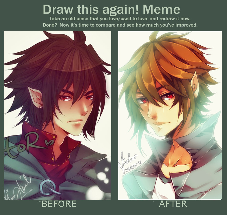
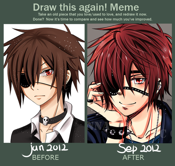
I see the chance. I took it :U- Before: October 7, 2011 [link]
After : May 27, 2013
SAI & Wacom Tablet
*Victor belongs to *phryseth
*Blank meme: [link]
Related content


Comments: 137


slkghspngpewing they are both so beautiful ;3;
I like the hair in the second one cause its so unique and screams your drawing hahha if that makes sense
Love,
Harumi <3
👍: 0 ⏩: 0


I think I prefer the older...
Clothes are more original and the hair's texture is better. The light on the second hurt the eyes.
👍: 0 ⏩: 0

I personally think the before looks better but the placement of the nose and such is better on the after one.
👍: 0 ⏩: 0

At first I was going to say the first one was better, but then you look at things like anatomy,placement, and shape and the "after" is a great improvement. Still, I like the hair on the first one better. ^^ Most likely because of the dark color.
👍: 0 ⏩: 0


I actually think the first one is better, but both are awesome c:
👍: 0 ⏩: 0

 (Smile)")


i still don't get how to draw guys' hair ono i'd say the first is better , has a few more favorable qualities
👍: 0 ⏩: 0

Instant improvement: Just add lens flare!
Sorry, couldn't resist being snarky. Anyways, gratuitous use of lighting effects aside, the 'after' image shows an improvement in anatomy, shape and depth, and some improvement in colour theory (cool lighting + warm tones and shadows = 
👍: 0 ⏩: 2

Sadly, however, Lens Flare does not exist in Paint Tool SAI.
👍: 0 ⏩: 0

I have to agree with alphabetsoup314 on this one. While there are some areas of improvement, such as the line work of the collar or the shading on the face, overall I am more impressed with the older version, mostly because of the hair.
👍: 0 ⏩: 0

They both look so good fjsdklfjd ;v; -pets drawings- uvu
👍: 0 ⏩: 0


Both are amazing. * Q *
I love the way you shaded the hair in the second one.
👍: 0 ⏩: 0

Not trying to insult you or anything at all, but I prefer the older one. ^^
👍: 0 ⏩: 0

I like how both before and after are fricking gorgeous XD
👍: 0 ⏩: 0


Definitely the new one!
The old one's nice, but I dont think it's as unique a style as the current one.
👍: 0 ⏩: 0


I don't see a major difference. From what I can tell, the newer one is more "cutesy". The older one has a more somber, serious feel to it. I prefer the latter.
👍: 0 ⏩: 0

Oh wow, both are soooo good-looking!! *.* The old one is so badass and the new one so bishie, lol //hides
i know i don't make any sense xD
Anyway, you really improved, it's so awesome to see it! ^^
👍: 0 ⏩: 0

")

It's 51% to 49% for the old version because of the lips 8D I like the hair from the
new version better though~ well, I'm weird
👍: 0 ⏩: 0

I prefer the way the hair and coloring is done on the first one. The shading on the clothes just looks more realistic to me, and the hair looks like far more detail is put into it. However, I like the facial structure of the second one more. It is hard to tell they are the same character though. xD Anatomy has improved. Coloring/shading has not in my opinion. Both are still absolutely beautiful.
👍: 0 ⏩: 0

I like all the detail lines in the before picture but the highlights are better in the after version
👍: 0 ⏩: 0

wow, your art changed so drastically so fast! .O im impressed!
👍: 0 ⏩: 0

I think I like the Before better...But the After is good too ^w^
👍: 0 ⏩: 0

it was already good but you improved XD The way you do hair now is better I think; how do you make the color so vibrant? looks cool
👍: 0 ⏩: 0


I prefer the old one simply because the new one is way too light. It's all fades around the edges so he isn't as crisp.
👍: 0 ⏩: 0

I like the face/anatomy and shading on the new one, but I absolutely adore the hair on the older one, and the clothing choice too. I'm just loving that nose and mouth on the new one, and the collar bone and Adam's apple too. There's just so much awesome in all of this, I just.. aaaa <33
👍: 0 ⏩: 1

Aah, the older one has the original clothing
I just got lazy and rush the new one so there lol
Thank you, I'm glad you like them!
👍: 0 ⏩: 0

The after one is so shinehh *A*
AMG but you are so good even before
👍: 0 ⏩: 1

Both pieces are absolutely stunning..~ Great job ;D
👍: 0 ⏩: 1

I like both, the new one is more clean and has those sharp features of the shadows that I love. Also the proportions of the head look better. He's more bishie and sparkly.
The old one is also well-drawn and has a more mysterious air to it. I think I like his clothes there XD
👍: 0 ⏩: 1
"those sharp features of the shadows that I love" jsklfs
I lost my focus in picking the color for the new one, supposed to be darker but the reference does have various colors of brown @_@
I'm just glad you still like my current style (that got lazier by times)
thank you!
👍: 0 ⏩: 1
I know what you mean, I tend to mess up the colours too when I don't use a strict palette...
And of course I LOVE it!! Lazier doesn't always mean worse, in your case it's cleaner too! <3
👍: 0 ⏩: 0

You've really improved, obviously you have changed your colouring style if it's better or not is just a personal preference. But the facial structure has gotten alot better
👍: 0 ⏩: 1
I'm really glad you noticed that, thanks so much!

👍: 0 ⏩: 0
| Next =>