HOME | DD
 nemuis — Rain on me
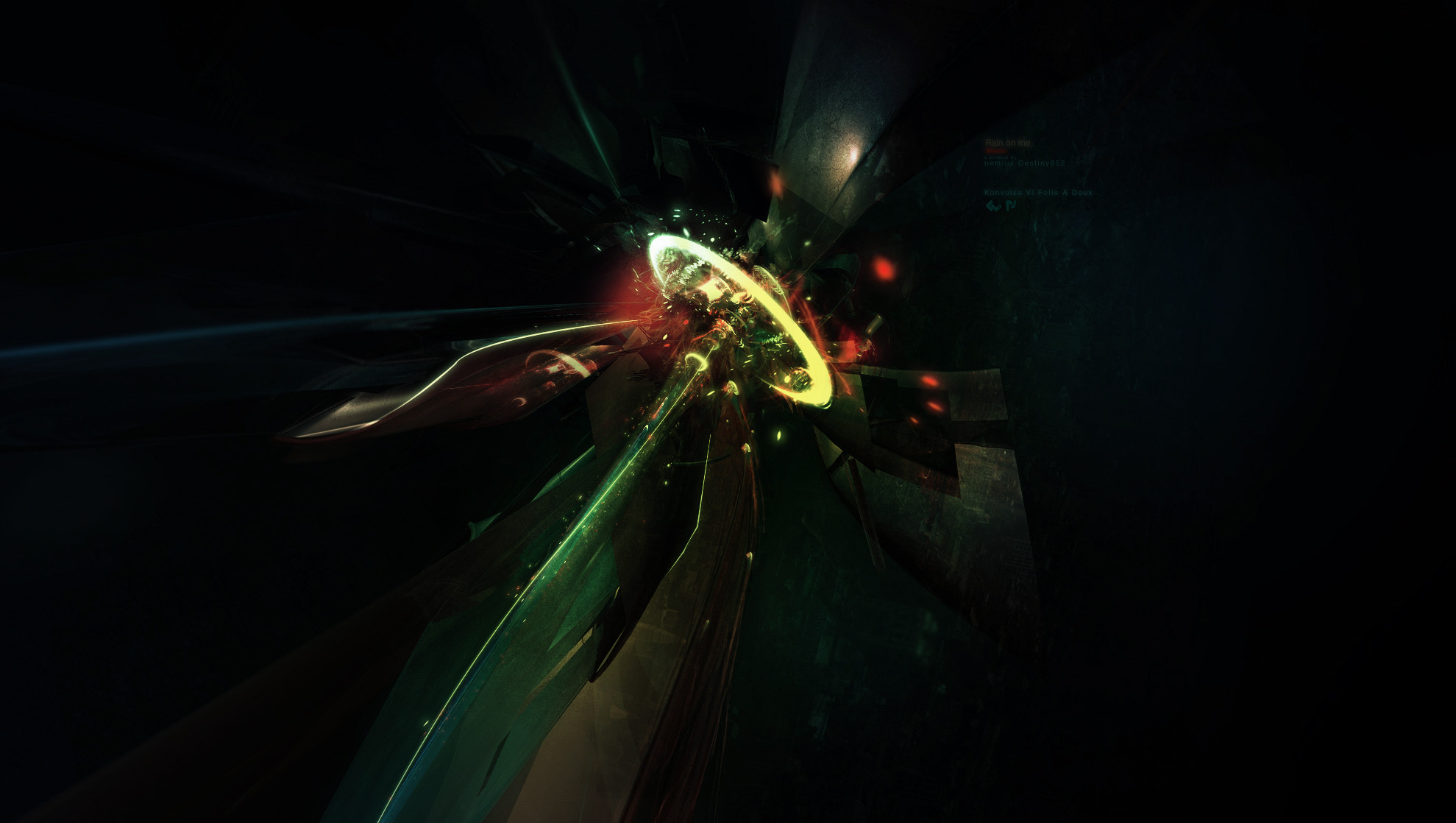
Published: 2007-01-07 04:00:38 +0000 UTC; Views: 1247; Favourites: 40; Downloads: 38
Redirect to original
Description
Presented in Konvulse's Folio a Deux - [link]a product by
+
Thanks for viewing, I hope you enjoy!
Quote Destiny952
"I did render, he did most of postwork, i added some texture and color. Check out his version for a different color version"
Related content


Comments: 24


the yellow where the white is sopsioed to be for the contrast is killing it imo. nice thohg anyway
👍: 0 ⏩: 1

i understand what u mean, thats my fault.
👍: 0 ⏩: 0


WOW. ~LOVE the lighting! +fav.
also: is it on Destiny's? I'll fav it there too if so.
👍: 0 ⏩: 0


Rock on man, this is great. I think I fav'd one already but what the hell, I'll fav the other
👍: 0 ⏩: 0

 (Smile)")

damn..nicest piece ive ever seen with this colour scheme..
this new pack is amazing..
👍: 0 ⏩: 0

This piece has been featured in my latest journal. Check it out here: [link]
👍: 0 ⏩: 0


The resolution is a bit big, bit I like the work! Well done...
")
👍: 0 ⏩: 0


the background is a bit empty, but overall its worth to fav it
 (Wink)")
👍: 0 ⏩: 0


Great stuff - I love the whole piece, text and all. Very well hidden and the colours are superb.
Definite
👍: 0 ⏩: 0

i love this piece, it has an amazing atmosphere and depth, great color, but the only thing i don't like is the text. It's would be nicer if it stood out a bit more. Great work overall +fav
👍: 0 ⏩: 0

THAT IS AMAZING!!!
No that wasent caps lock, you must tell me HOW you do that It looks AMAZINGLY FANTASTIC!!!
👍: 0 ⏩: 0