HOME | DD
 neomammut — BLACKEYE II
Published: 2006-09-23 15:34:23 +0000 UTC; Views: 15111; Favourites: 49; Downloads: 3209
Redirect to original
Description
------------------Prev:[link]
------------------
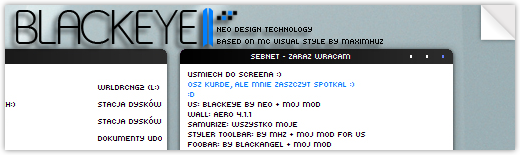
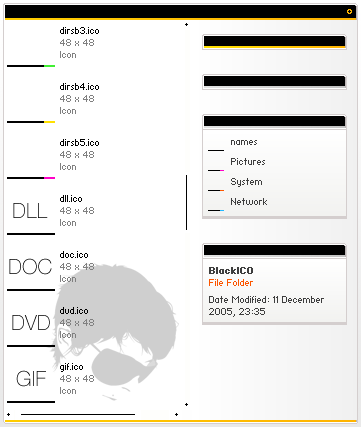
Name of visual style: BlackEYE 2.0
Author: Neo
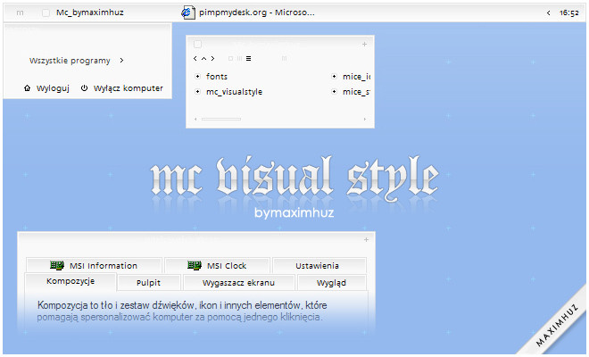
Based on: Mc Visual Style by Maximhuz ([link] )
Samurize system info: [link]
Samurize taskbar system: [link]
Thanks Maximhuz!
Peace!
Related content


Comments: 25

looking good mate, realy minimal. thats what its about nowerdays
nice one and cheers for sharing geezer
 (Wink)")
👍: 0 ⏩: 1
 (Smile)")

+fav ...using it atm [link]
I found a little bug though, in Photoshop the contour otion in the layer styles dialog seems to apear white on white where it usually appears grey on white so you actually don't really know what you choose
")
👍: 0 ⏩: 1

aha i jak moge usunac ten pasek po lewej stronie(zadania systemowe itd) gdy wchodze w moj komputer? :/
👍: 0 ⏩: 1

Własciwosci mojego komputera --> zaawansowane --> ustawienia --> odznacz "uzyj popularnych zadan w folderach"
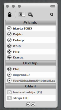
Skinow do mirandy nei udostepniam, ale jest to do zrobienia (clist_modern)
Dziekuje za komenta
👍: 0 ⏩: 0
Mozesz gdzies zamiescic skin do Twojej mirandy? Chcialbym miec wszystko idealnie do siebie pasujace. btw. bardzo ladny, estetyczny styl
👍: 0 ⏩: 0

very very nice ! id like to use it...but im from czech republic and some chars from our alphabet are missing in those fonts...can u recommend me some font with all chars like Arial and etc.?
👍: 0 ⏩: 1
J don`t know what font will be better, sorry ")
👍: 0 ⏩: 0


I like this a lot. My only gripe is that when a window is maximized, there is a little space between the task bar and the bottom of the window. I've seen this on a bunch of skins though *shrug* Other than that, I'm not crazy about the start button but I'll deal with it. I love the minimalistic look and the black/white/blue combo is brilliant. Great work
👍: 0 ⏩: 1

I like it. My only gripe is the shade of blue used, I'm more of a blue-grey fan, but that's more of a personal nitpick than a critique
i'm using this right now. sleek, minimalistic, awesome. +fav
")
👍: 0 ⏩: 1


A few problems my friend.
Very nice, but a few problems. When i have it up the side of my display, vertically.
Pink bit on each corner where the curve should be. Also, when you open the start bar menu, yo have a black bit on each corner where the curve should be.
...
👍: 0 ⏩: 1
I know - this is my idea
Thanks for comment
👍: 0 ⏩: 0


Agreed, nice idea, but those kinda fonts look nasty. BBC Acorn computers had better a better font(s)
👍: 0 ⏩: 0
