HOME | DD
 NeoPaladinOfLight — The Legendary DJ
Published: 2011-09-05 06:20:33 +0000 UTC; Views: 791; Favourites: 32; Downloads: 16
Redirect to original
Description
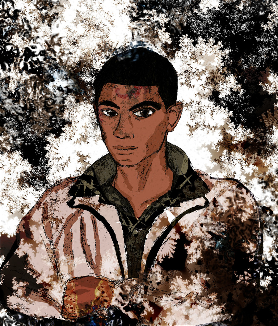
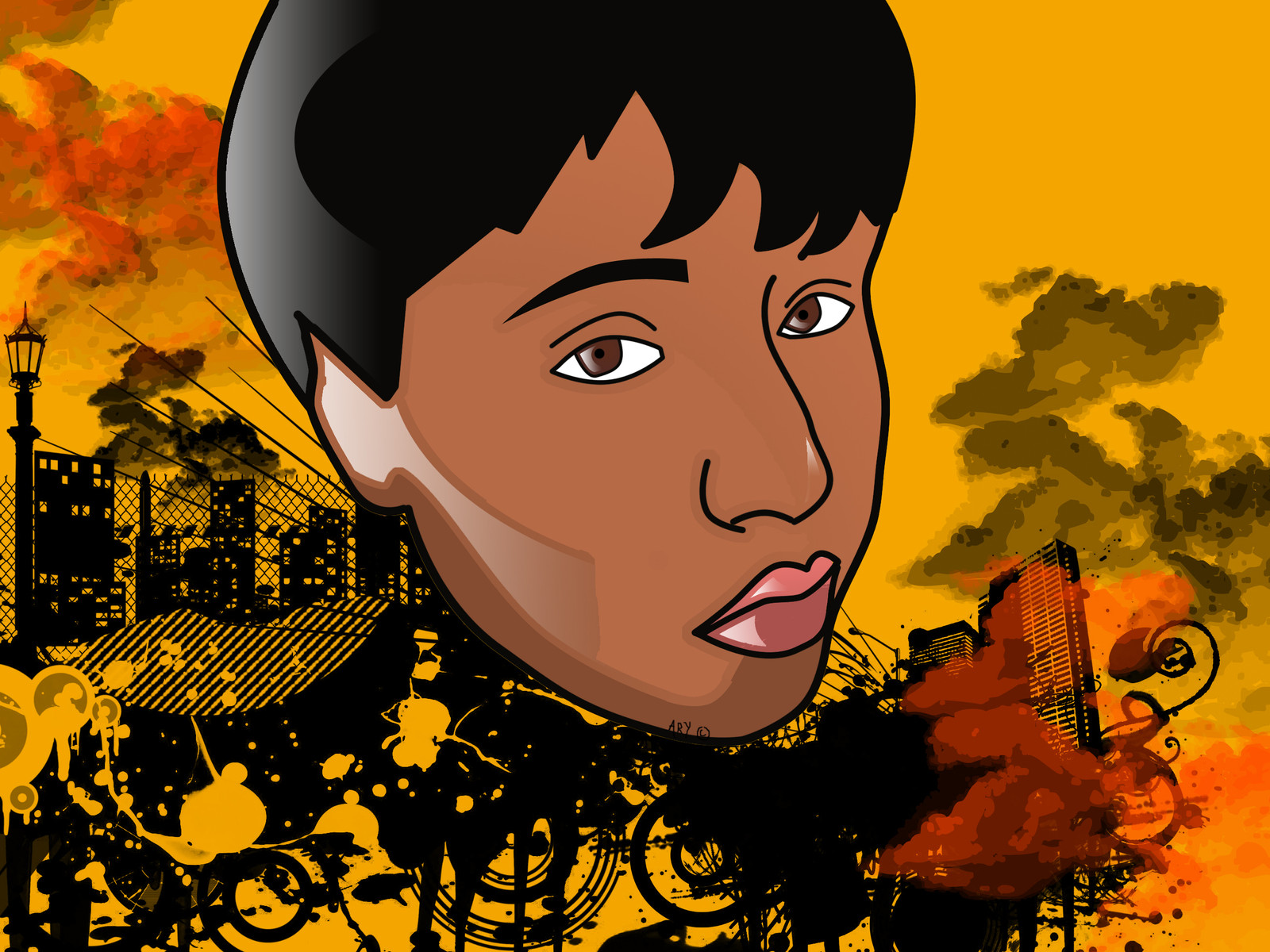
It's been years since I drew it, but I finally got around to coloring that old DJ portrait from way back. Mouse died out so I did it all with the touchpad in Paint.Net, but I don't think a mouse woulda made that much of a difference. As for the character himself, you can read his story all in Black Void. [link] He is sorta the protagonist in it.As always, leave a comment. Tell me what you think. Tell me how to get better at this drawing thing. Help me understand proportions, shadows, coloring, and all that other artsy fartsy stuff that I clearly don't understand, an' we'll be cooler than a polar bear's toe nails.
Peace and God Bless
Related content


Comments: 28


Thank you, thank you. The applause can continue for another hour.
👍: 0 ⏩: 1


I love the background/texture here, it really gives the portrait a great intensity
I cannot help you for the proportions, shadows, ... xD I don't think it's something you can actually "explain" to someone (even thought there are art classes for that), you just have to practice... practice, practice... practice again ")
 (Smile)")
👍: 0 ⏩: 1
Thank you for your input.
👍: 0 ⏩: 0

DJ's lookin' geeeeeewd nice color scheme choice
👍: 0 ⏩: 1
You're too kind. Thank you.
👍: 0 ⏩: 1

I really like this one. The color effects (yeah, I don't know the artsy fartsy words either!) are great with the mix of them and I like that they are both background and then brought into the foreground. Great job on the face shape and neck. You've given him a really strong look with the facial shading as well.
👍: 0 ⏩: 1
I'm so glad you like it.
👍: 0 ⏩: 0

So glad you think so.
👍: 0 ⏩: 1


Pretty good! FYI, if you want to maybe have some better quality art, I recommend GIMP. It's a little bit more complicated than paint.net, but in my opinion, it's way better with more options.
👍: 0 ⏩: 0

Looking through your work I see great improvement! Keep it up
👍: 0 ⏩: 1
Oh snaps. That means a lot.
👍: 0 ⏩: 0

This piece is pretty decent. The white, brown, and black really catch my eye.
How to improve this piece really depends on what your goals were and how you actually wanted it to look. Since you've listed it as comics, I'll critique this from a comic book standpoint.
1. Proportions and Anatomy: From what I can see here, your proportions and anatomy are not bad. The shoulders, chest, and arms are a little off I think, and it's hard to say for sure since so much of the pose is lost in the jacket and the texture overlaying everything. The face is well done. The eyes are a bit large, but that might have been the style you were going for. They really don't ruin the image at all, it's just noticeable that they're larger than normal.
2. Line work: The line work is probably the weakest point in this image. While your lines do pretty well in the head, face, and neck, they get a lot more sketchy and awkward in the shoulders, chest and arms. From a comic standpoint, you would want your lines to be more solid, as well as more smooth and less sketchy. Varying line thicknesses (Using thicker bolder lines in the dark areas and thinner lines in the light areas) would also help to punch up the character more. You've got some thicker lines in the open front of the jacket but not anywhere else.
3. Colors: I like your choice of colors, though the application of them is a bit chunky and sketchy. A little more blending in the skin tones and in the folds of the jacket could go a long way.
4: Texture overlay: While I like the texture overlay you've got going on, I don't really like the way it is stamped all over the character. As a comic piece, I don't really like the texture at all, but if this were to be worked up into more of a painting, I think it could work great.
My thoughts on how best to improve your figures are pretty simple. Study more anatomy and use reference photos.
For lines, I'm not familiar with drawing with a touch pad, so I can't really help you there. Some people love working with a mouse, but personally, I can't do it very well. If you can swing it, I highly recommend getting a digital tablet. Wacom is of course the best, but Adesso is a lot cheaper. In terms of traditional lines, try drawing more with long smooth strokes than short sketchy ones and experiment with making your lines thick and thin.
Color and blending can be tricky, but I simply recommend trying to add a few more tones to your shading and try to blend them together a bit more. Unless you're going for a hard edged two tone coloring job. In that case, I recommend making sure your tones have a nicely crafted shape to them.
Probably the most important advice is to observe everything. Pay attention to the details, textures, and colors all around you and try to recreate them by drawing constantly. The more you look and draw what you see, the better you're going to get.
👍: 0 ⏩: 1
Thank you so much for taking the time to help me out here. I've always had the hardest time with anatomy, and even here I thought it was off a little bit in spite of trying to draw from a reference picture. It's nice to know that it's not bad. Thanks for the tips on line art too. Lots of good info I didn't really think about. Weight of the lines for dark and light areas? Who knew? I guess painting was more of what happened in the end with the texture. I kinda like it, but you're right about the comic book thing. Color blending is definitely something I'm new at and sorta experimenting with. Again, thanks a bunch. This really helped.
👍: 0 ⏩: 1
I forgot to mention, if you want some decent help with anatomy and figure drawing, you might check out Burne Hogarth's "dynamic" books. I found them somewhere online where you could actually print out the entire book for free. Additionally, much of my early learning came from Andrew Loomis' "Figure Drawing for All It's Worth" That book was recently reprinted, and should probably not be too hard to find. (My copy came from an older friend who liked to draw before he passed away several years ago)
👍: 0 ⏩: 0

That works. Thanks my dude.
👍: 0 ⏩: 1

you've really improved... i doubt you even remember me - anyhoo, take care

👍: 0 ⏩: 1
Of course I remember you, and thanks. I try, man. I try.
👍: 0 ⏩: 0

I love the techniques that you used in this piece. It's beautiful
👍: 0 ⏩: 1
I ain't got no tech. Dis was jus' coloring 'til it looked right. Still don't look right. Help me out here. What'd make this pic as a whole look better?
👍: 0 ⏩: 0